A solution for the visual and source order disconnect
A presentation at CSS Cafe by Rachel Andrew

A solution for the visual and source order disconnect

Rachel Andrew Content lead for Chrome Developer Relations rachelandrew.co.uk
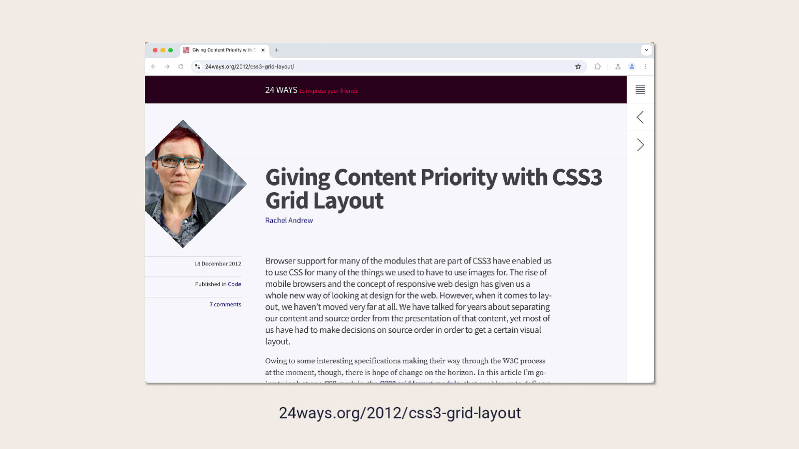
24ways.org/2012/css3-grid-layout
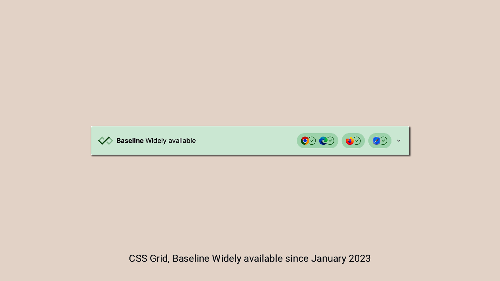
CSS Grid, Baseline Widely available since January 2023
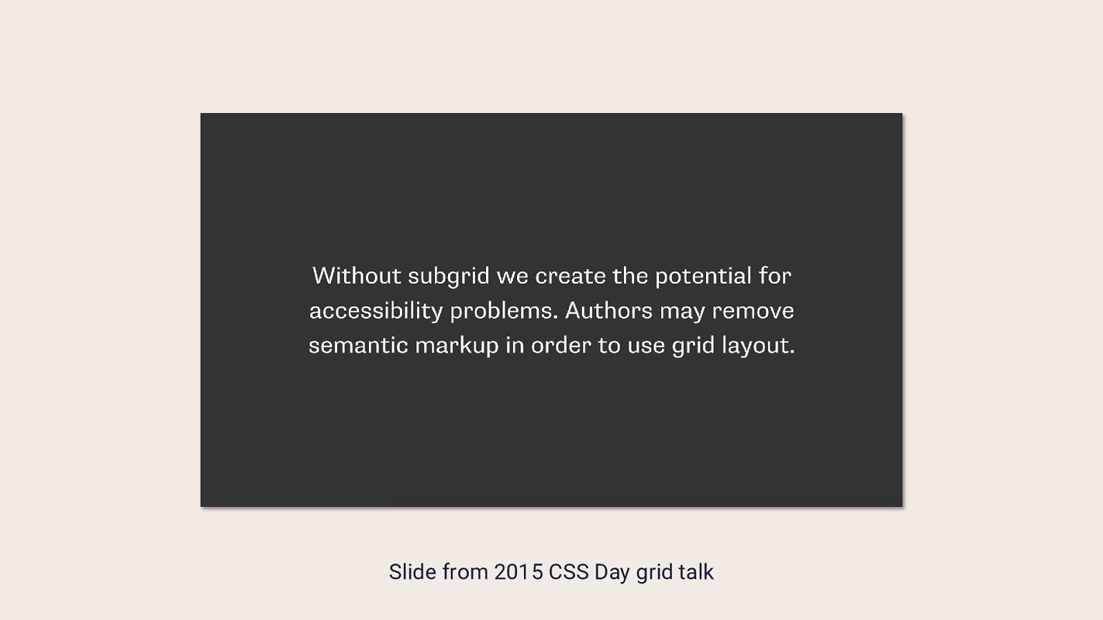
Slide from 2015 CSS Day grid talk
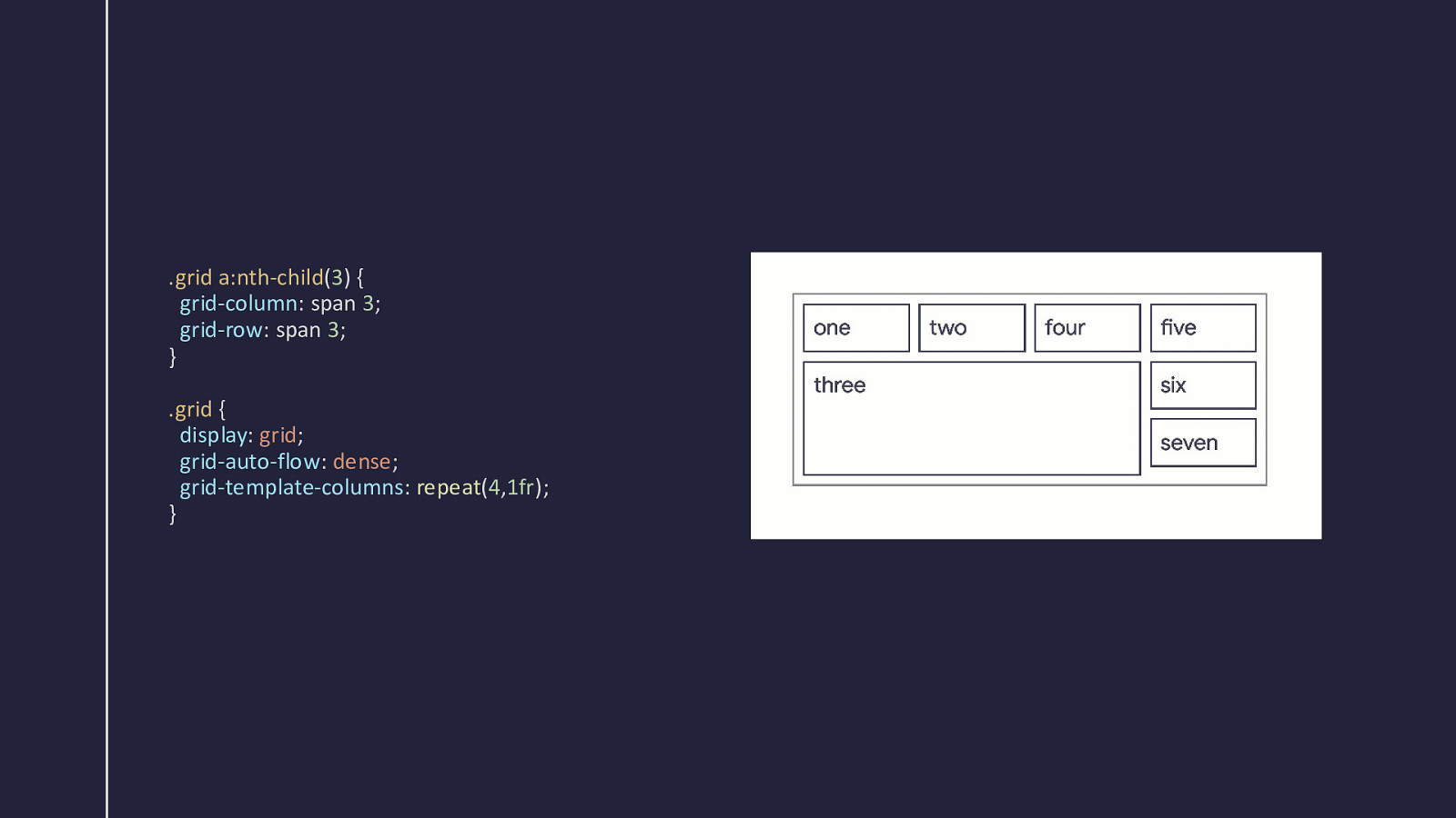
.grid a:nth-child(3) { grid-column: span 3; grid-row: span 3; } .grid { display: grid; grid-auto-flow: dense; grid-template-columns: repeat(4,1fr); }
Here’s a cool thing Please don’t use it.
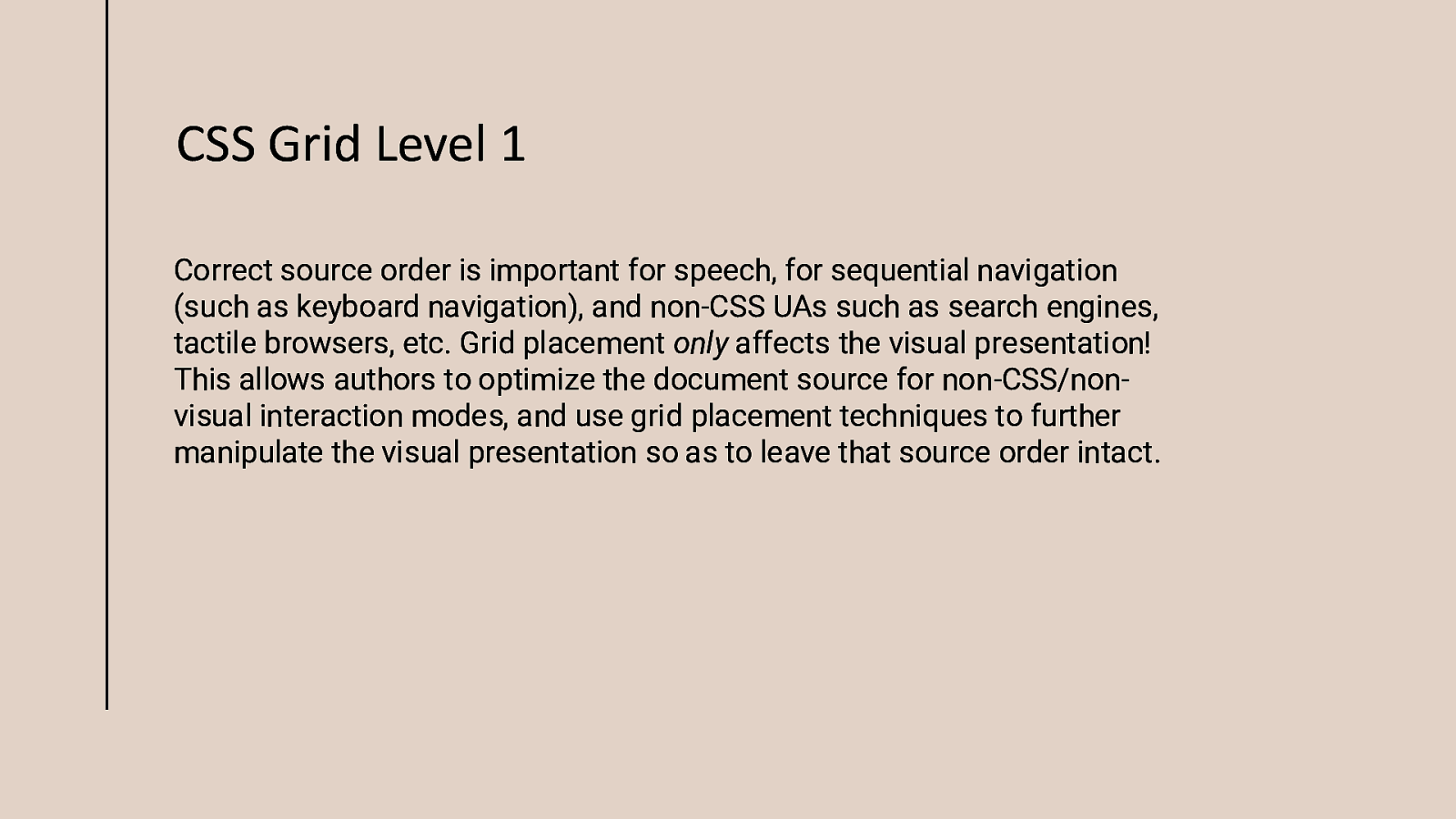
CSS Grid Level 1 Correct source order is important for speech, for sequential navigation (such as keyboard navigation), and non-CSS UAs such as search engines, tactile browsers, etc. Grid placement only affects the visual presentation! This allows authors to optimize the document source for non-CSS/nonvisual interaction modes, and use grid placement techniques to further manipulate the visual presentation so as to leave that source order intact.
Separating content from presentation Something we’ve tried to do since the early days of CSS layout.
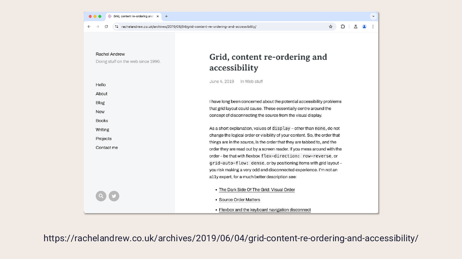
https://rachelandrew.co.uk/archives/2019/06/04/grid-content-re-ordering-and-accessibility/
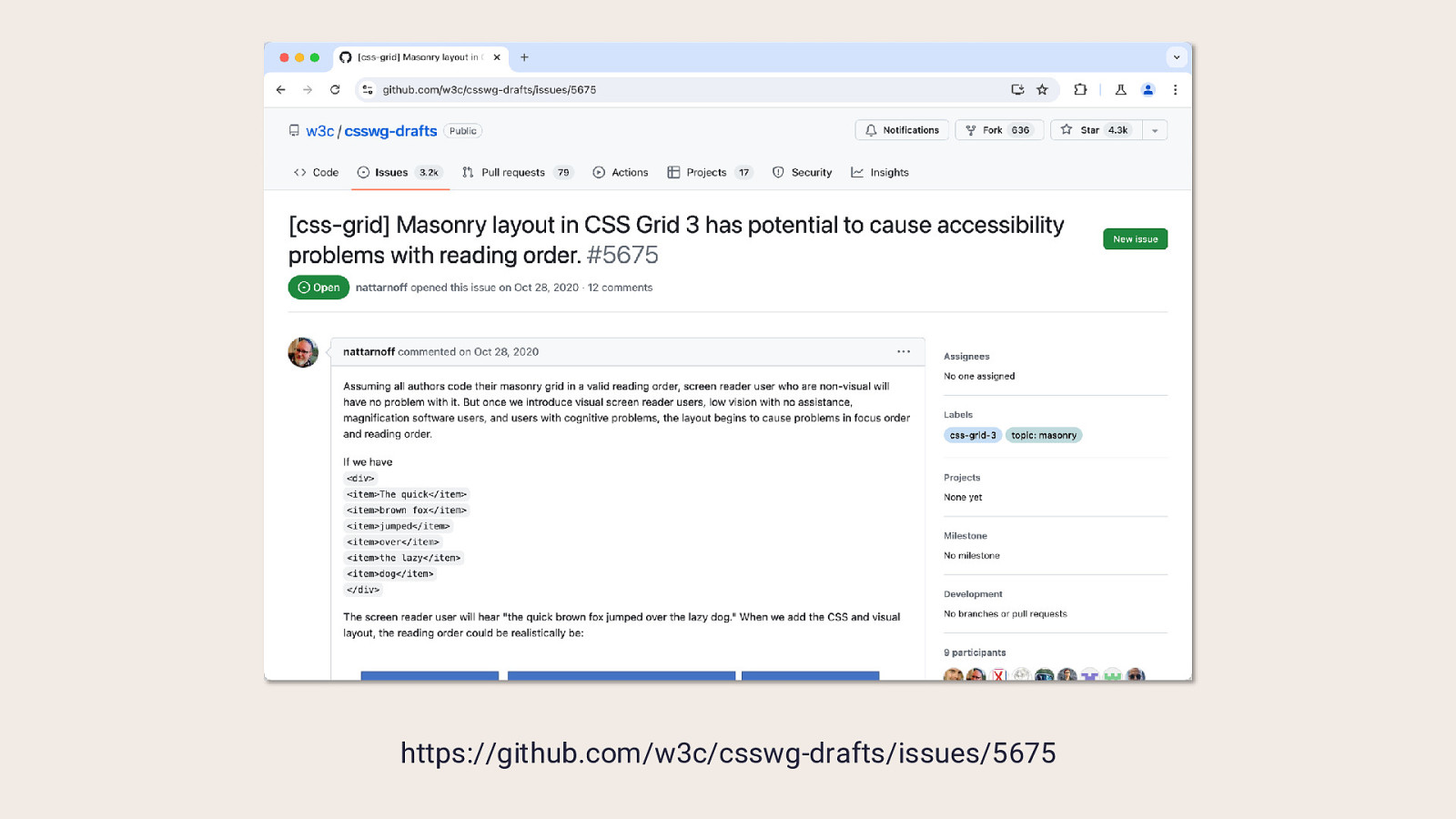
https://github.com/w3c/csswg-drafts/issues/5675
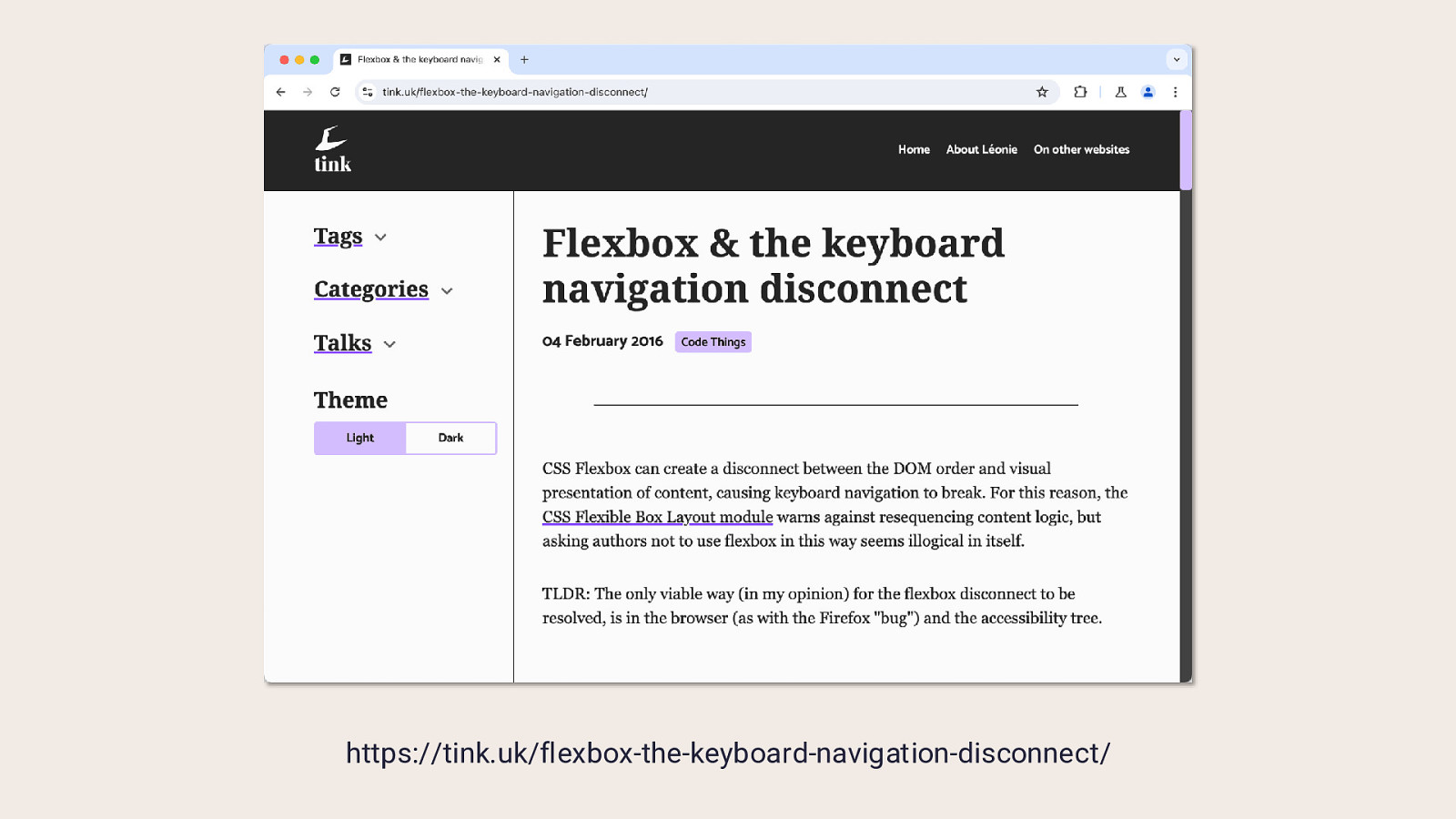
https://tink.uk/flexbox-the-keyboard-navigation-disconnect/
reading-flow CSS Display Level 4
Can we just opt into the order that flex or grid items are laid out?
Reading or visual order is subjective
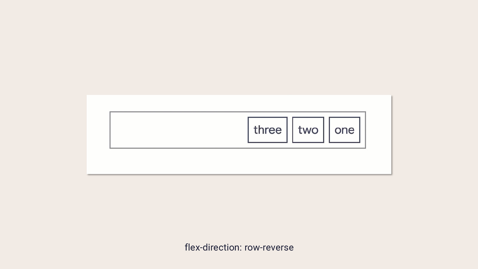
flex-direction: row-reverse
In most cases DOM order is what you want No universal switch to let developers forget about source order.
Scoped to particular layout methods We’re not trying to do this on block layout.
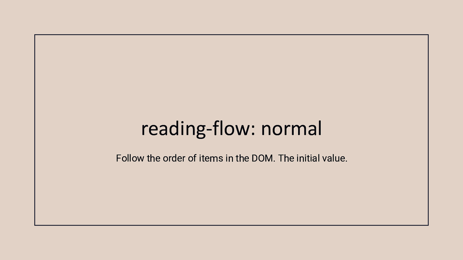
reading-flow: normal Follow the order of items in the DOM. The initial value.
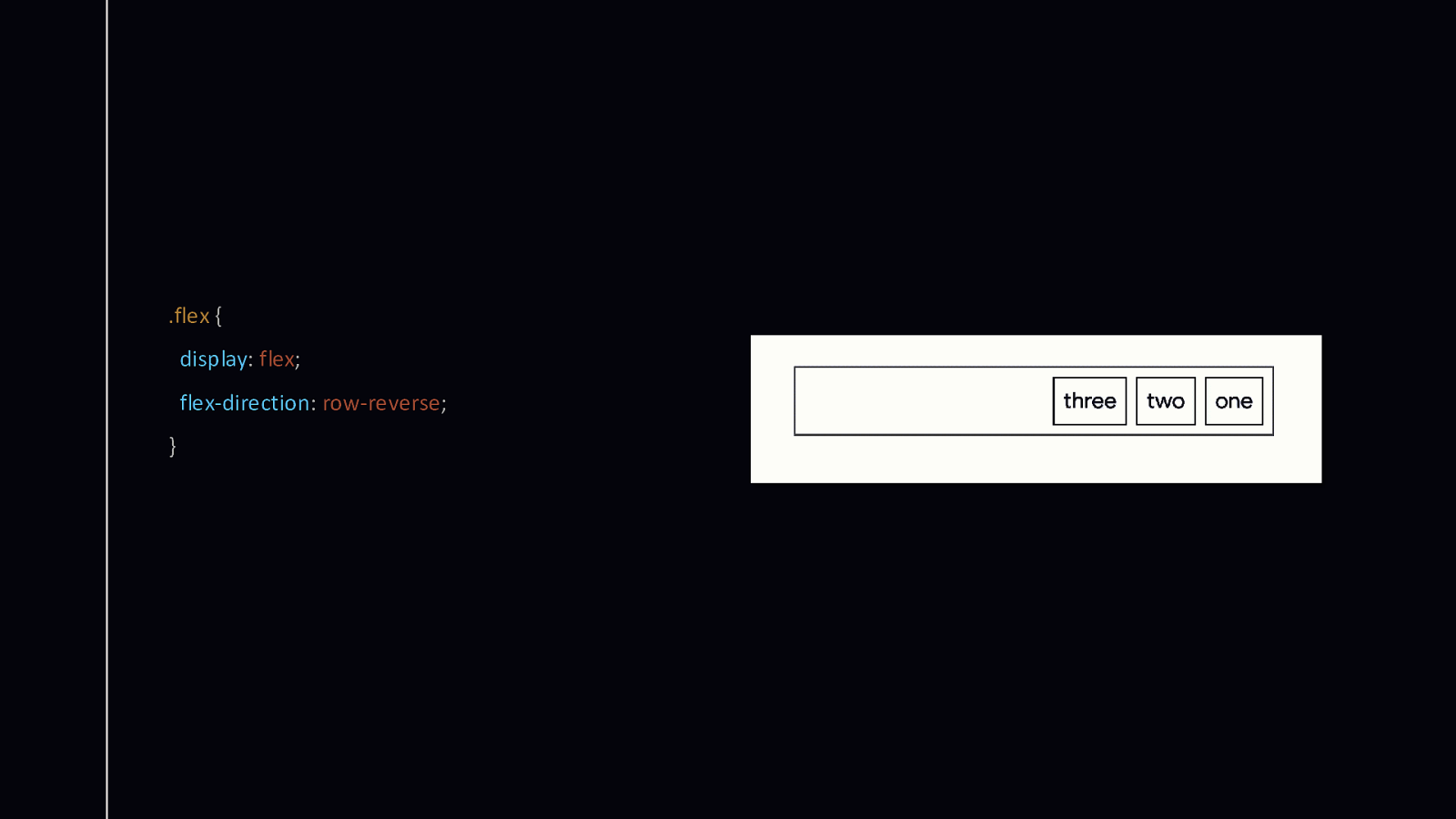
.flex { display: flex; flex-direction: row-reverse; }
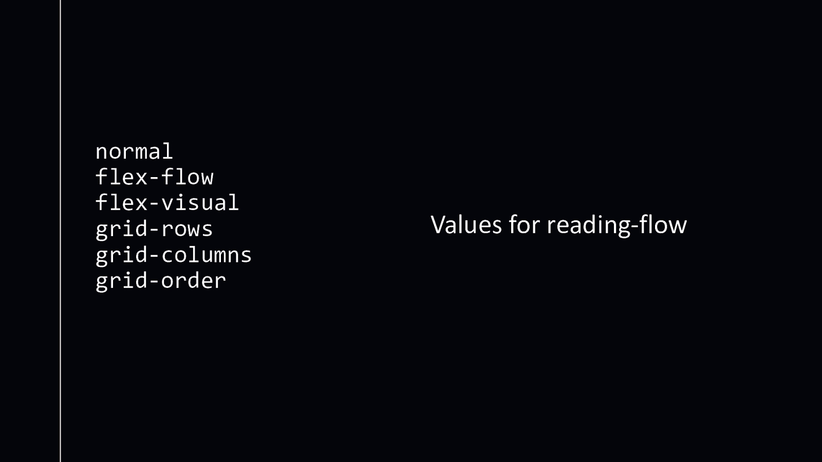
normal flex-flow flex-visual grid-rows grid-columns grid-order Values for reading-flow
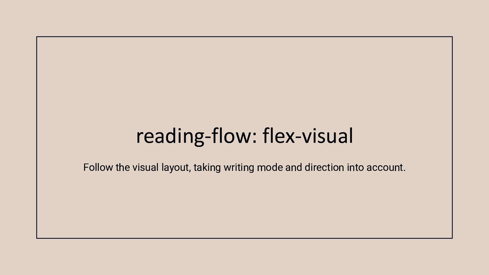
reading-flow: flex-visual Follow the visual layout, taking writing mode and direction into account.
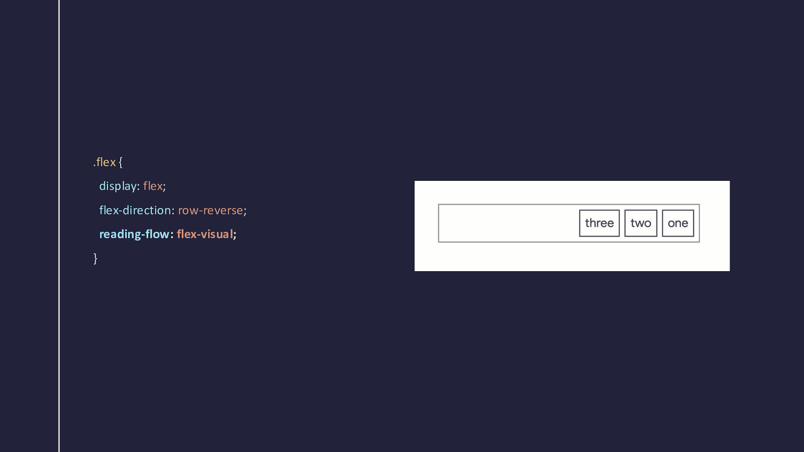
.flex { display: flex; flex-direction: row-reverse; reading-flow: flex-visual; }
reading-flow: flex-flow Follow the flow order.
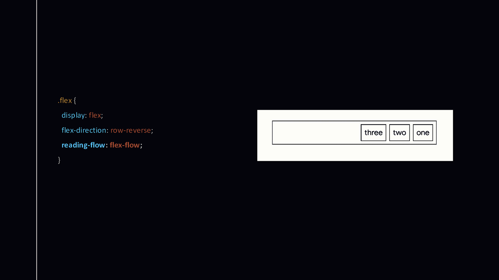
.flex { display: flex; flex-direction: row-reverse; reading-flow: flex-flow; }
Adding the order property The reading flow now takes into account the modification made by order.
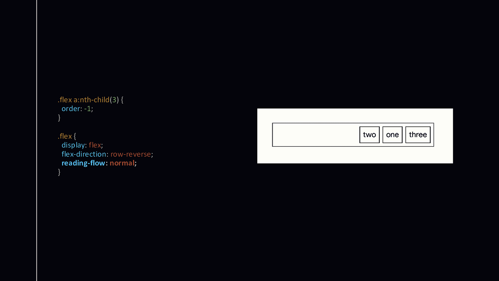
.flex a:nth-child(3) { order: -1; } .flex { display: flex; flex-direction: row-reverse; reading-flow: normal; }
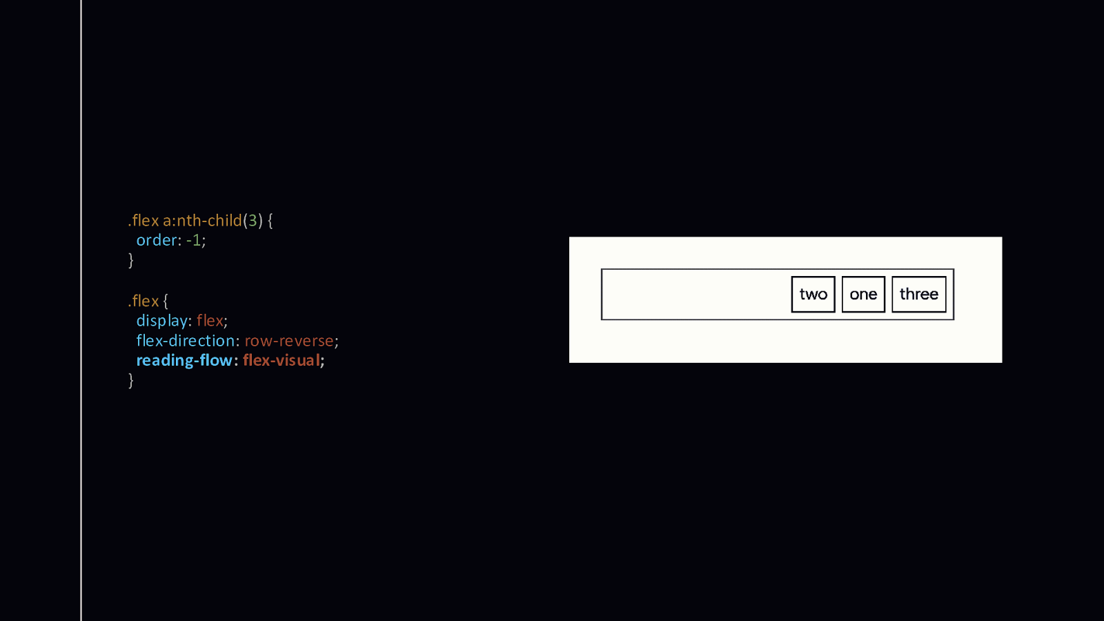
.flex a:nth-child(3) { order: -1; } .flex { display: flex; flex-direction: row-reverse; reading-flow: flex-visual; }
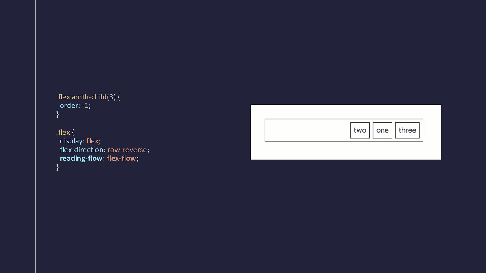
.flex a:nth-child(3) { order: -1; } .flex { display: flex; flex-direction: row-reverse; reading-flow: flex-flow; }
Grid and reading flow Automatic layout—grid-auto-flow: dense
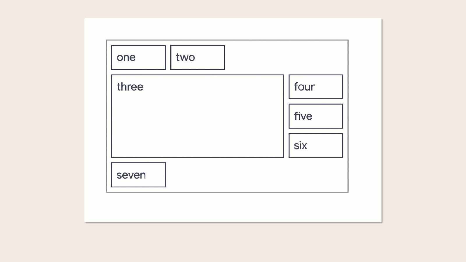
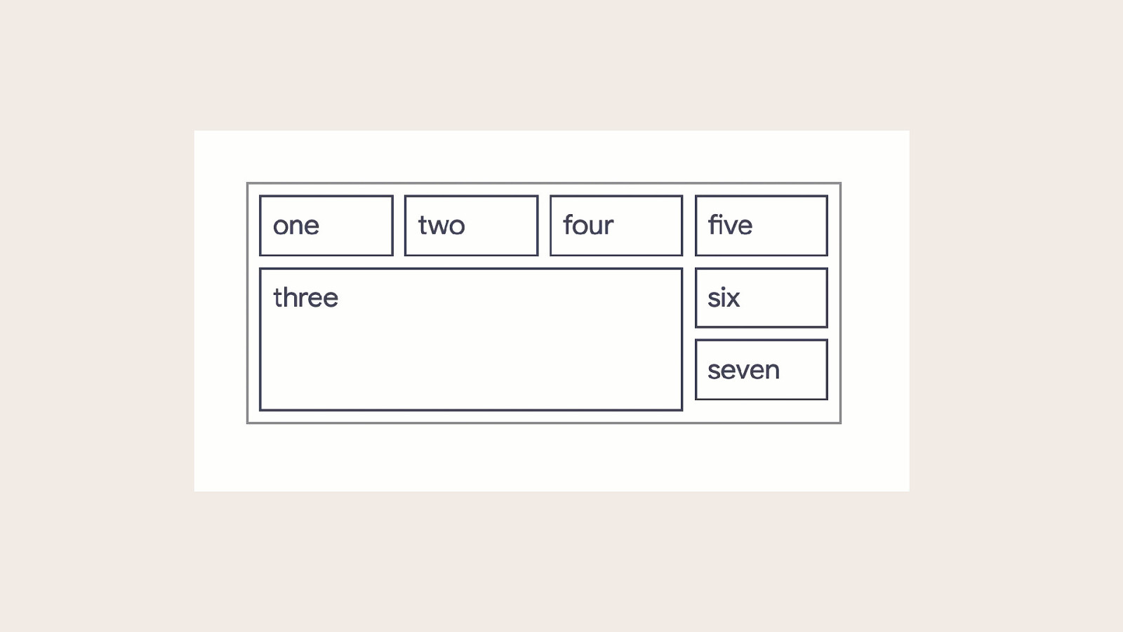
reading-flow: grid-rows Follow the reading order by row.
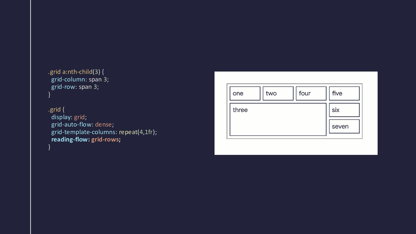
.grid a:nth-child(3) { grid-column: span 3; grid-row: span 3; } .grid { display: grid; grid-auto-flow: dense; grid-template-columns: repeat(4,1fr); reading-flow: grid-rows; }
reading-flow: grid-columns Follow the reading order by column.
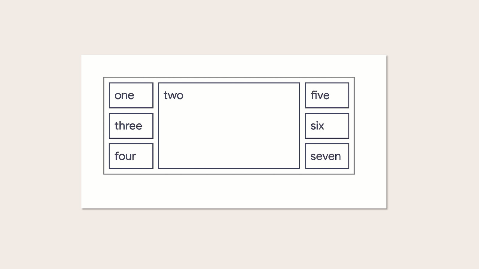
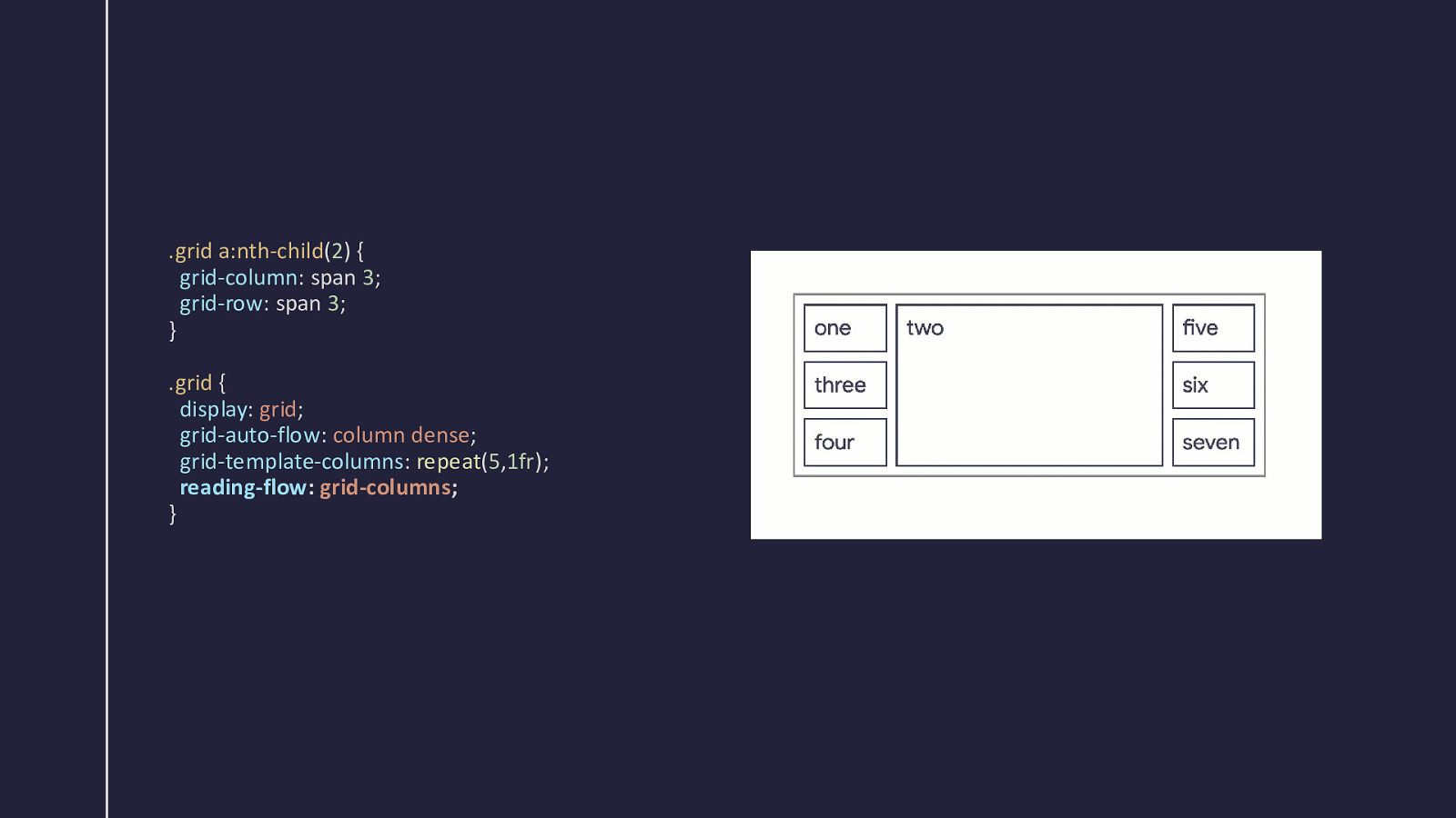
.grid a:nth-child(2) { grid-column: span 3; grid-row: span 3; } .grid { display: grid; grid-auto-flow: column dense; grid-template-columns: repeat(5,1fr); reading-flow: grid-columns; }
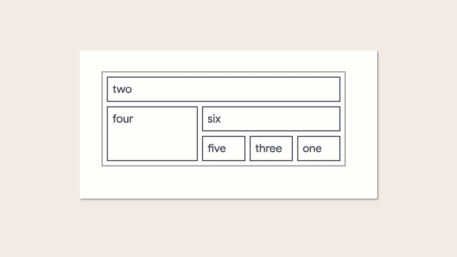
Grid and reading flow Line-based placement, grid-template-areas
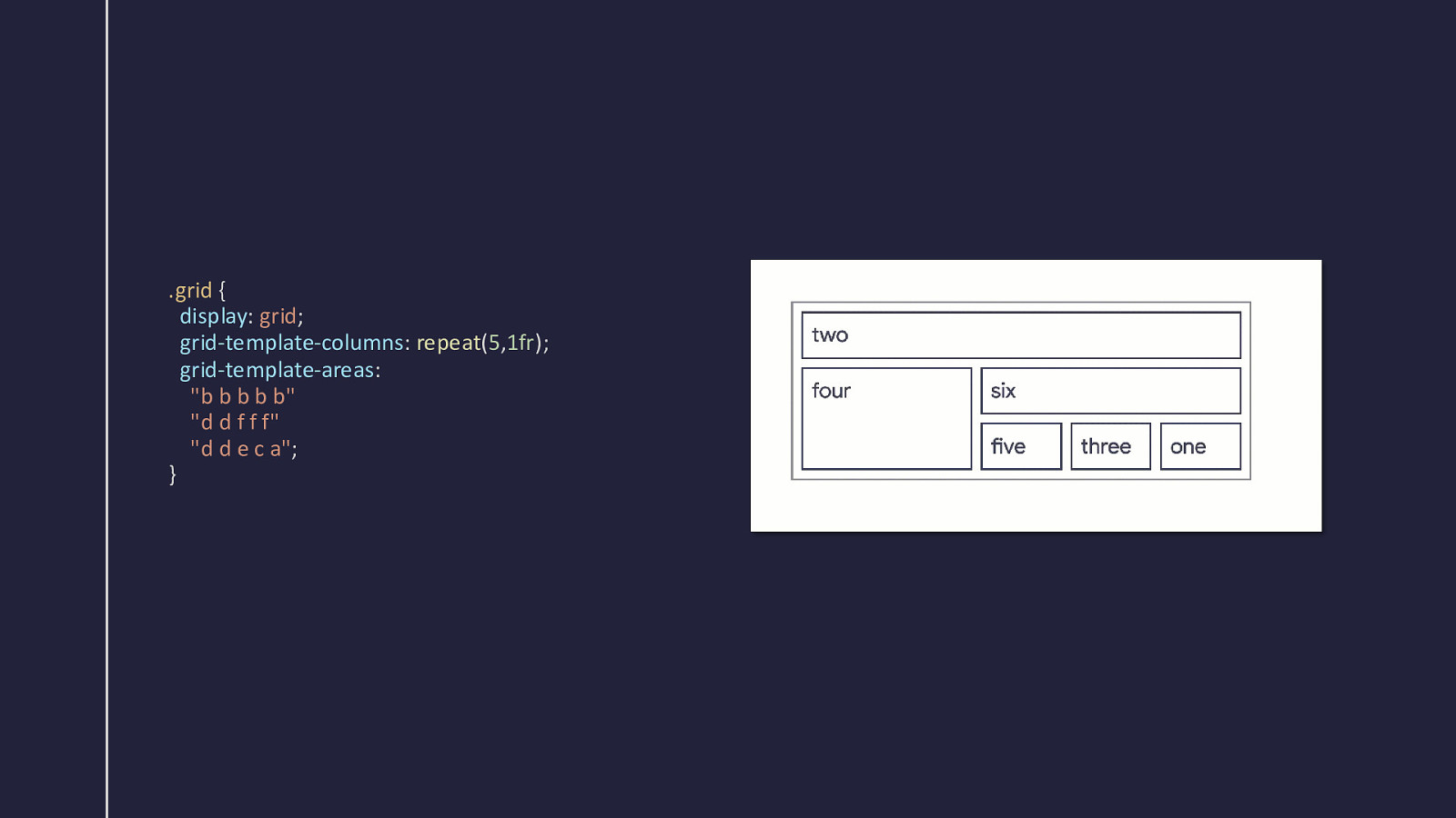
.grid { display: grid; grid-template-columns: repeat(5,1fr); grid-template-areas: “b b b b b” “d d f f f” “d d e c a”; }
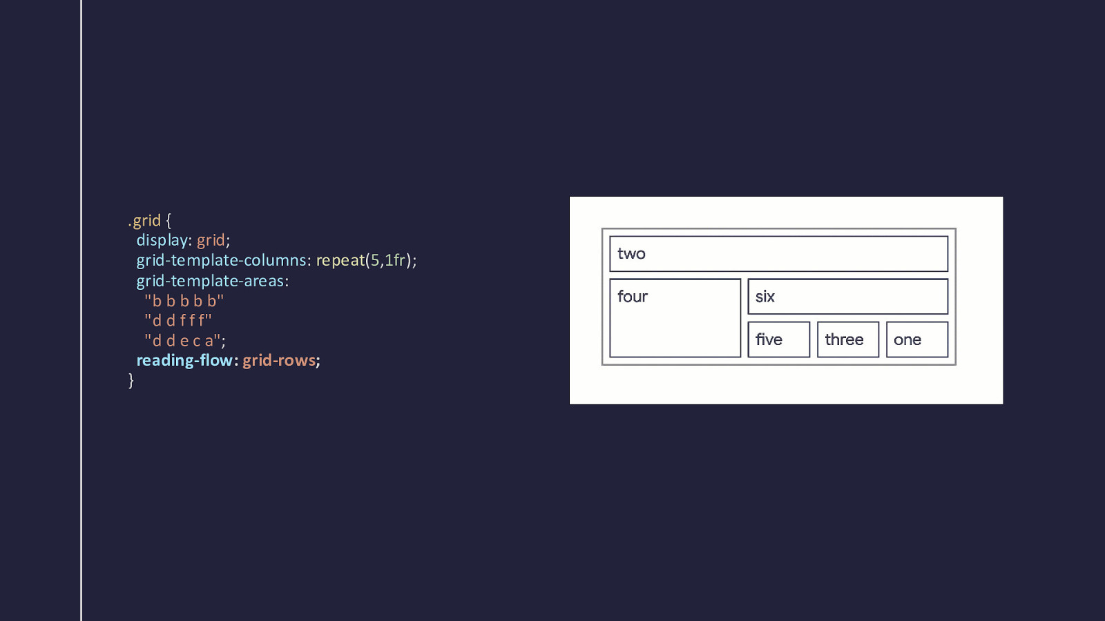
.grid { display: grid; grid-template-columns: repeat(5,1fr); grid-template-areas: “b b b b b” “d d f f f” “d d e c a”; reading-flow: grid-rows; }
reading-flow: grid-order As normal, but take the order property into account.
The reading-order property For the children of a reading flow container.

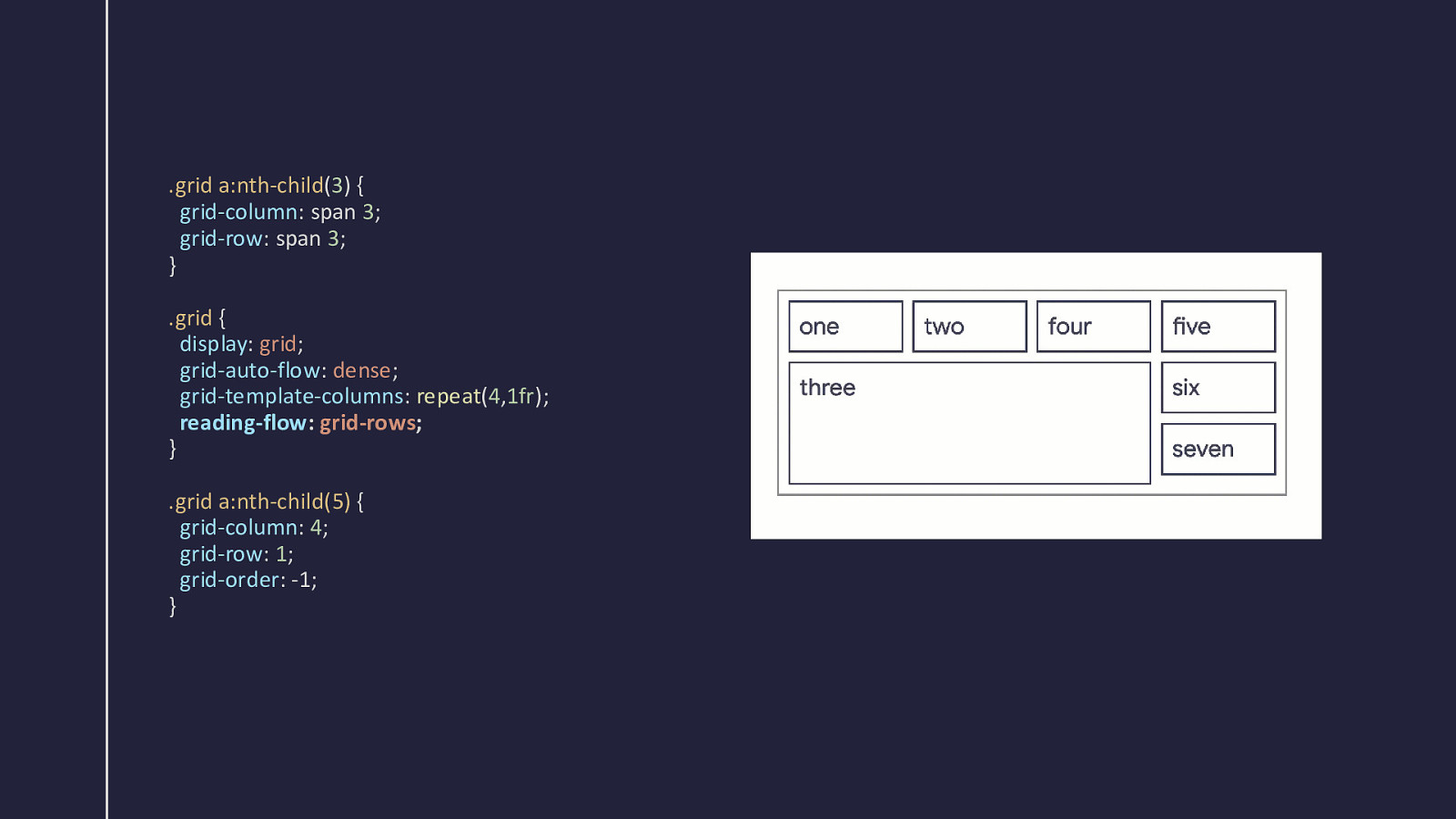
.grid a:nth-child(3) { grid-column: span 3; grid-row: span 3; } .grid { display: grid; grid-auto-flow: dense; grid-template-columns: repeat(4,1fr); reading-flow: grid-rows; } .grid a:nth-child(5) { grid-column: 4; grid-row: 1; grid-order: -1; }
Source order is important Never use reading-flow to avoid the work of updating your HTML.
Create a sensible document Then consider small tweaks to optimize the reading experience at different breakpoints.

Try it out in Chrome Canary https://chrome.dev/reading-flow-examples

Questions? Rachel Andrew https://noti.st/rachelandrew/Aj6atb/
Using grid layout to position items can sometimes result in a disconnected tab order, creating challenges for accessibility. While avoiding reordering has traditionally been the advice, this approach limits some of the powerful features of grid layout. A new solution is on the horizon! In this talk, I’ll introduce the reading-flow property and discuss the work being done by the CSS Working Group to address this issue.
