Start Using CSS Grid Layout Today
A presentation at Frontend United 2017 in in Athens, Greece by Rachel Andrew
START USING CSS GRID LAYOUT TODAY! @rachelandrew @ Frontend United

March 2017 March 2017 March 2017 March 2017 March 2017 Soooooon!

Rachel Andrew ▸ CSS Working Group Invited Expert ▸ Google Developer Expert ▸ co-founder Perch CMS ▸ Old Nerd. ▸ You can find me in most places as @rachelandrew you can email me@rachelandrew.co.uk or check out my site at https://rachelandrew.co.uk
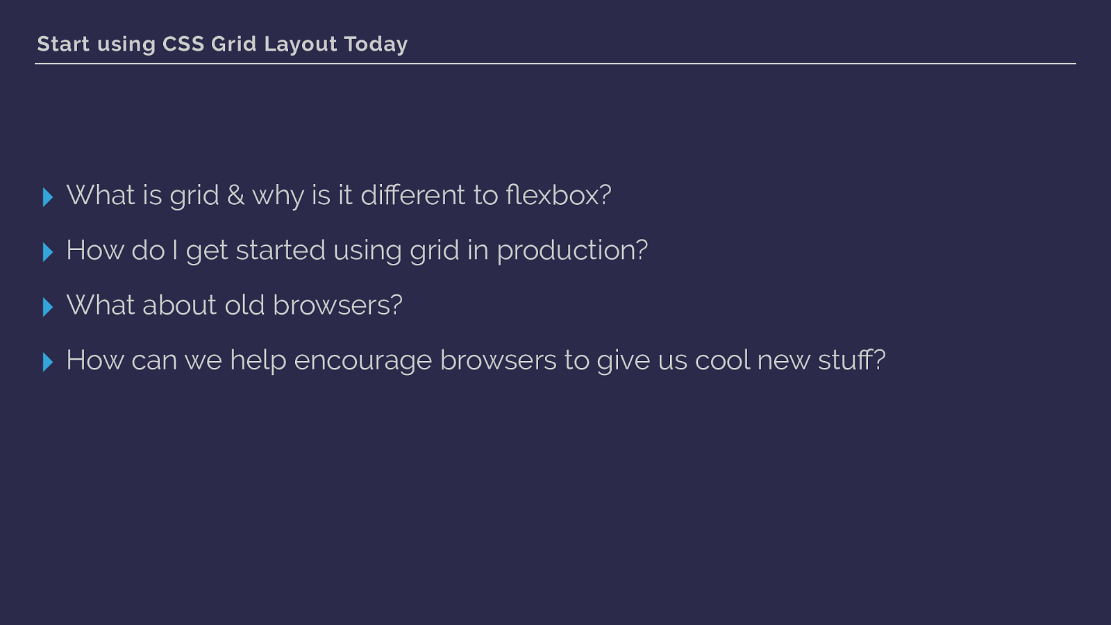
Start using CSS Grid Layout Today ▸ What is grid & why is it different to fl exbox? ▸ How do I get started using grid in production? ▸ What about old browsers? ▸ How can we help encourage browsers to give us cool new stuff?
Why not use flexbox? CSS Grid Layout
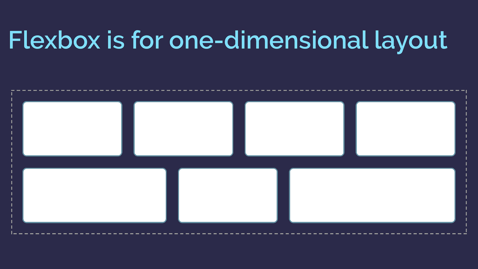
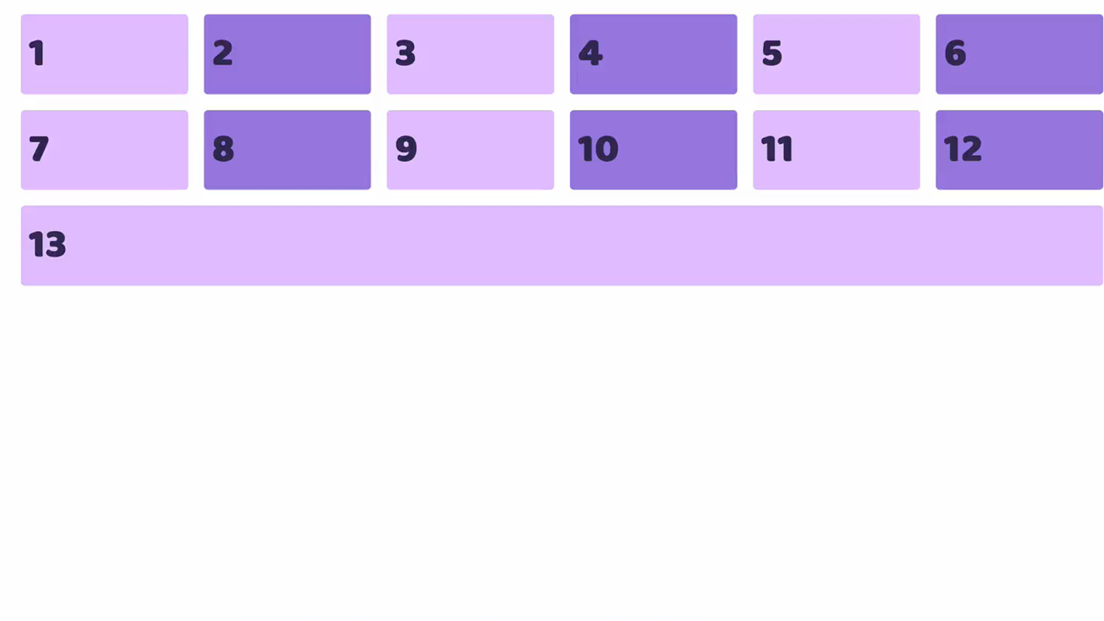
Flexbox is for one-dimensional layout
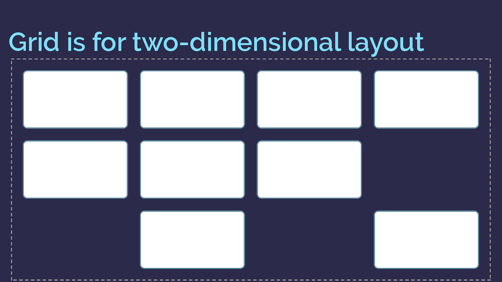
Grid is for two-dimensional layout
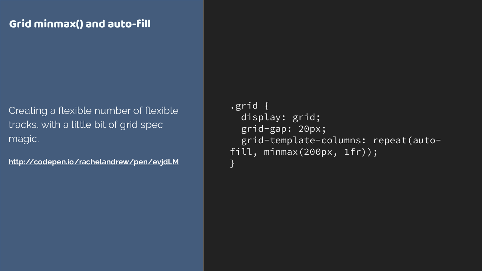
.grid { display: grid; grid-gap: 20px; grid-template-columns: repeat(auto- fill, minmax(200px, 1fr)); } Grid minmax() and auto-fill Creating a flexible number of fl exible tracks, with a little bit of grid spec magic. http://codepen.io/rachelandrew/pen/evjdLM
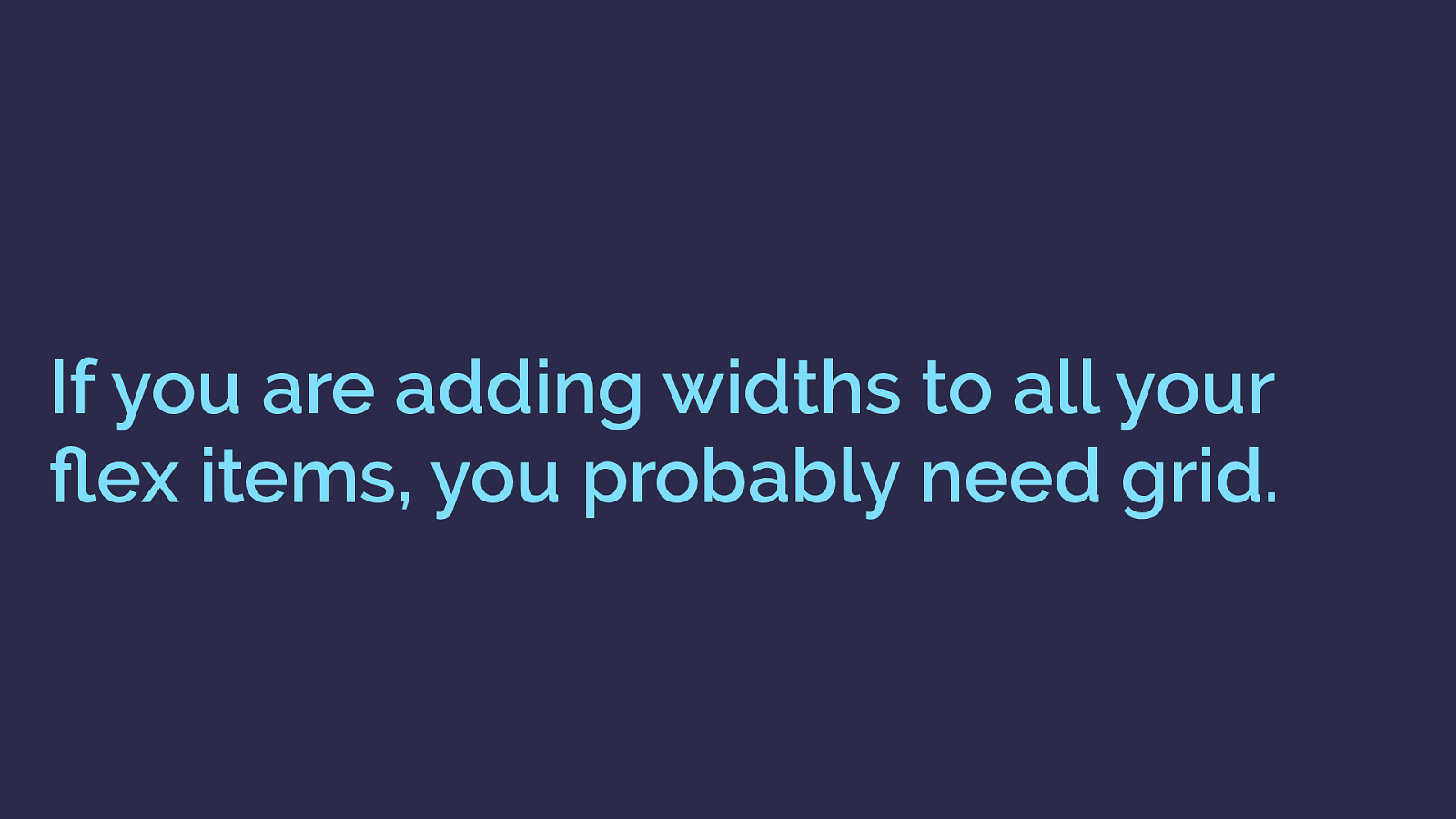
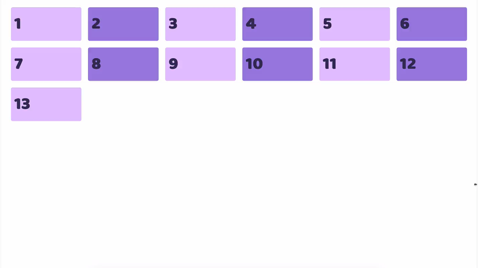
If you are adding widths to all your flex items, you probably need grid.
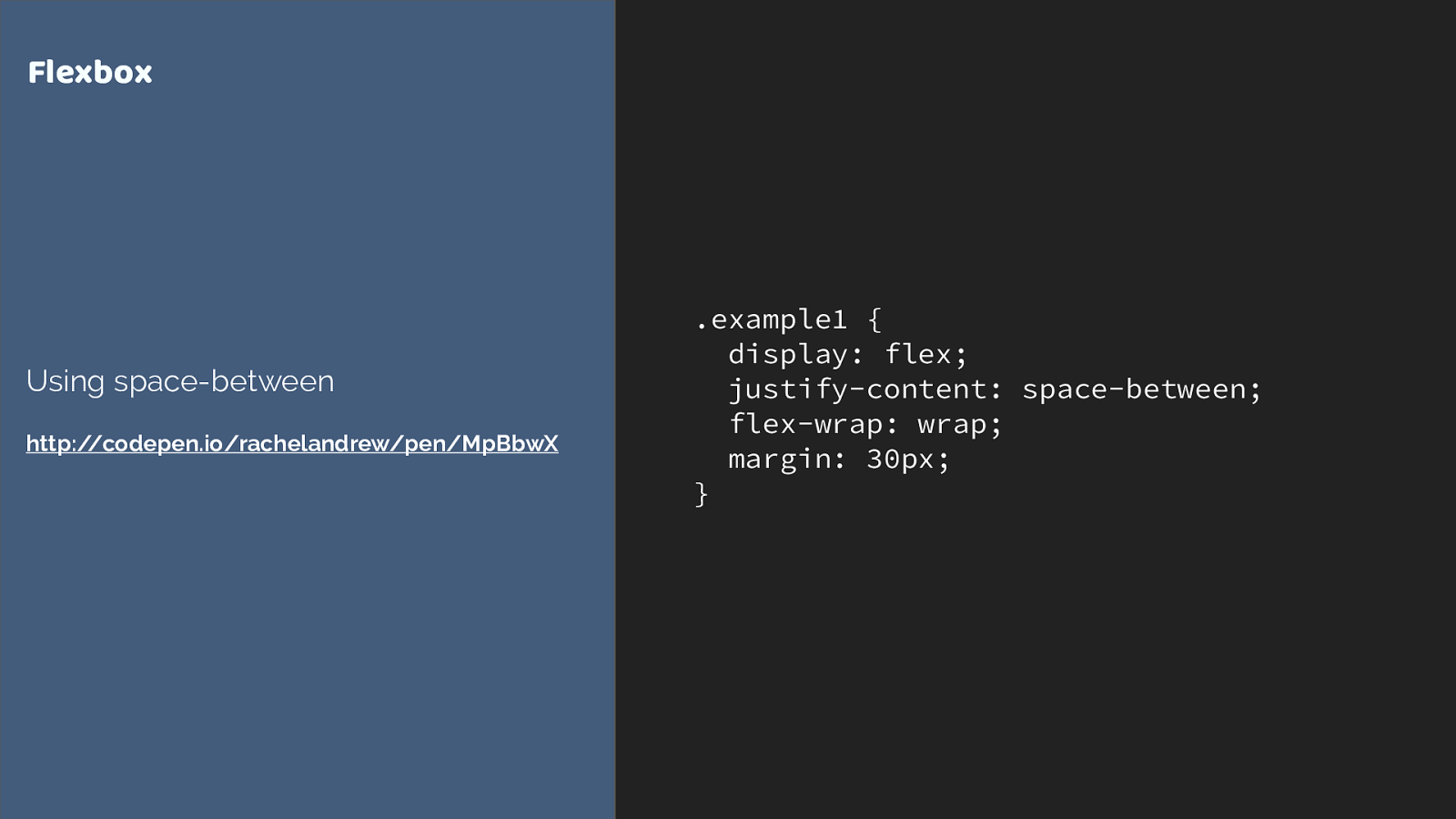
.example1 { display: flex; justify-content: space-between; flex-wrap: wrap; margin: 30px; } Flexbox Using space-between http://codepen.io/rachelandrew/pen/MpBbwX
.example2 {
display: flex;
flex-wrap: wrap;
}
.example2 > div {
flex: 1 1 0;
}
.example2 > div.bigger {
flex: 4 1 0;
}
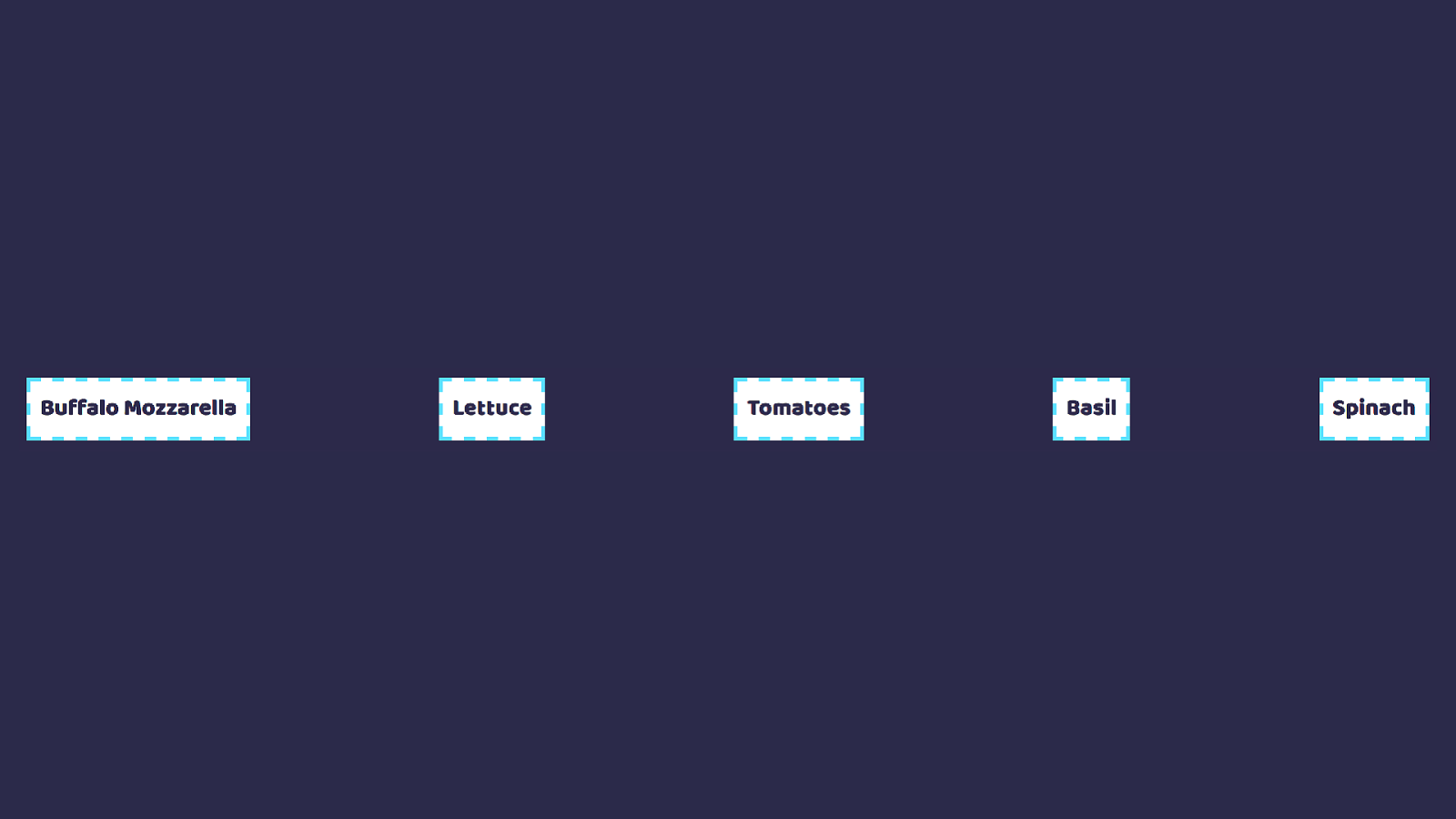
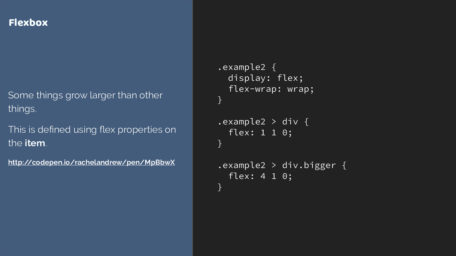
Flexbox
Some things grow larger than other
things.
This is defined using
fl
ex properties on
the
item
.
http://codepen.io/rachelandrew/pen/MpBbwX
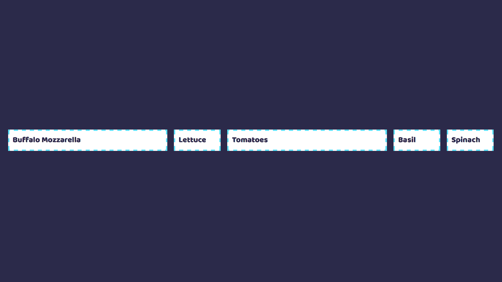
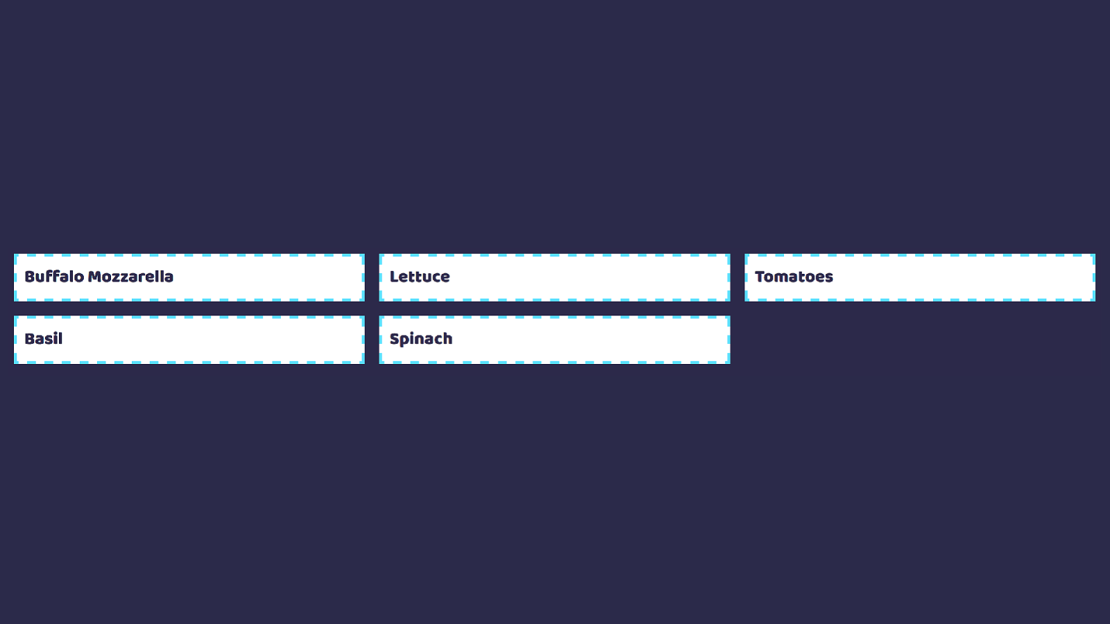
Grid works from the container in
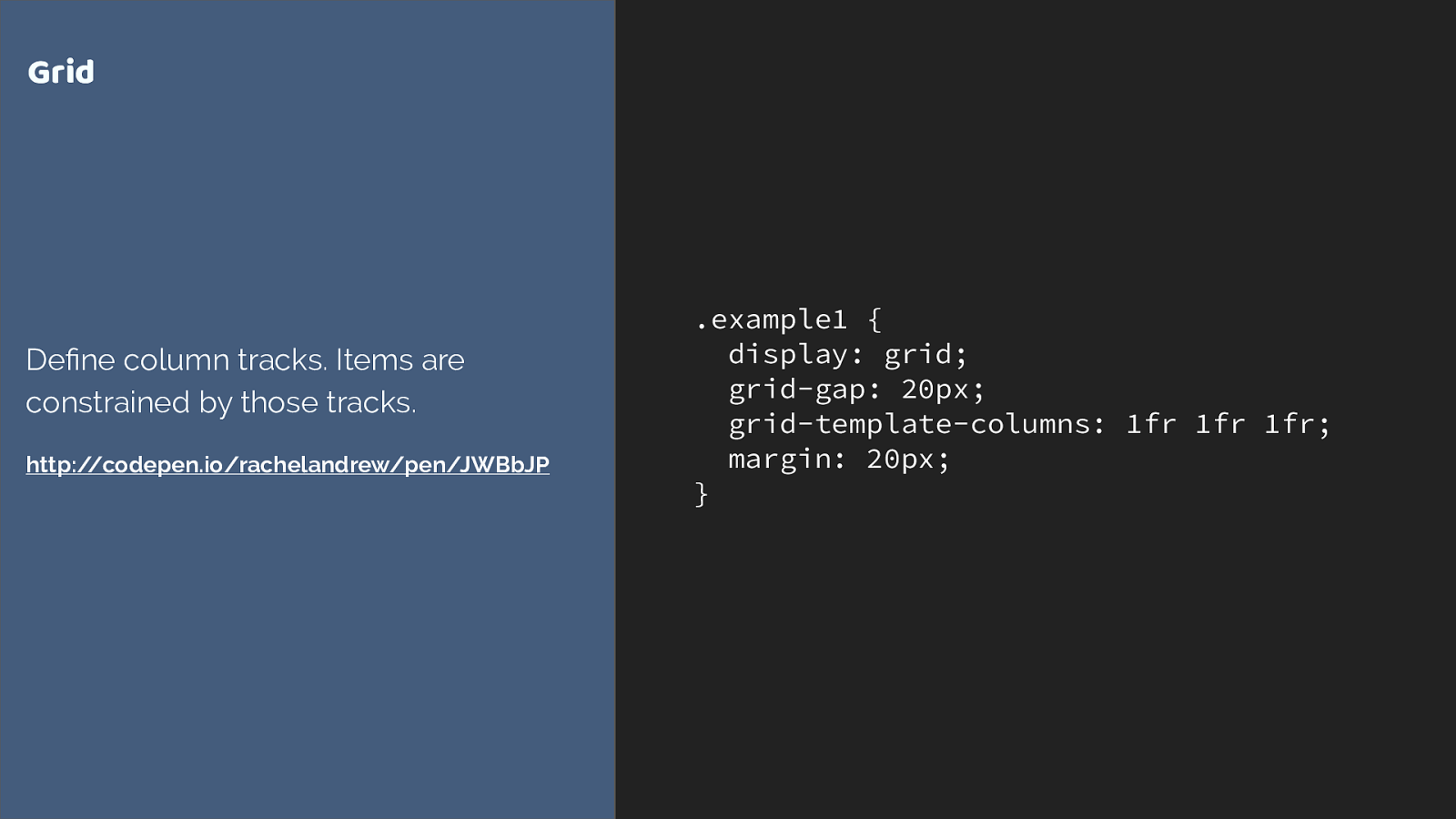
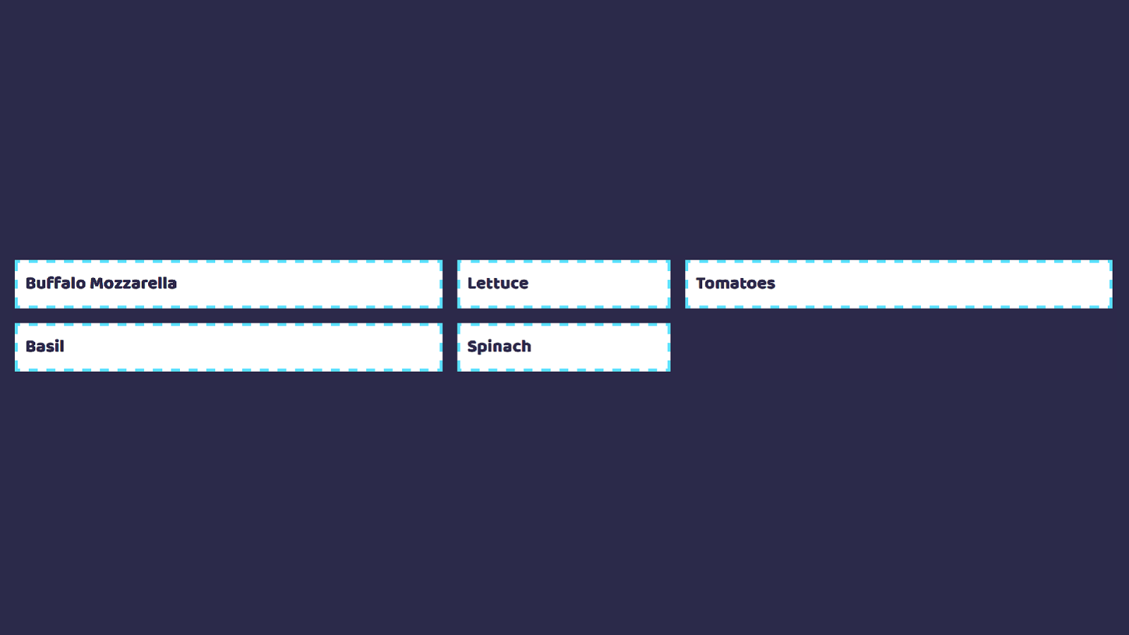
.example1 { display: grid; grid-gap: 20px; grid-template-columns: 1fr 1fr 1fr; margin: 20px; } Grid Define column tracks. Items are constrained by those tracks. http://codepen.io/rachelandrew/pen/JWBbJP
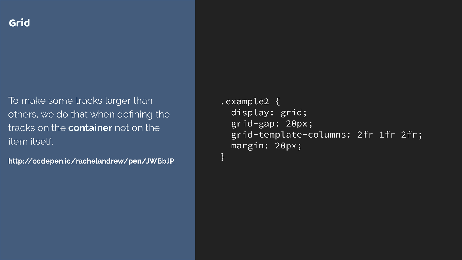
.example2 { display: grid; grid-gap: 20px; grid-template-columns: 2fr 1fr 2fr; margin: 20px; } Grid To make some tracks larger than others, we do that when defining the tracks on the container not on the item itself. http://codepen.io/rachelandrew/pen/JWBbJP
Other layout methods start with the item.
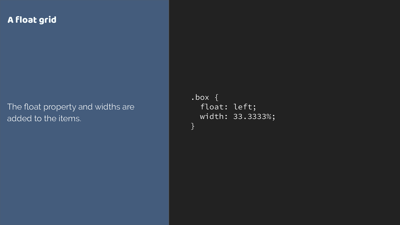
.box { float: left; width: 33.3333%; } A float grid The float property and widths are added to the items.
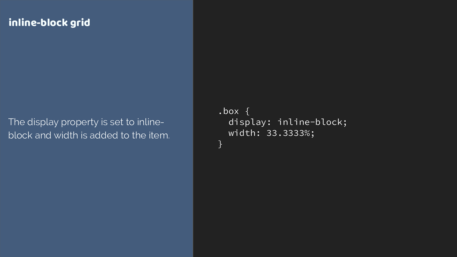
.box { display: inline-block; width: 33.3333%; } inline-block grid The display property is set to inline- block and width is added to the item.
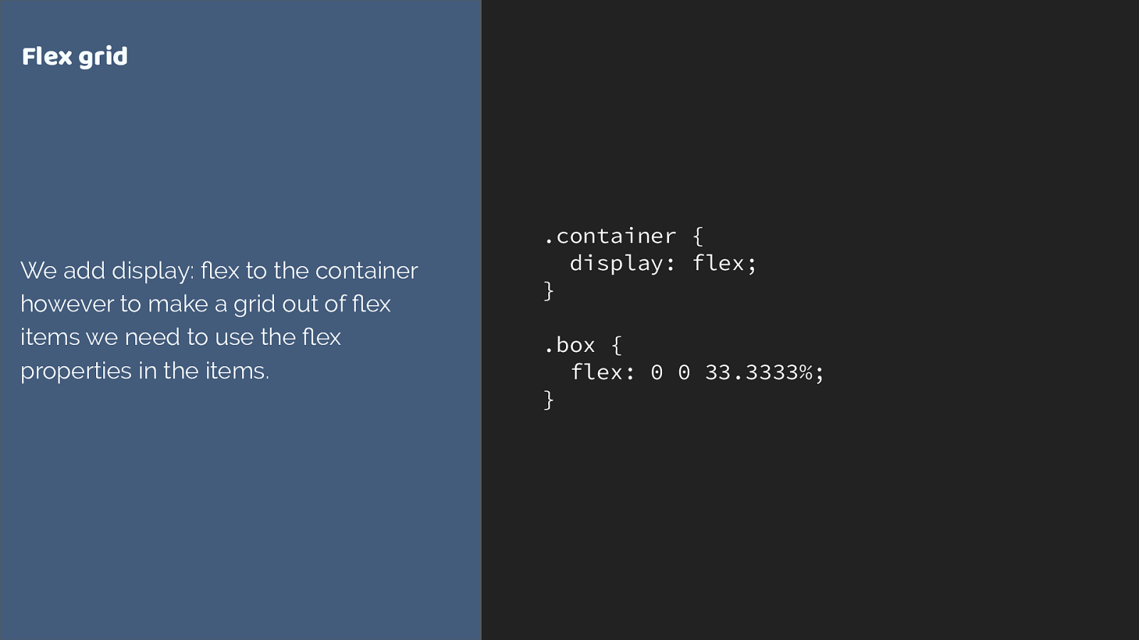
.container { display: flex; } .box { flex: 0 0 33.3333% ; } Flex grid We add display: flex to the container however to make a grid out of flex items we need to use the flex properties in the items.
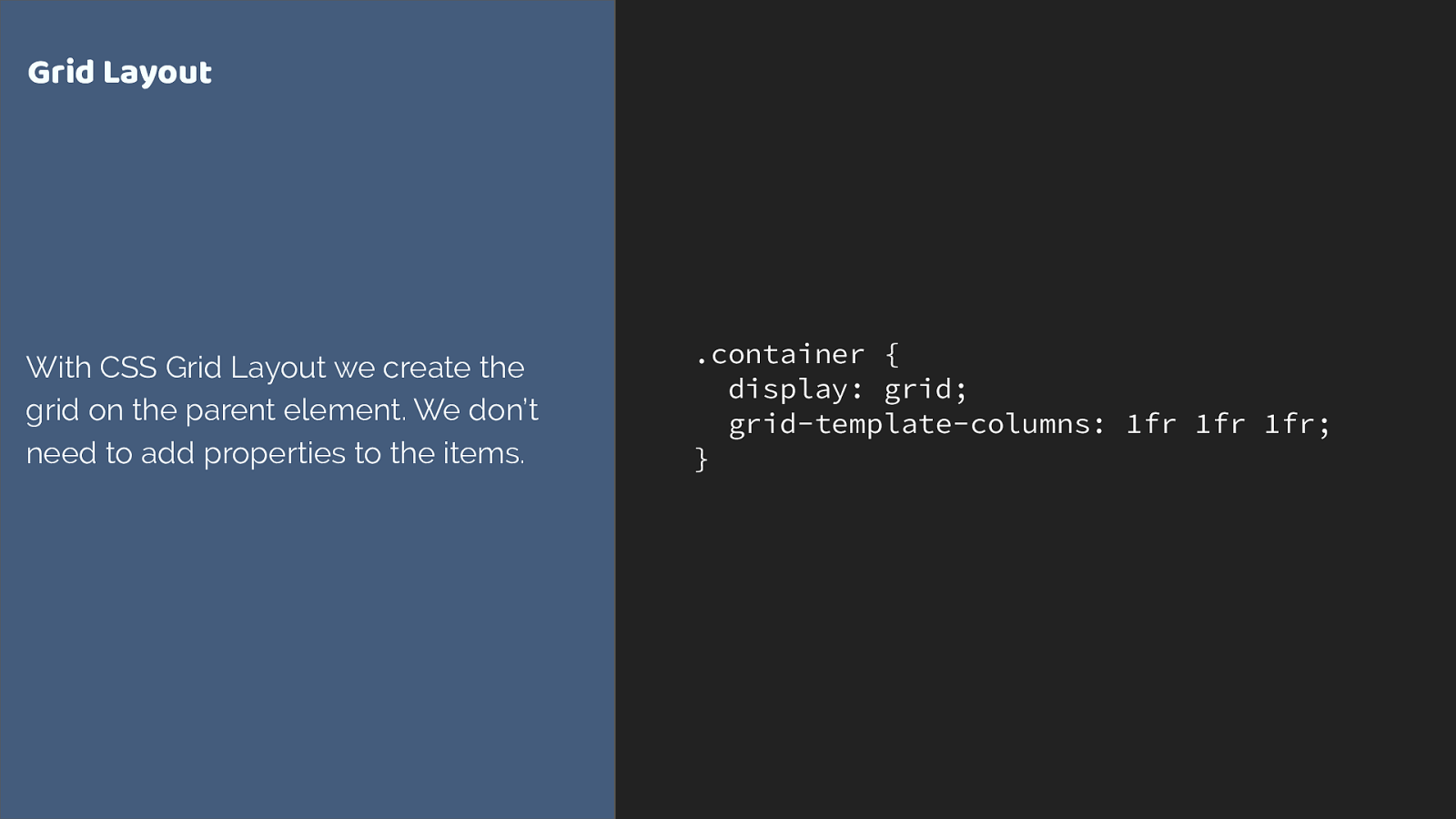
. container { display: grid; grid-template-columns: 1fr 1fr 1fr; } Grid Layout With CSS Grid Layout we create the grid on the parent element. We don’t need to add properties to the items.
Grid is all about the container
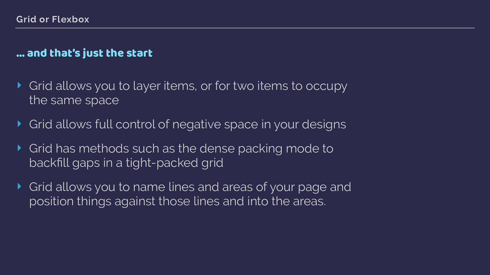
Grid or Flexbox … and that’s just the start ‣ Grid allows you to layer items, or for two items to occupy the same space ‣ Grid allows full control of negative space in your designs ‣ Grid has methods such as the dense packing mode to backfill gaps in a tight-packed grid ‣ Grid allows you to name lines and areas of your page and position things against those lines and into the areas.
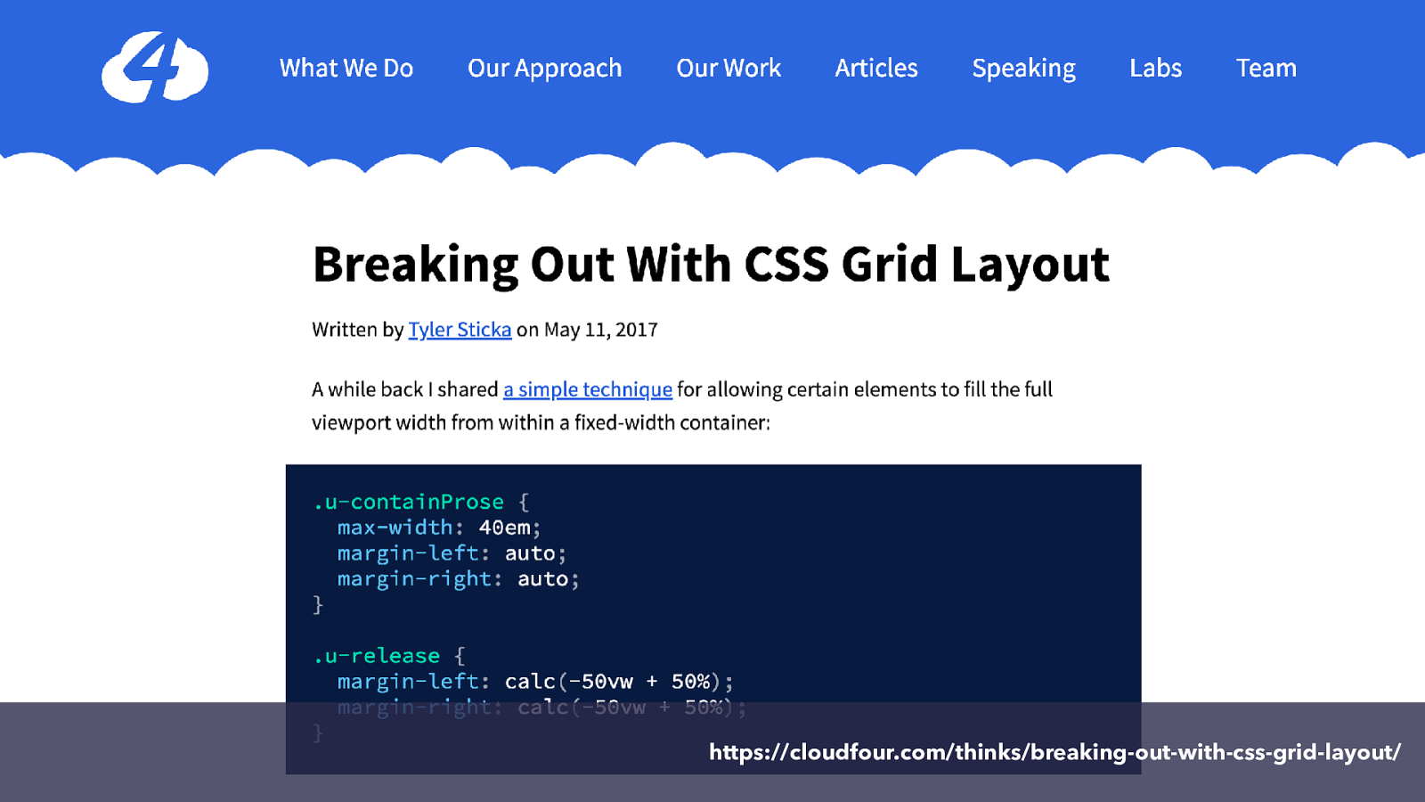
https://cloudfour.com/thinks/breaking-out-with-css-grid-layout/
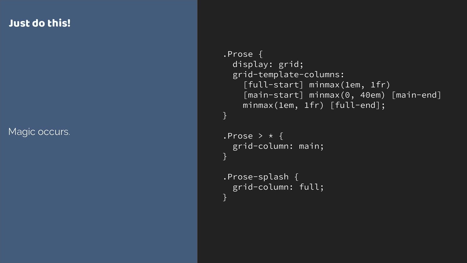
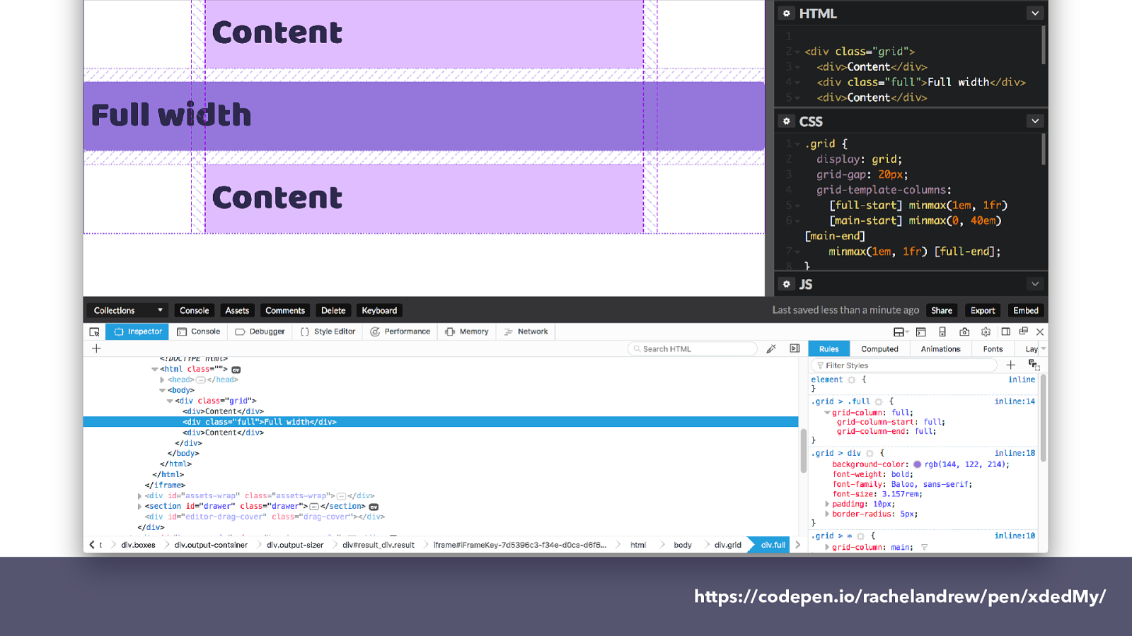
.Prose {
display: grid;
grid-template-columns:
[full-start] minmax(1em, 1fr)
[main-start] minmax(0, 40em) [main-end]
minmax(1em, 1fr) [full-end];
}
.Prose > * {
grid-column: main;
}
.Prose-splash {
grid-column: full;
}
Just
do this!
Magic occurs.
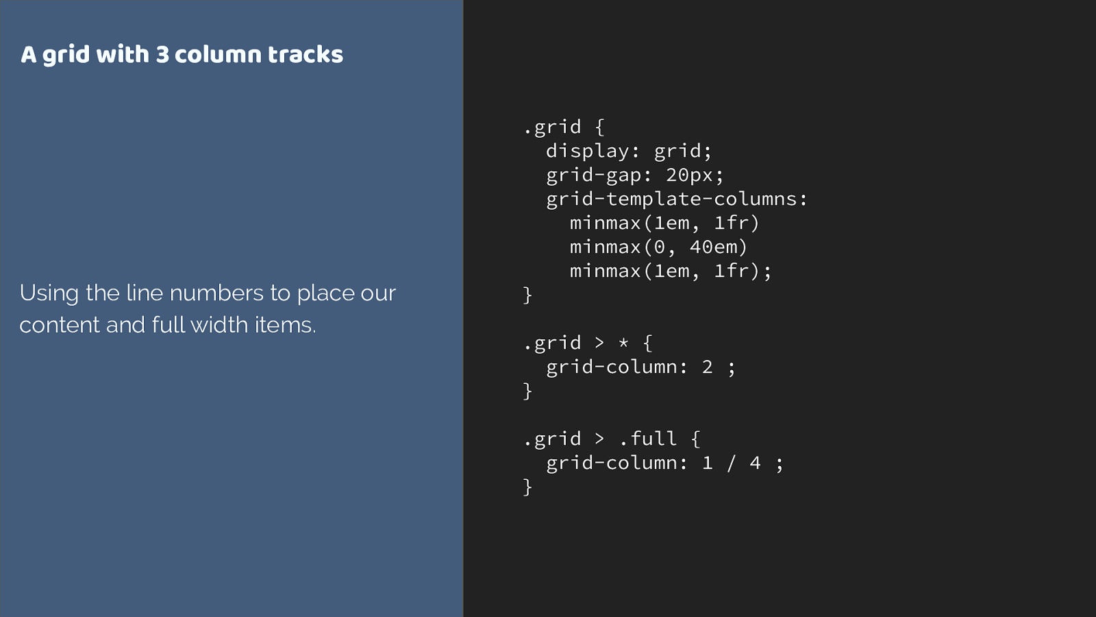
.grid {
display: grid;
grid-gap: 20px;
grid-template-columns:
minmax(1em, 1fr)
minmax(0, 40em)
minmax(1em, 1fr);
}
.grid > * {
grid-column: 2
;
}
.grid > .full {
grid-column: 1 / 4
;
}
A grid with 3 column tracks
Using the line numbers to place our
content and full width items.

1 2 3 4
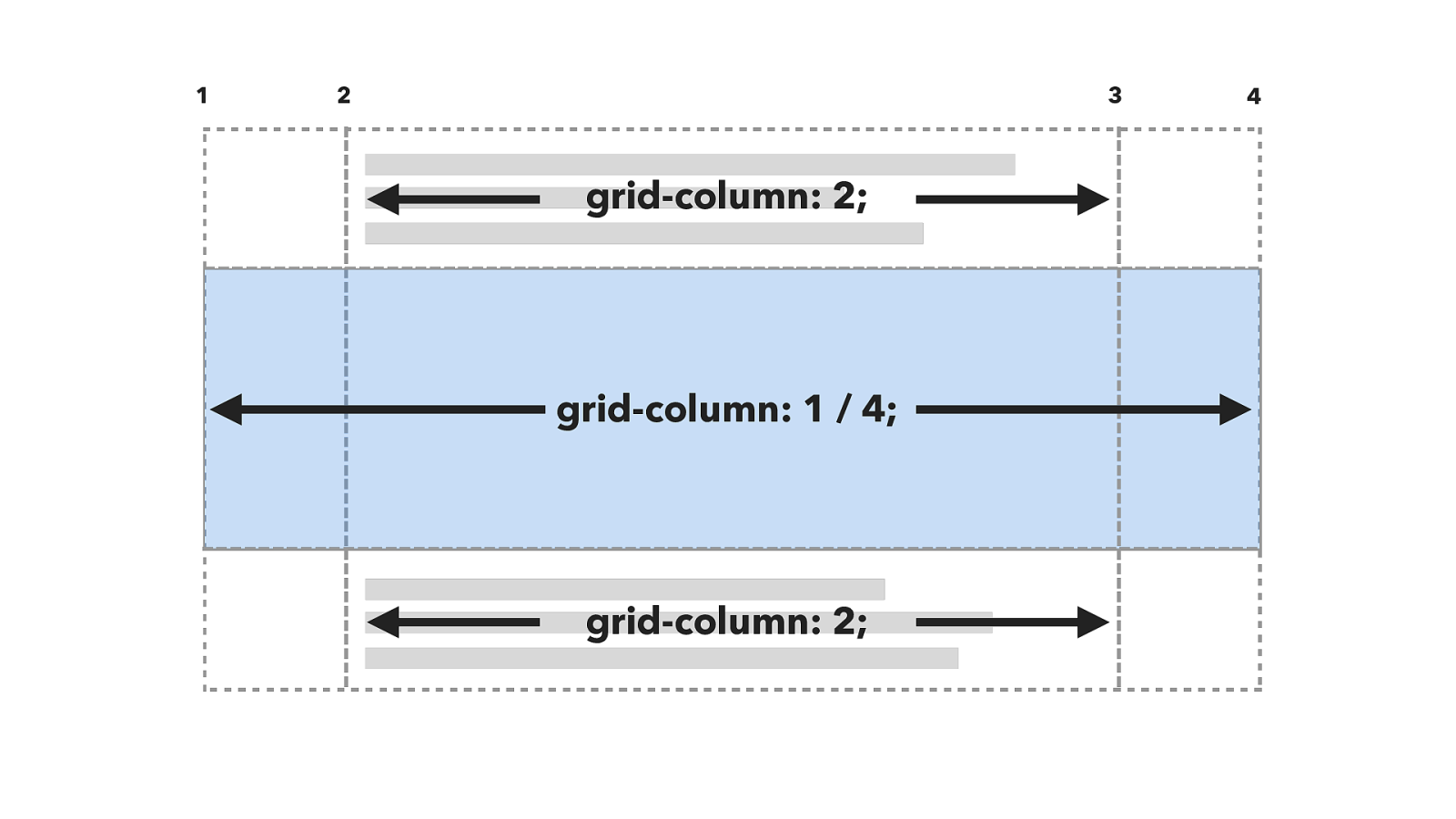
1 2 3 4 grid-column: 2; grid-column: 1 / 4; grid-column: 2;
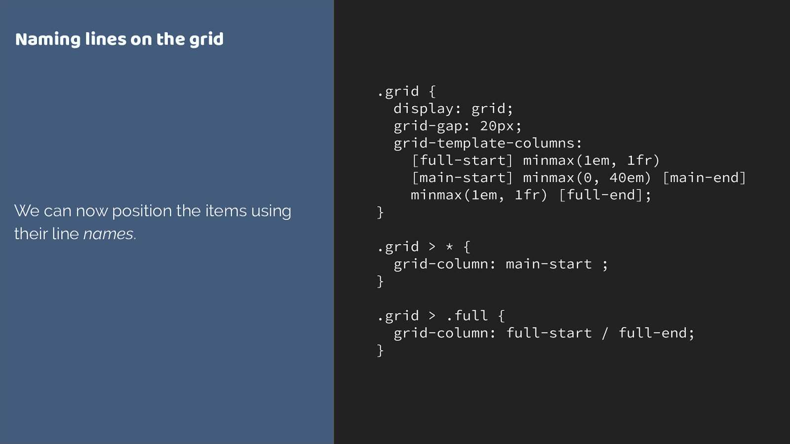
.grid {
display: grid;
grid-gap: 20px;
grid-template-columns:
[full-start] minmax(1em, 1fr)
[main-start] minmax(0, 40em) [main-end]
minmax(1em, 1fr) [full-end];
}
.grid > * {
grid-column: main-start
;
}
.grid > .full {
grid-column: full-start / full-end
;
}
Naming lines on the grid
We can now position the items using
their line
names
.
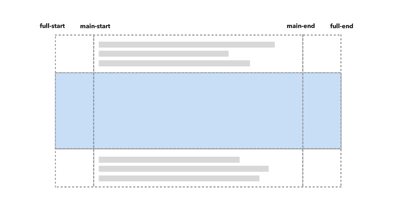
full-start main-start main-end full-end
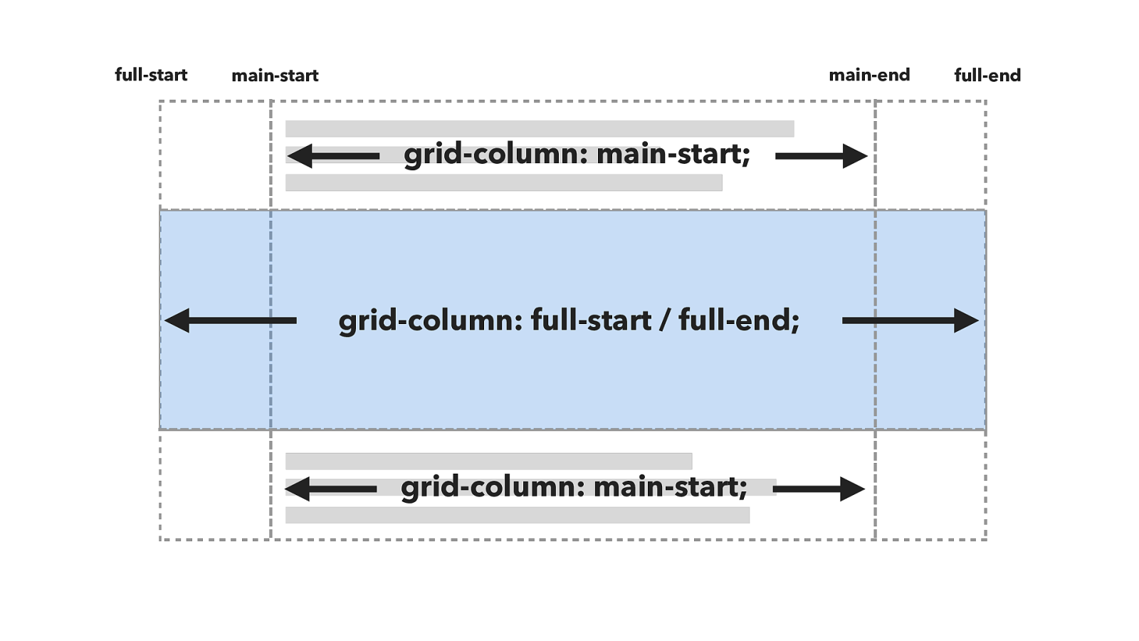
grid-column: main-start; grid-column: full-start / full-end; full-start main-start main-end full-end grid-column: main-start;
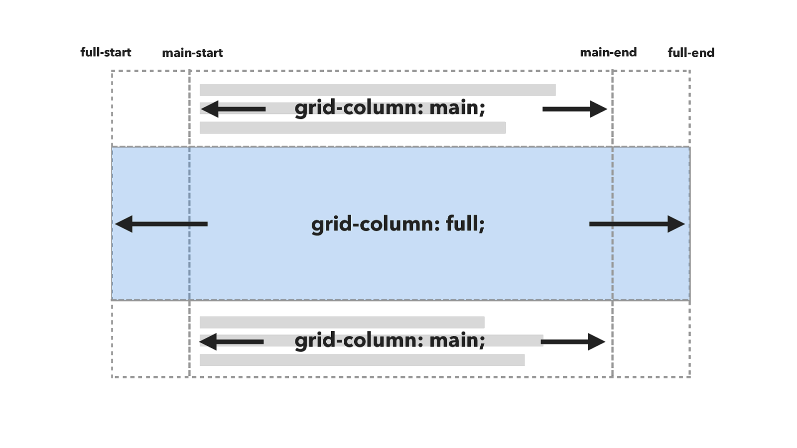
grid-column: main; grid-column: full; full-start main-start main-end full-end grid-column: main;
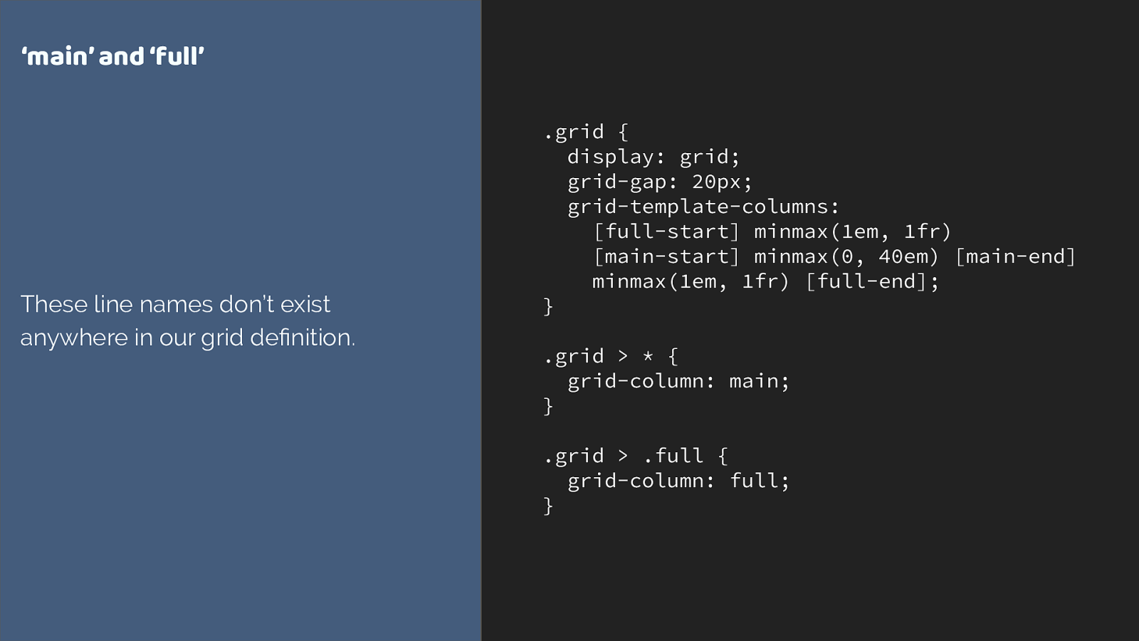
.grid {
display: grid;
grid-gap: 20px;
grid-template-columns:
[full-start] minmax(1em, 1fr)
[main-start] minmax(0, 40em) [main-end]
minmax(1em, 1fr) [full-end];
}
.grid > * {
grid-column: main;
}
.grid > .full {
grid-column: full;
}
‘main’ and ‘full’
These line names don’t exist
anywhere in our grid definition.
https://www.w3.org/TR/css-grid-1/#implicit-named-areas “Since a named grid area is referenced by the implicit named lines it produces, explicitly adding named lines of the same form (foo-start/foo-end) effectively creates a named grid area. ”
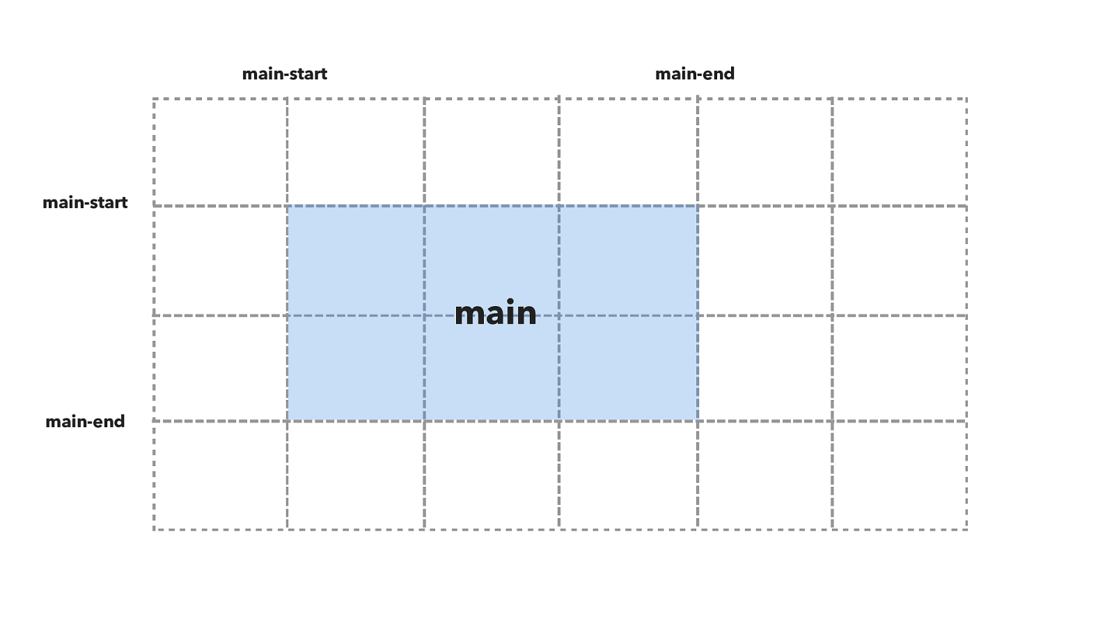
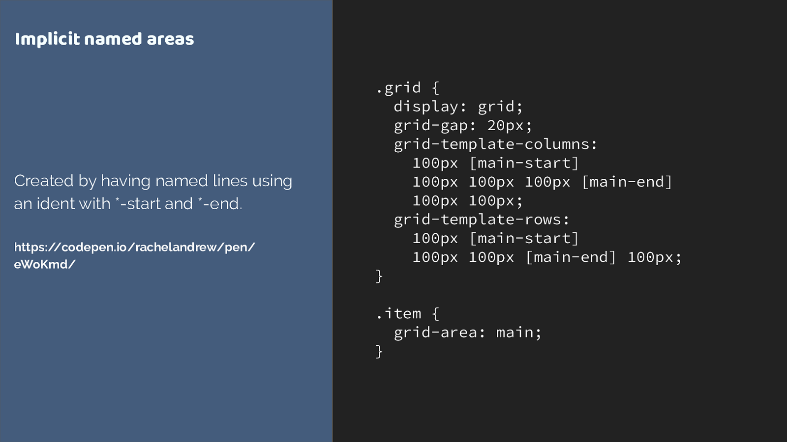
main-start main-start main-end main-end main
.grid {
display: grid;
grid-gap: 20px;
grid-template-columns:
100px [main-start]
100px 100px 100px [main-end]
100px 100px; grid-template-rows:
100px [main-start]
100px 100px [main-end] 100px; }
.item { grid-area: main; } Implicit named areas Created by having named lines using an ident with *-start and *-end. https://codepen.io/rachelandrew/pen/ eWoKmd/
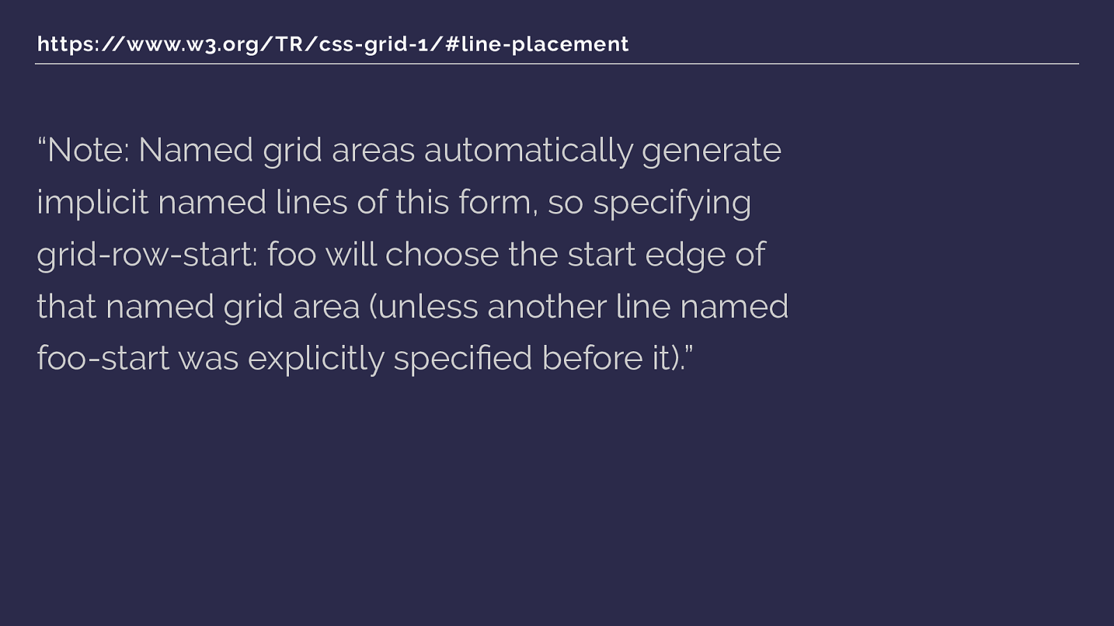
https://www.w3.org/TR/css-grid-1/#line-placement “Note: Named grid areas automatically generate implicit named lines of this form, so specifying grid-row-start: foo will choose the start edge of that named grid area (unless another line named foo-start was explicitly specified before it). ”
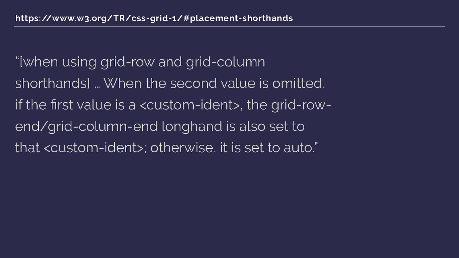
https://www.w3.org/TR/css-grid-1/#placement-shorthands “[when using grid-row and grid-column shorthands] … When the second value is omitted, if the first value is a <custom-ident>, the grid-row- end/grid-column-end longhand is also set to that <custom-ident>; otherwise, it is set to auto. ”

grid-column: main; grid-column: full; full-start main-start main-end full-end grid-column: main;
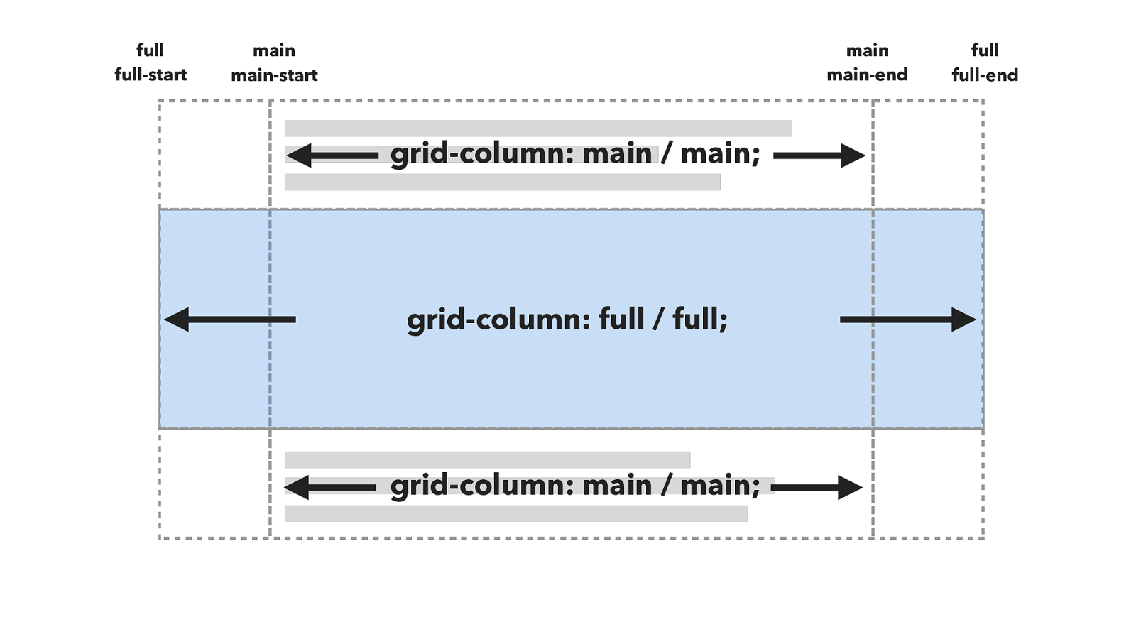
grid-column: main / main; grid-column: full / full; full-start main-start main-end full-end grid-column: main / main; full full main main
https://codepen.io/rachelandrew/pen/xdedMy/
Grid gives us powerful tools to control
layout via the containing element.
Flexbox or Grid? Use Flexbox when … ‣ Your content is a row OR a column ‣ You want the size of items to dictate their layout ‣ You want to distribute space
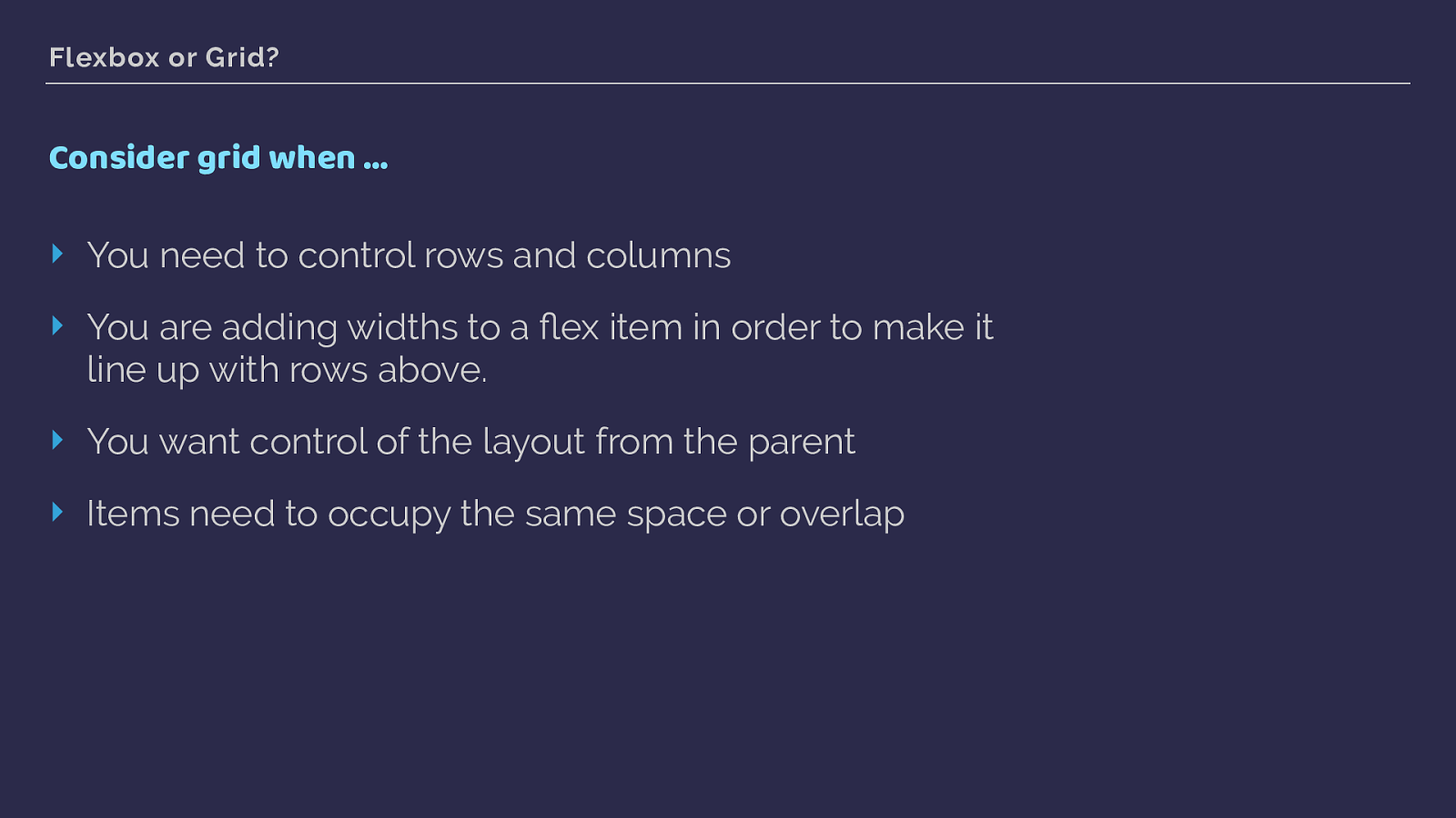
Flexbox or Grid? Consider grid when … ‣ You need to control rows and columns ‣ You are adding widths to a flex item in order to make it line up with rows above. ‣ You want control of the layout from the parent ‣ Items need to occupy the same space or overlap
Using grid in production CSS Grid Layout
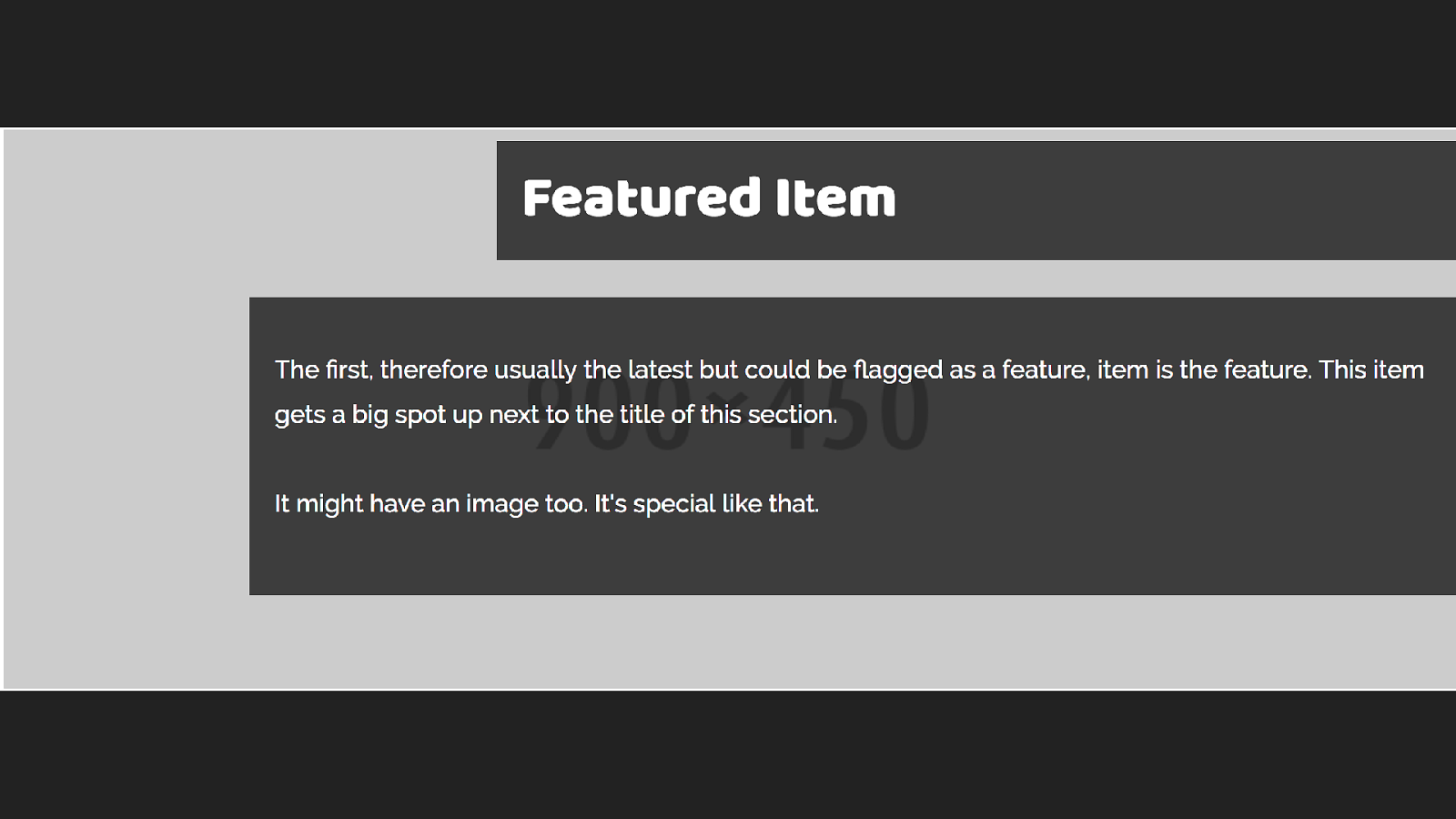
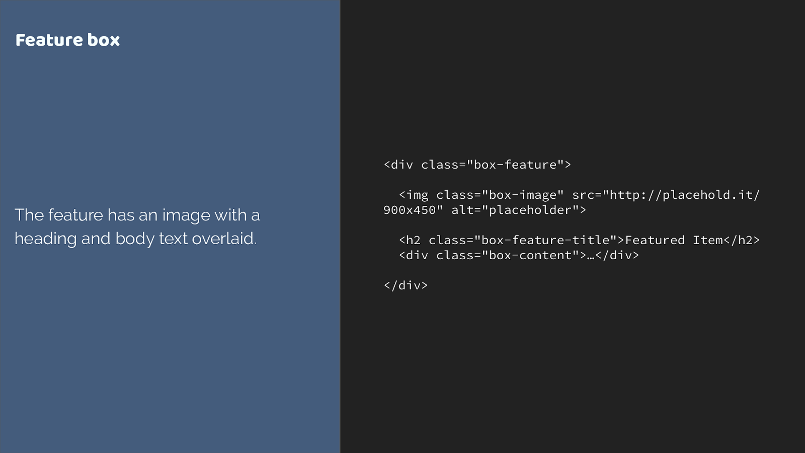
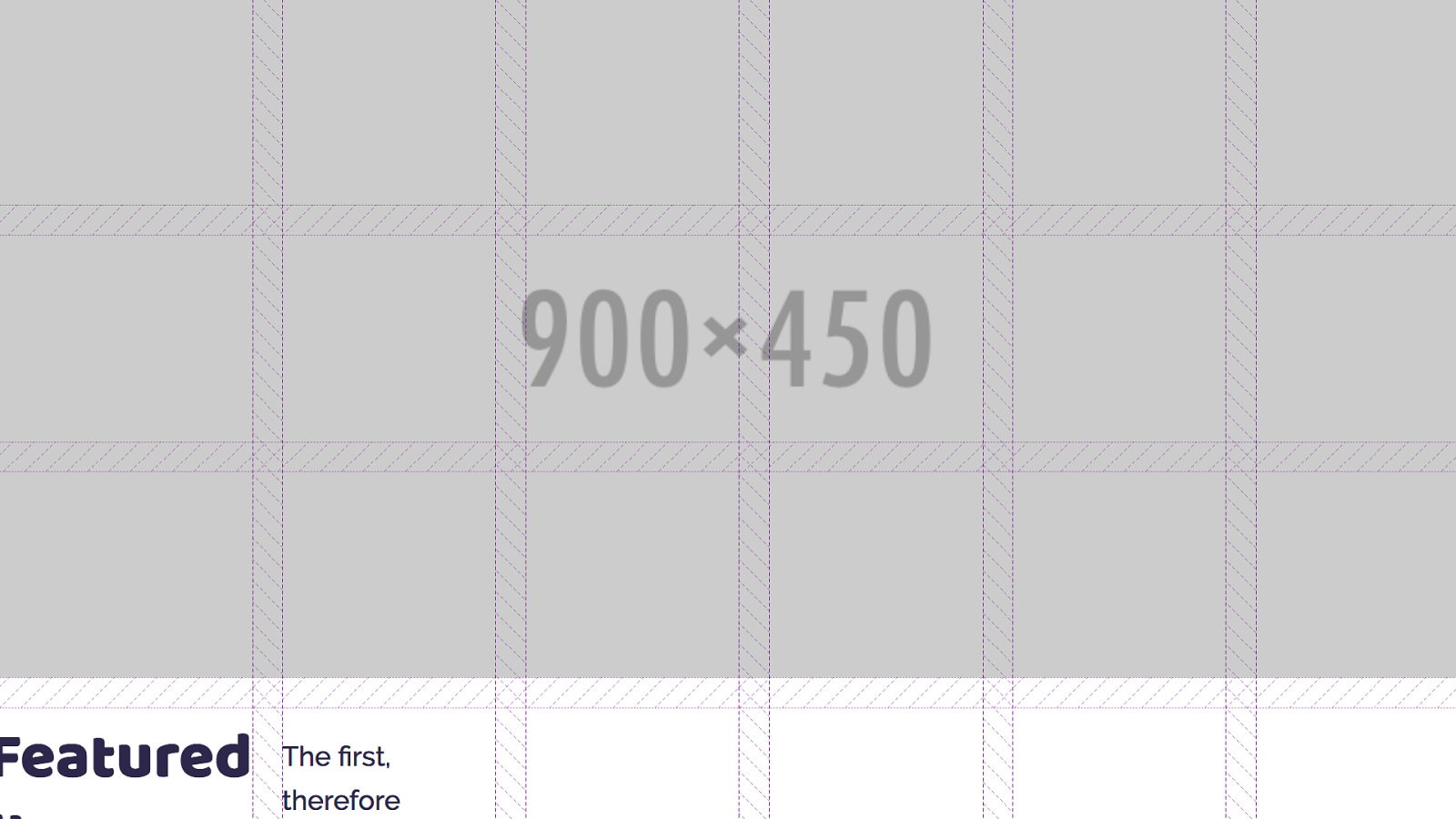
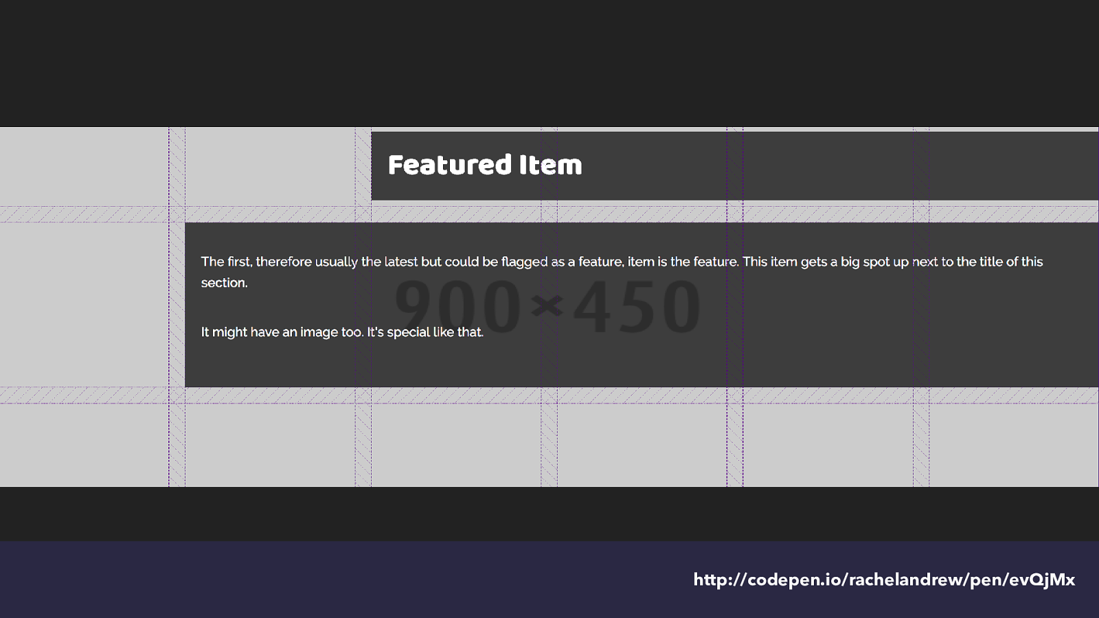
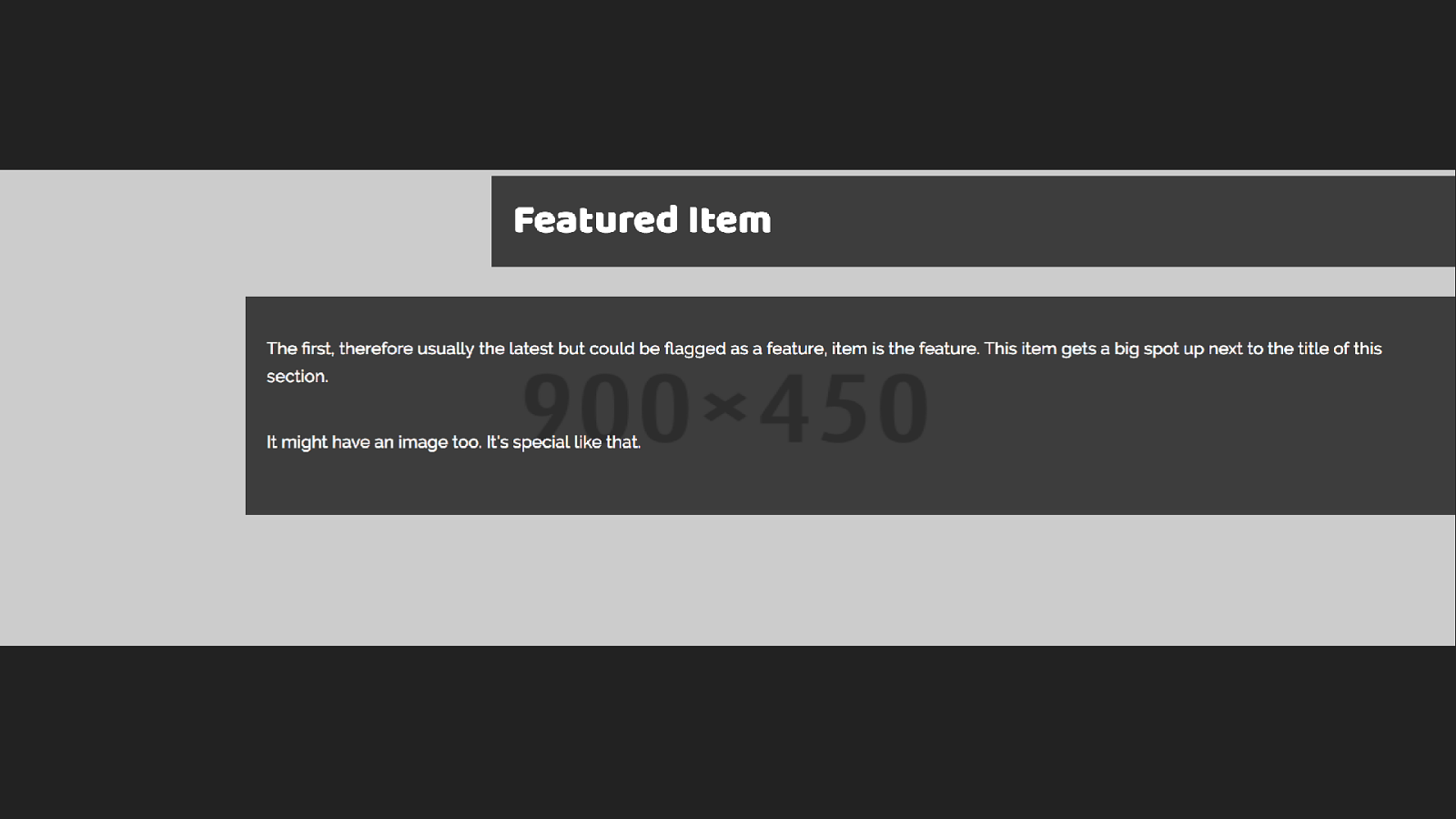
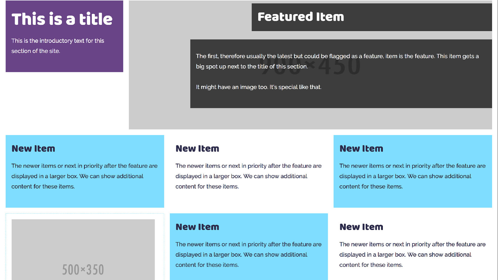
<img class="box-image" src="http://placehold.it/ 900x450" alt="placeholder">
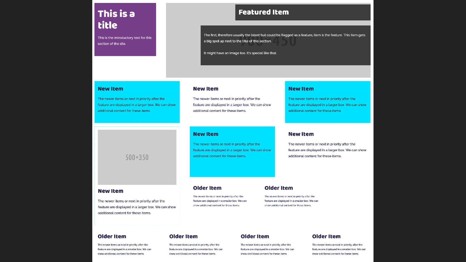
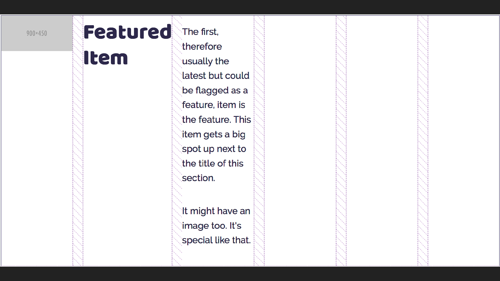
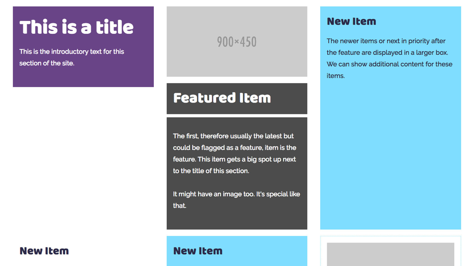
<h2 class="box-feature-title">Featured Item</h2> <div class="box-content">…</div> </div> Feature box The feature has an image with a heading and body text overlaid.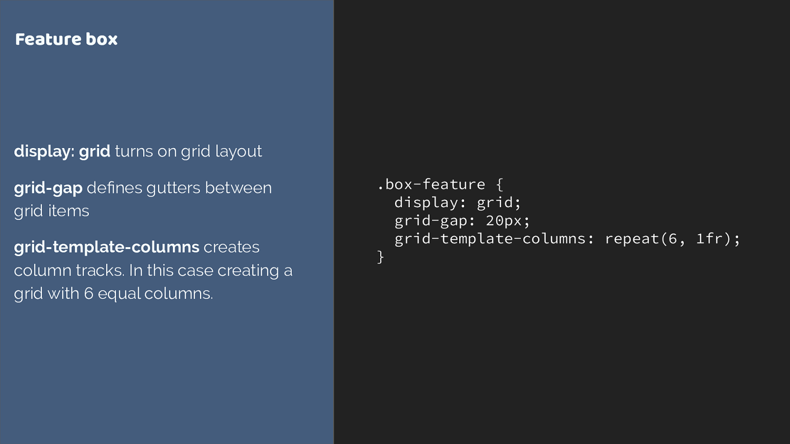
.box-feature {
display: grid;
grid-gap: 20px;
grid-template-columns: repeat(6, 1fr);
} Feature box display: grid turns on grid layout grid-gap defines gutters between grid items grid-template-columns creates column tracks. In this case creating a grid with 6 equal columns.
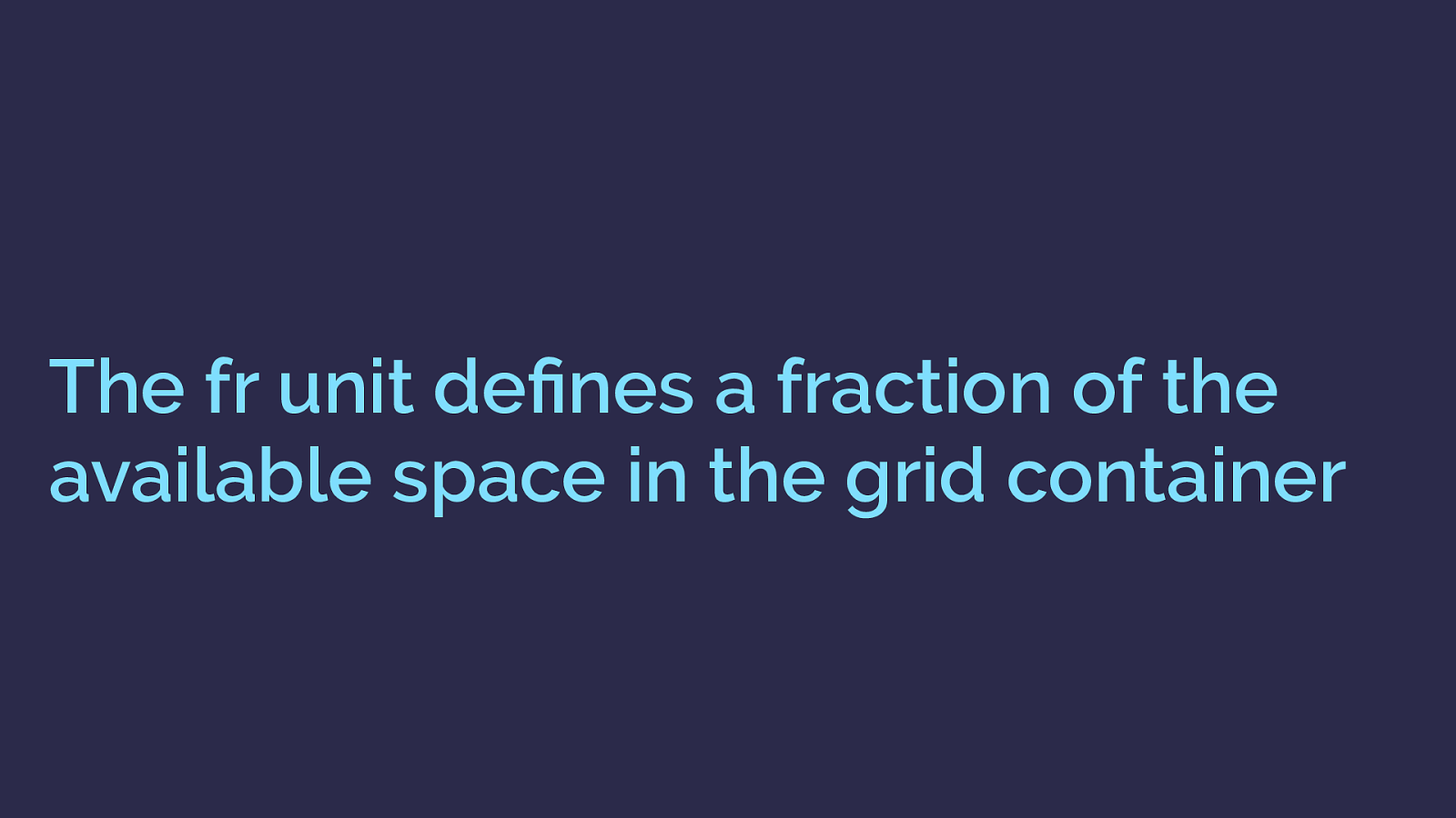
The fr unit defines a fraction of the available space in the grid container
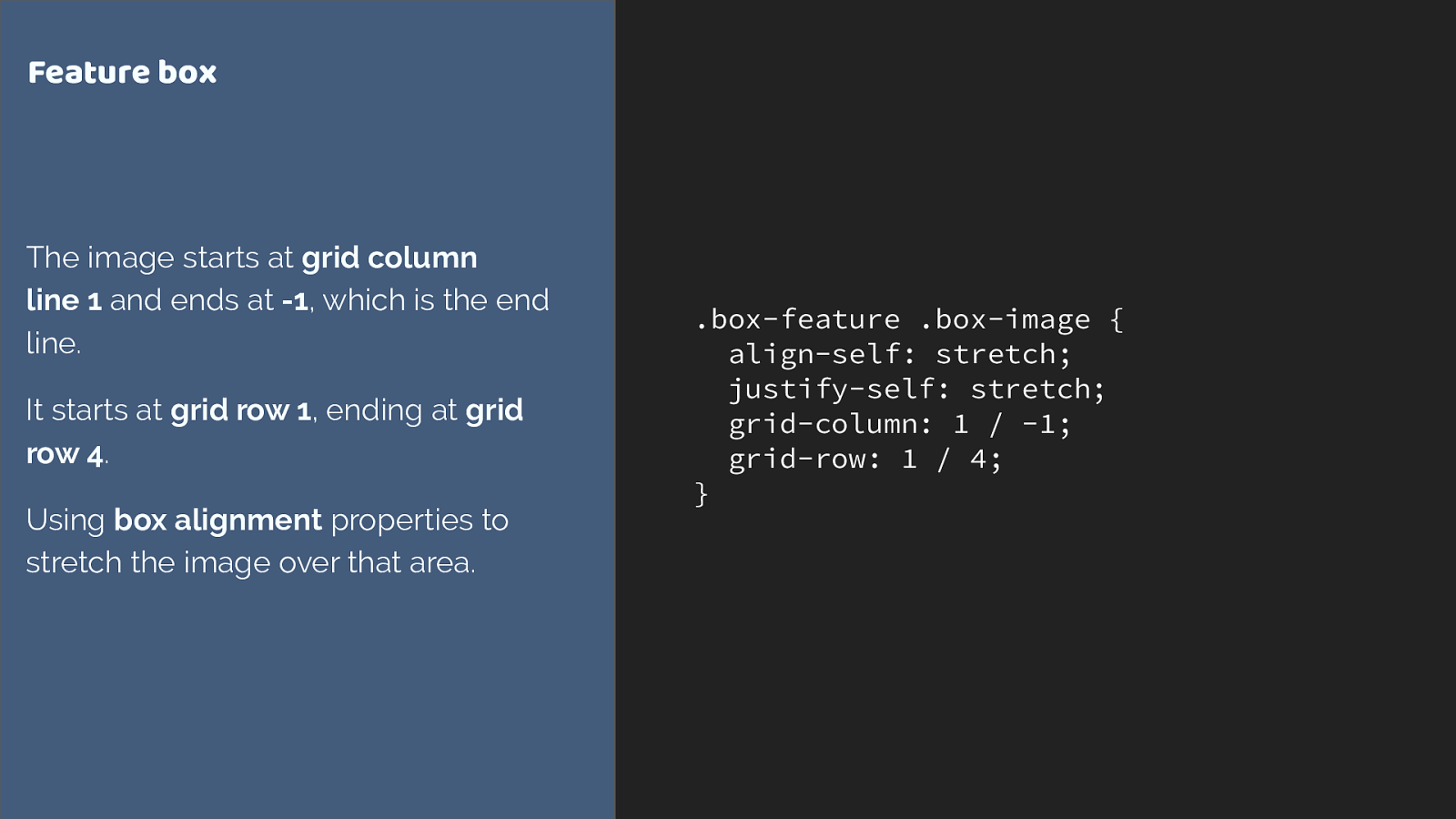
.box-feature .box-image { align-self: stretch; justify-self: stretch;
grid-column: 1 / -1; grid-row: 1 / 4;
} Feature box The image starts at grid column line 1 and ends at -1 , which is the end line. It starts at grid row 1 , ending at grid row 4 . Using box alignment properties to stretch the image over that area.
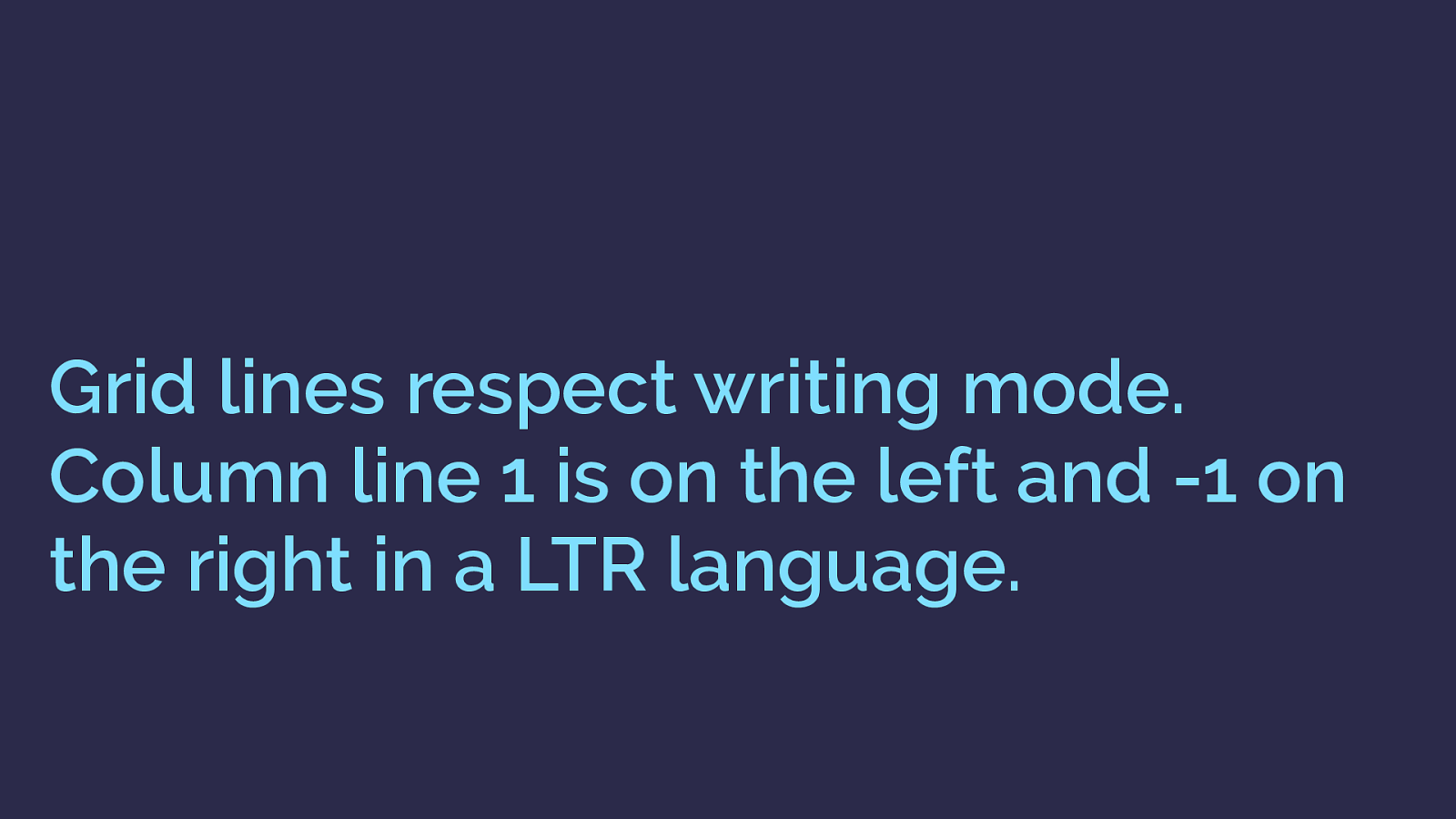
Grid lines respect writing mode. Column line 1 is on the left and -1 on the right in a LTR language.
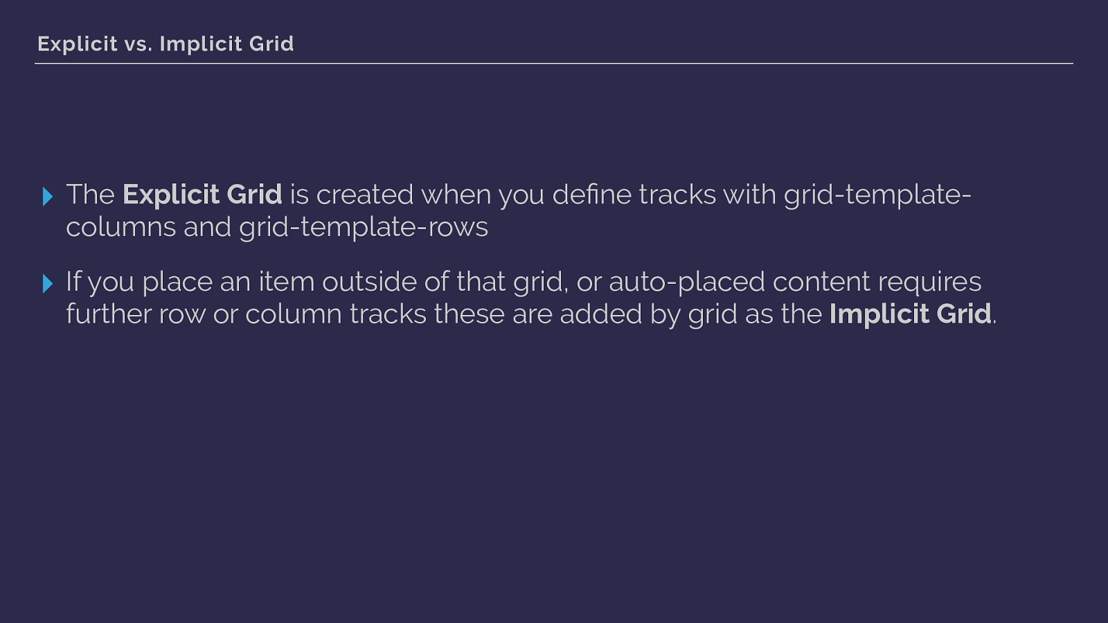
Explicit vs. Implicit Grid ▸ The Explicit Grid is created when you define tracks with grid-template- columns and grid-template-rows ▸ If you place an item outside of that grid, or auto-placed content requires further row or column tracks these are added by grid as the Implicit Grid .
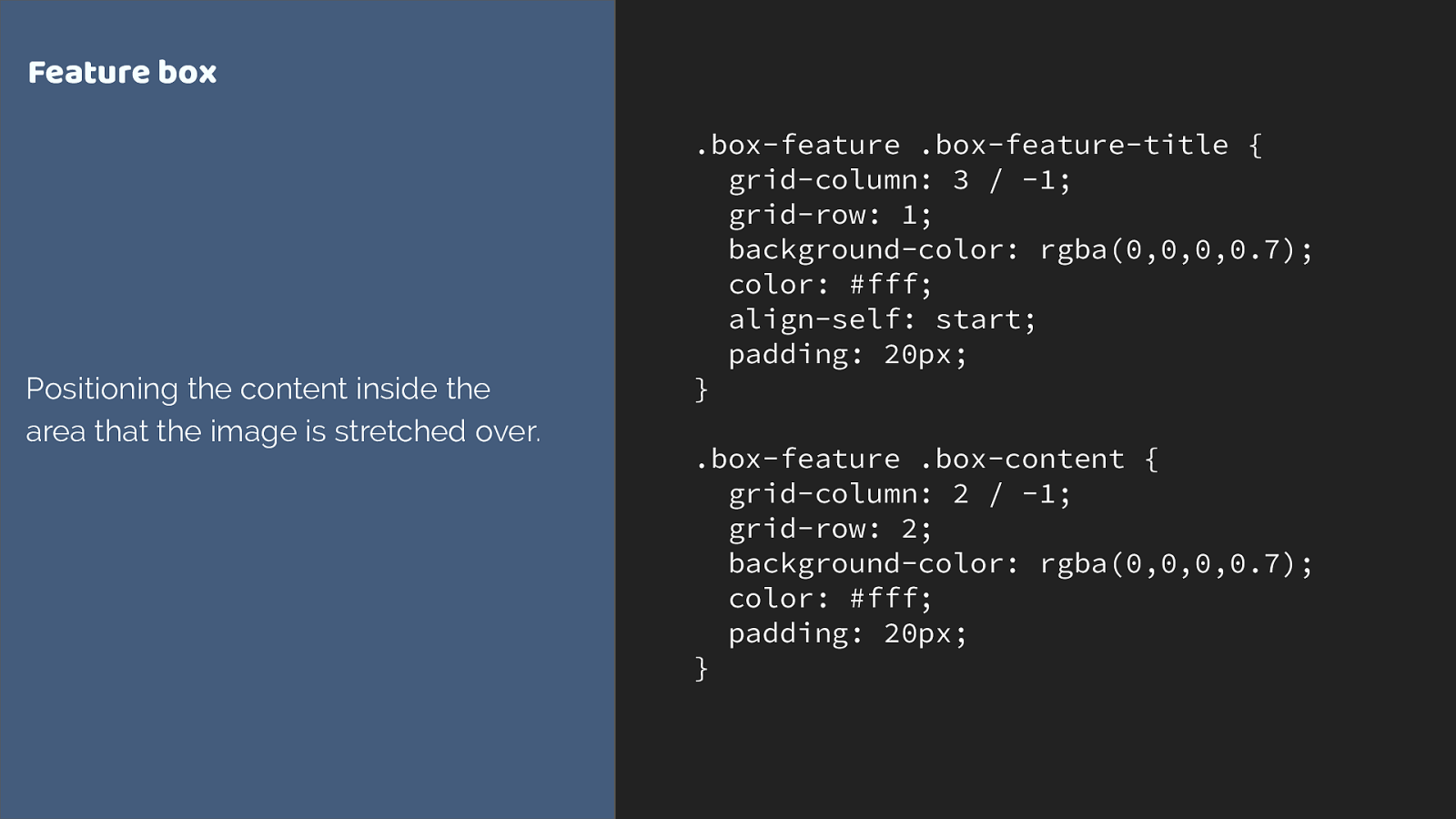
.box-feature .box-feature-title { grid-column: 3 / -1; grid-row: 1; background-color: rgba(0,0,0,0.7); color: #fff; align-self: start; padding: 20px; } .box-feature .box-content {
grid-column: 2 / -1; grid-row: 2; background-color: rgba(0,0,0,0.7); color: #fff; padding: 20px; } Feature box Positioning the content inside the area that the image is stretched over.
http://codepen.io/rachelandrew/pen/evQjMx
Layering items on the grid ▸ You can position items into the same grid cells ▸ Items further down in the source appear on top of earlier items ▸ Control the stack using z-index
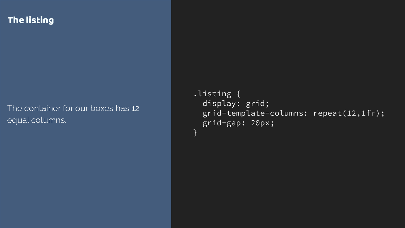
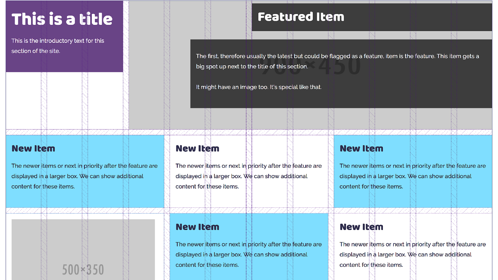
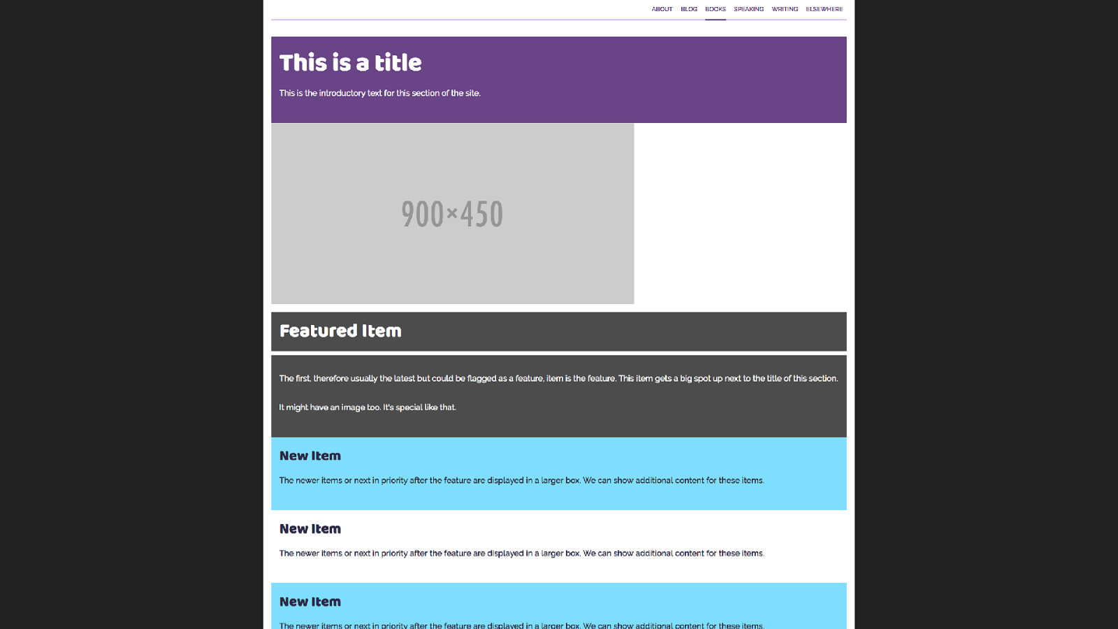
.listing { display: grid; grid-template-columns: repeat(12,1fr); grid-gap: 20px; } T he listing The container for our boxes has 12 equal columns.
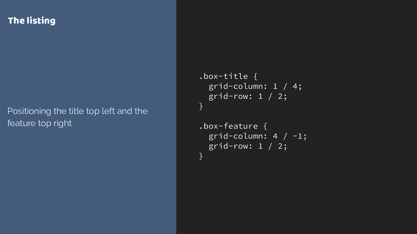
.box-title {
grid-column: 1 / 4;
grid-row: 1 / 2;
}
.box-feature {
grid-column: 4 / -1; grid-row: 1 / 2; } T he listing Positioning the title top left and the feature top right
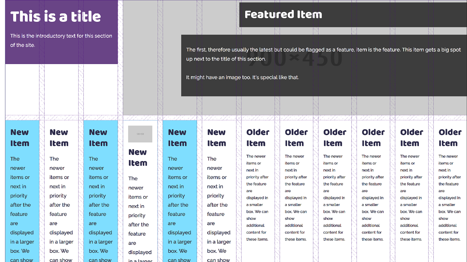
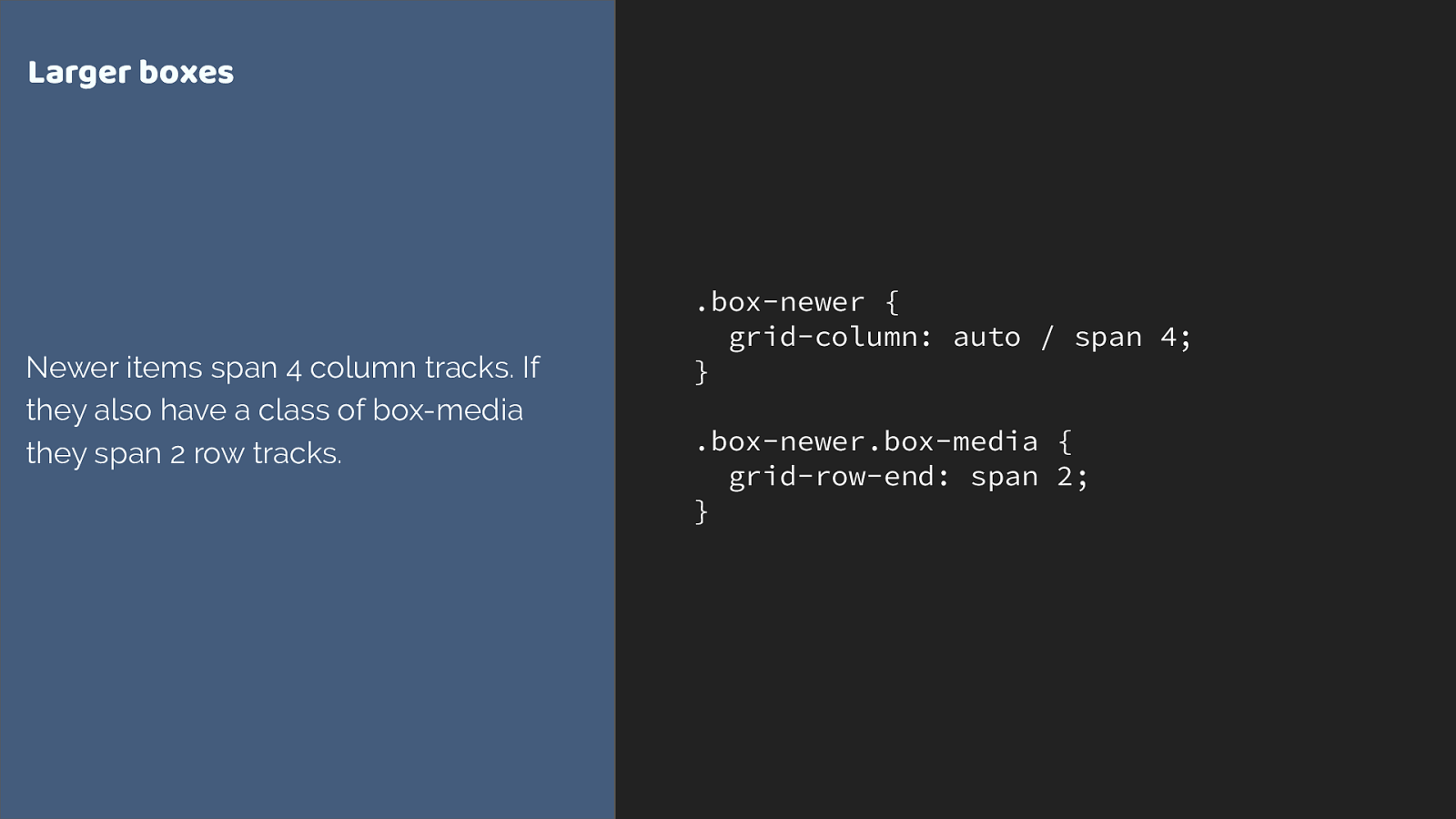
.box-newer { grid-column: auto / span 4; }
.box-newer.box-media { grid-row-end: span 2; } Larger boxes Newer items span 4 column tracks. If they also have a class of box-media they span 2 row tracks.
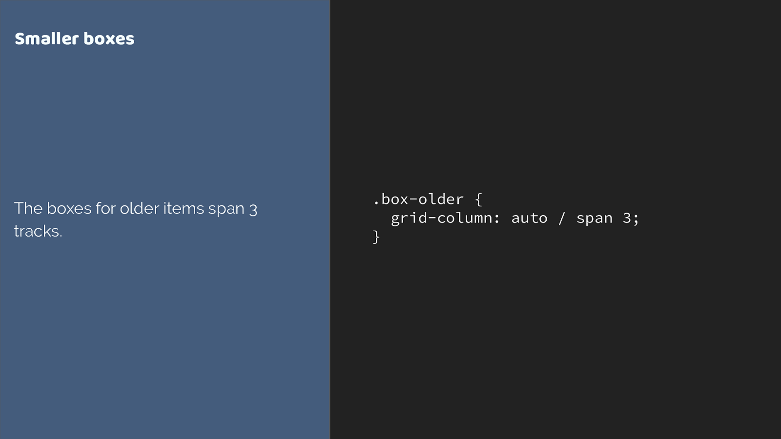
.box-older {
grid-column: auto / span 3; } Smaller boxes The boxes for older items span 3 tracks.
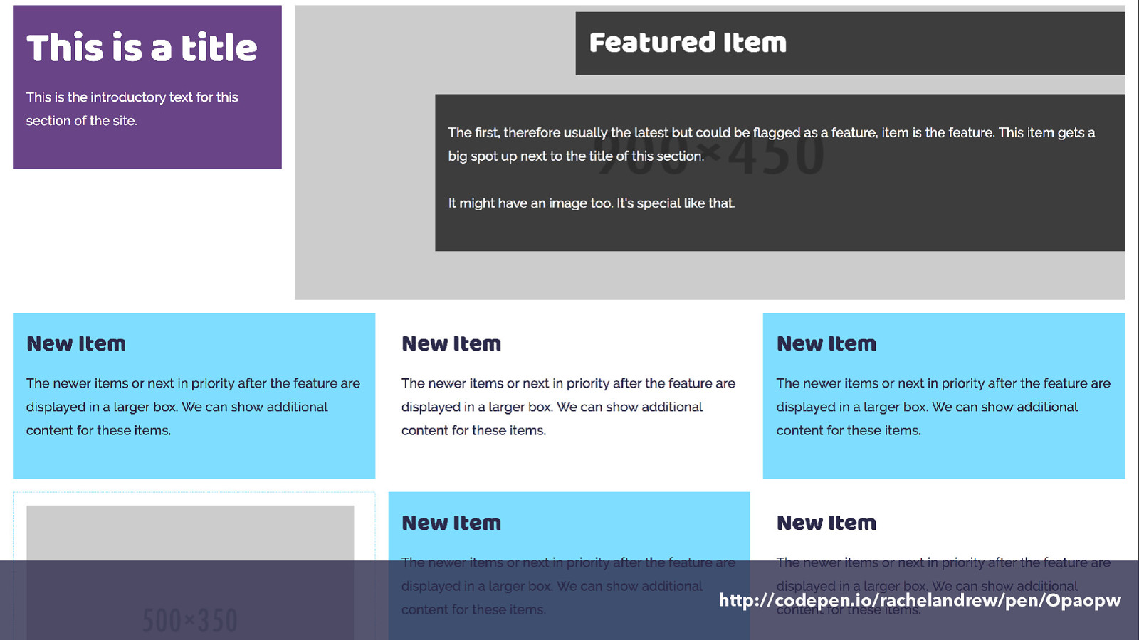
http://codepen.io/rachelandrew/pen/Opaopw
Going responsive CSS Grid
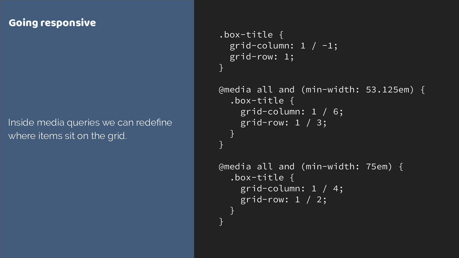
.box-title { grid-column: 1 / -1; grid-row: 1;
} @media all and (min-width: 53.125em) { .box-title { grid-column: 1 / 6; grid-row: 1 / 3;
}
} @media all and (min-width: 75em) { .box-title { grid-column: 1 / 4; grid-row: 1 / 2;
}
} Going responsive Inside media queries we can redefine where items sit on the grid.
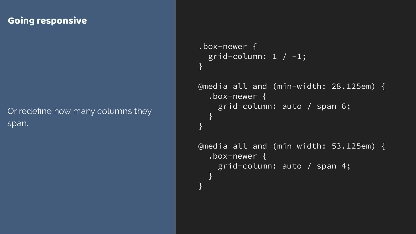
.box-newer { grid-column: 1 / -1;
} @media all and (min-width: 28.125em) { .box-newer { grid-column: auto / span 6;
}
} @media all and (min-width: 53.125em) { .box-newer { grid-column: auto / span 4;
}
} Going responsive Or redefine how many columns they span.
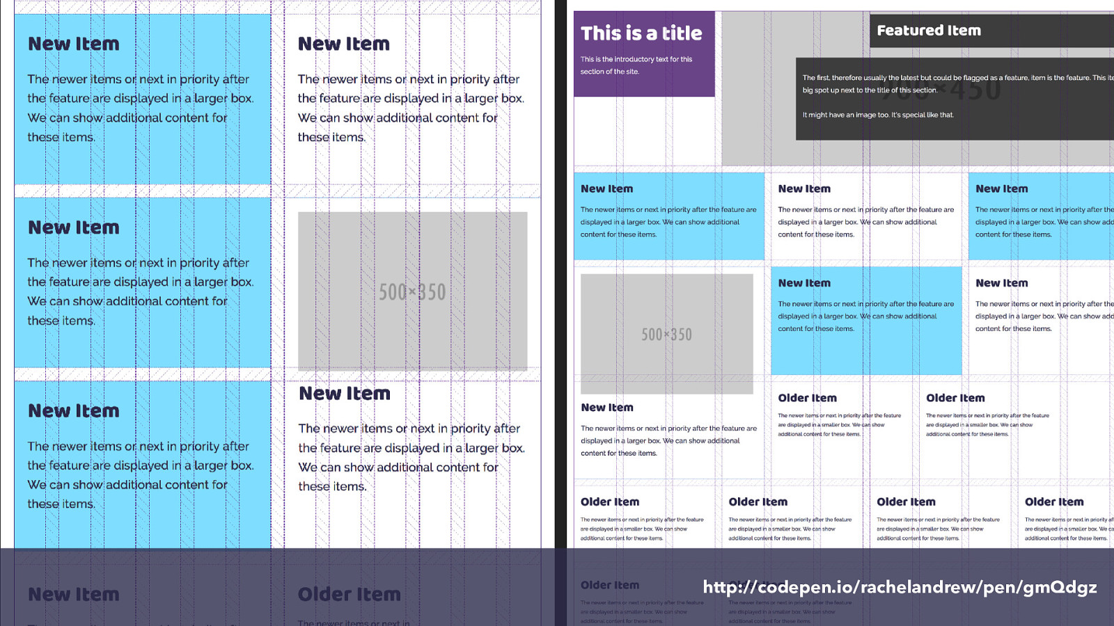
http://codepen.io/rachelandrew/pen/gmQdgz
What about old browsers? CSS Grid Layout
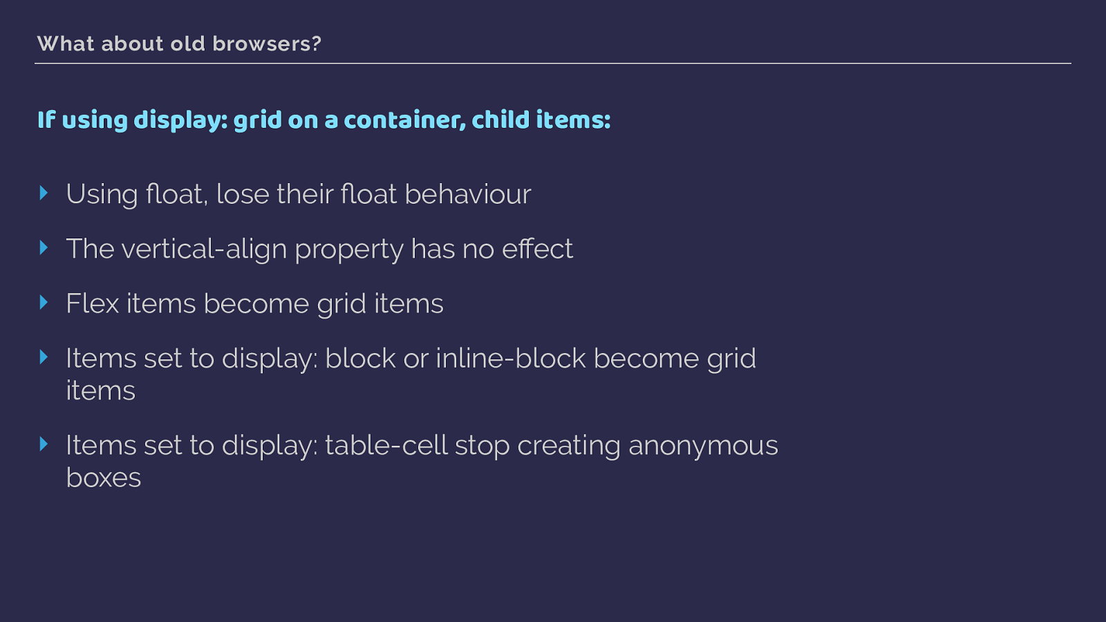
What about old browsers? If using display: grid on a container, child items: ‣ Using float, lose their fl oat behaviour ‣ The vertical-align property has no effect ‣ Flex items become grid items ‣ Items set to display: block or inline-block become grid items ‣ Items set to display: table-cell stop creating anonymous boxes
You do not need to build “two layouts”
It makes sense to start using grid on new sites right now.
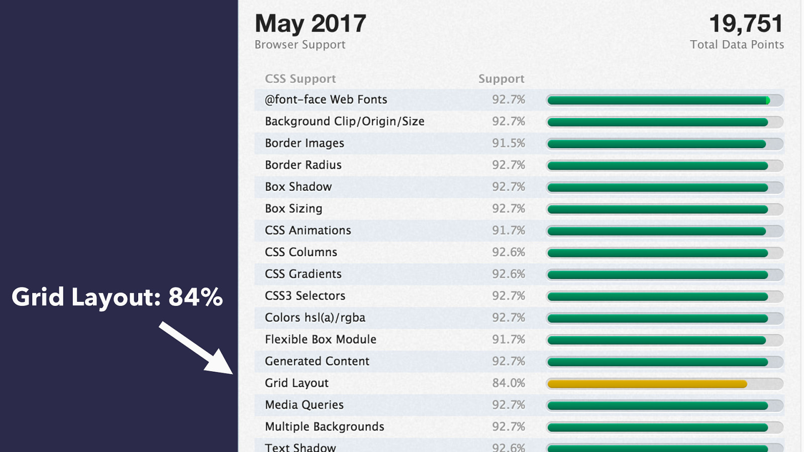
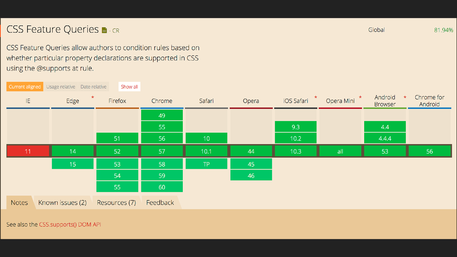
Grid Layout: 84%
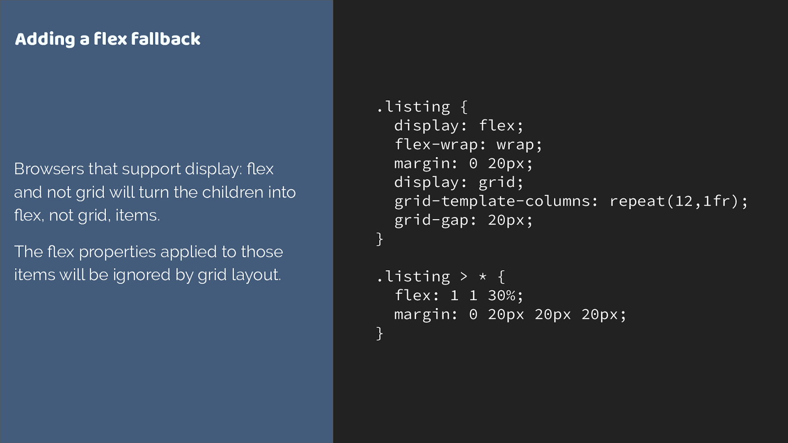
.listing { display: flex; flex-wrap: wrap; margin: 0 20px; display: grid; grid-template-columns: repeat(12,1fr); grid-gap: 20px; } .listing > * { flex: 1 1 30%; margin: 0 20px 20px 20px; } Adding a flex fallback Browsers that support display: flex and not grid will turn the children into flex, not grid, items. The flex properties applied to those items will be ignored by grid layout.

Feature Queries are your new best friend
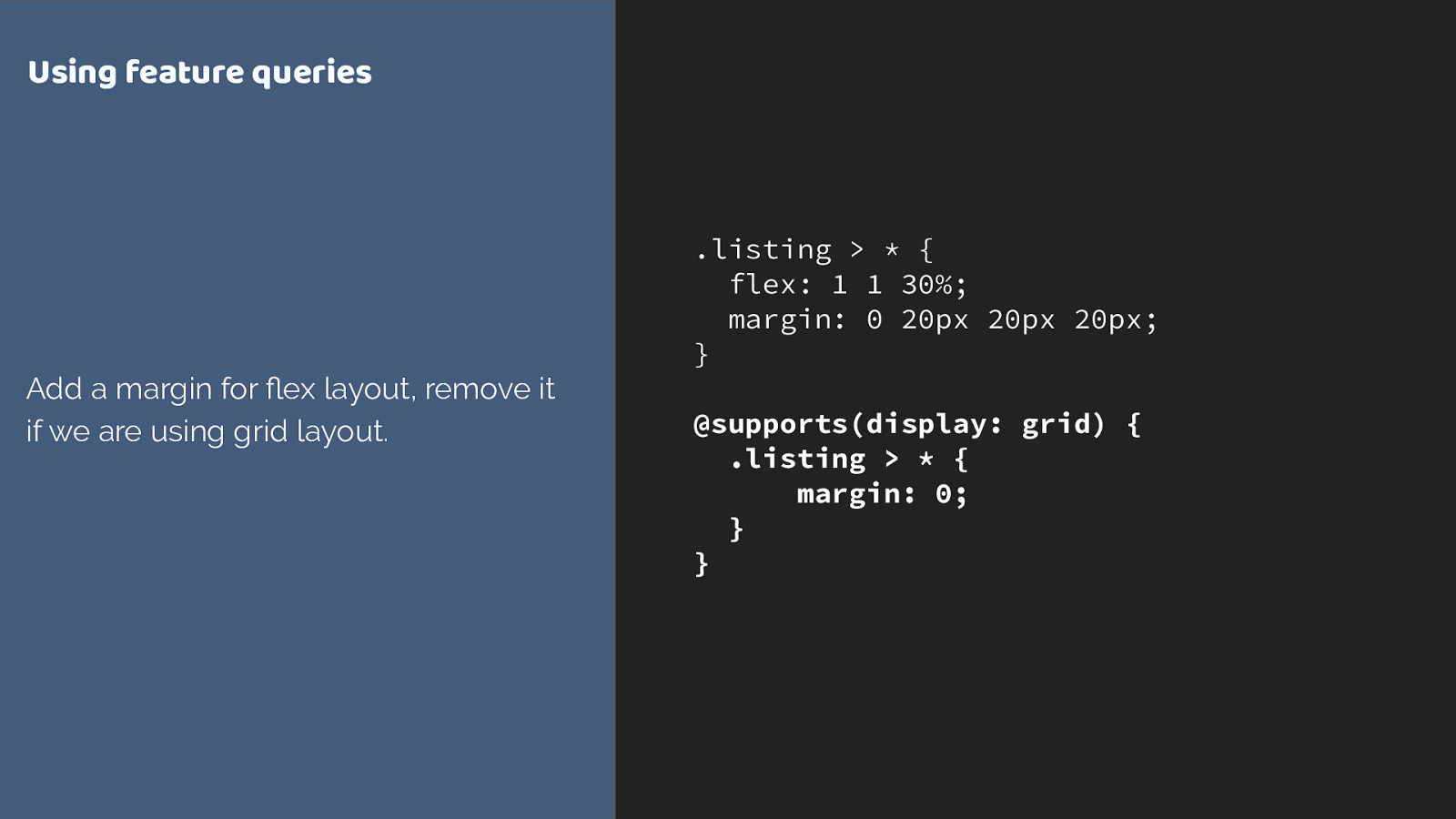
.listing > * { flex: 1 1 30%; margin: 0 20px 20px 20px; }
@supports(display: grid) { .listing > * { margin: 0; } } Using feature queries Add a margin for flex layout, remove it if we are using grid layout.
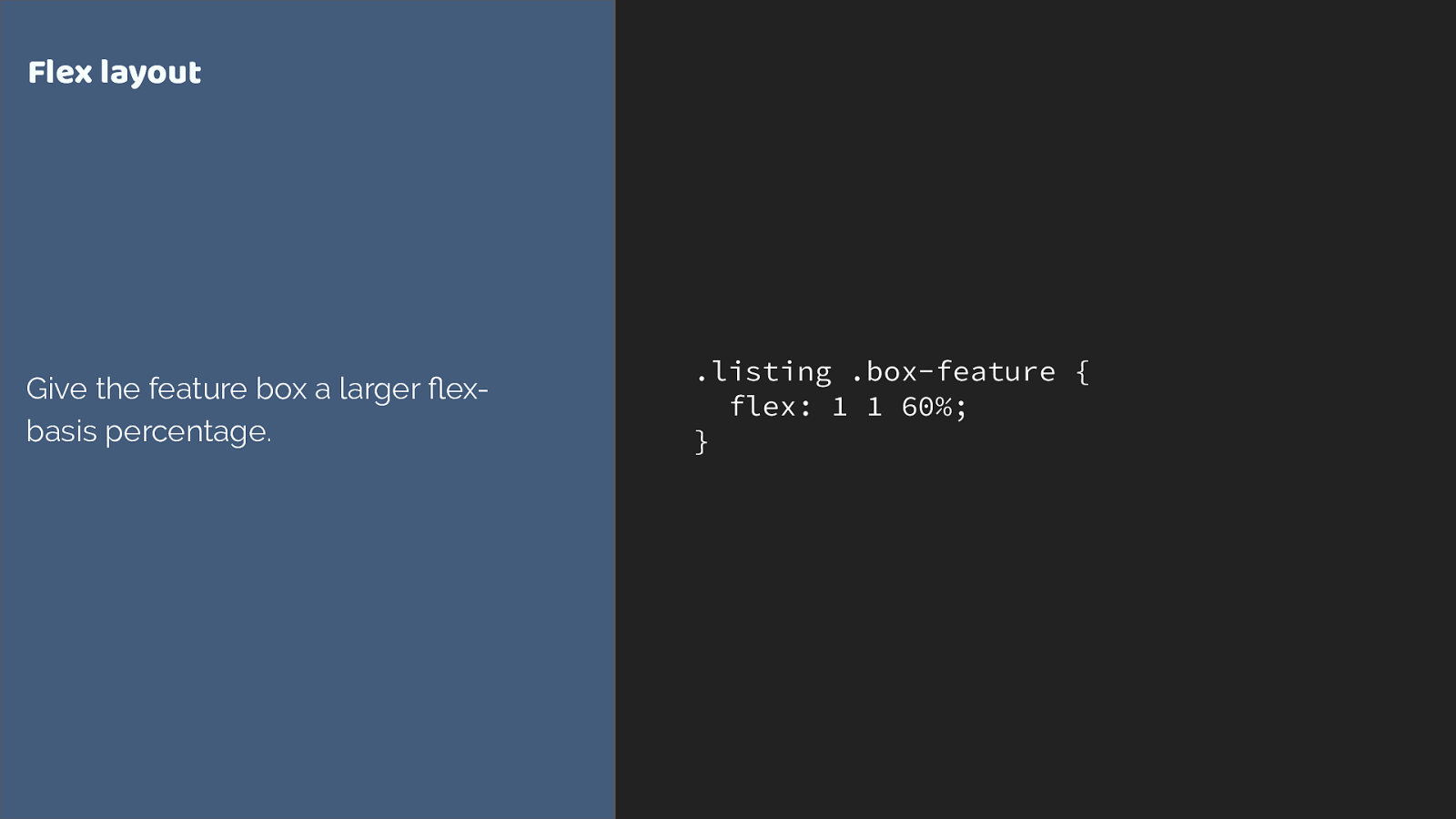
.listing .box-feature { flex: 1 1 60%; } Flex layout Give the feature box a larger flex- basis percentage.
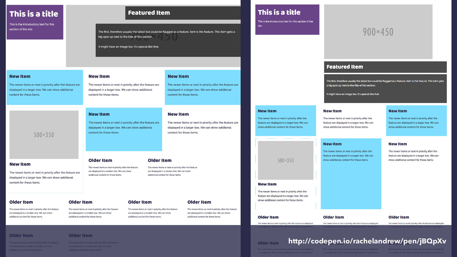
http://codepen.io/rachelandrew/pen/jBQpXv
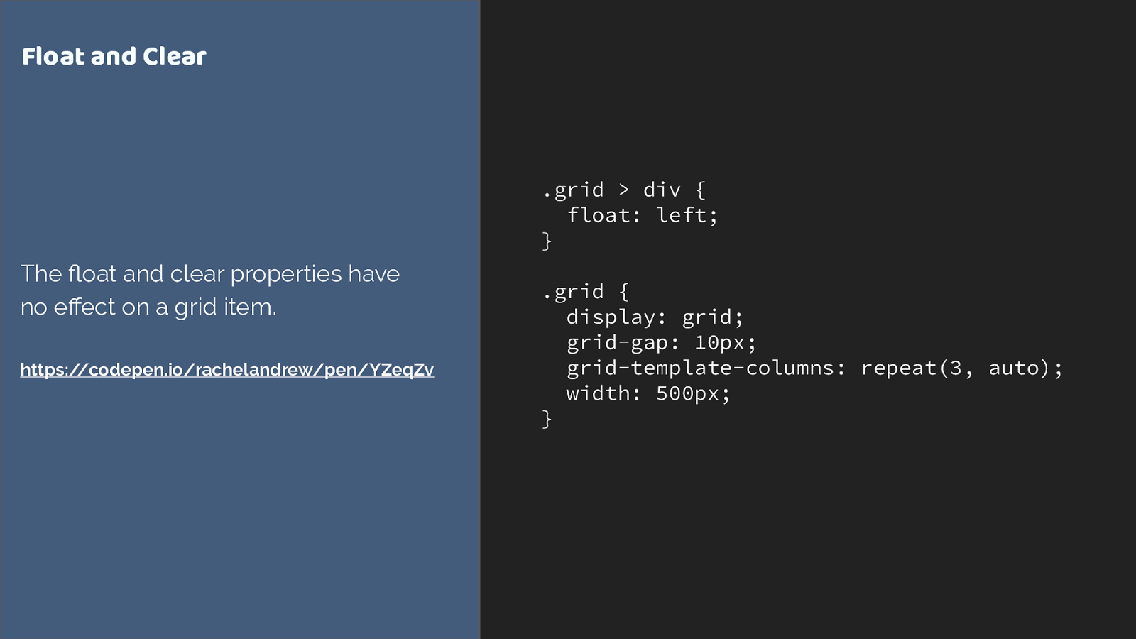
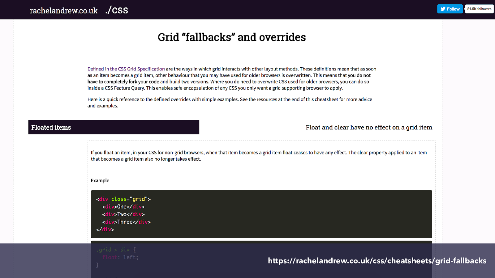
.grid > div { float: left; } .grid { display: grid; grid-gap: 10px; grid-template-columns: repeat(3, auto); width: 500px; } Float and Clear The float and clear properties have no effect on a grid item. https://codepen.io/rachelandrew/pen/YZeqZv
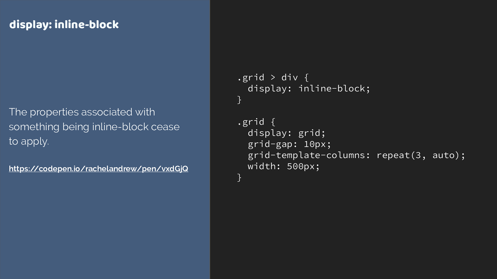
.grid > div { display: inline-block; } .grid { display: grid; grid-gap: 10px; grid-template-columns: repeat(3, auto); width: 500px; } display: inline-block The properties associated with something being inline-block cease to apply. https://codepen.io/rachelandrew/pen/vxdGjQ
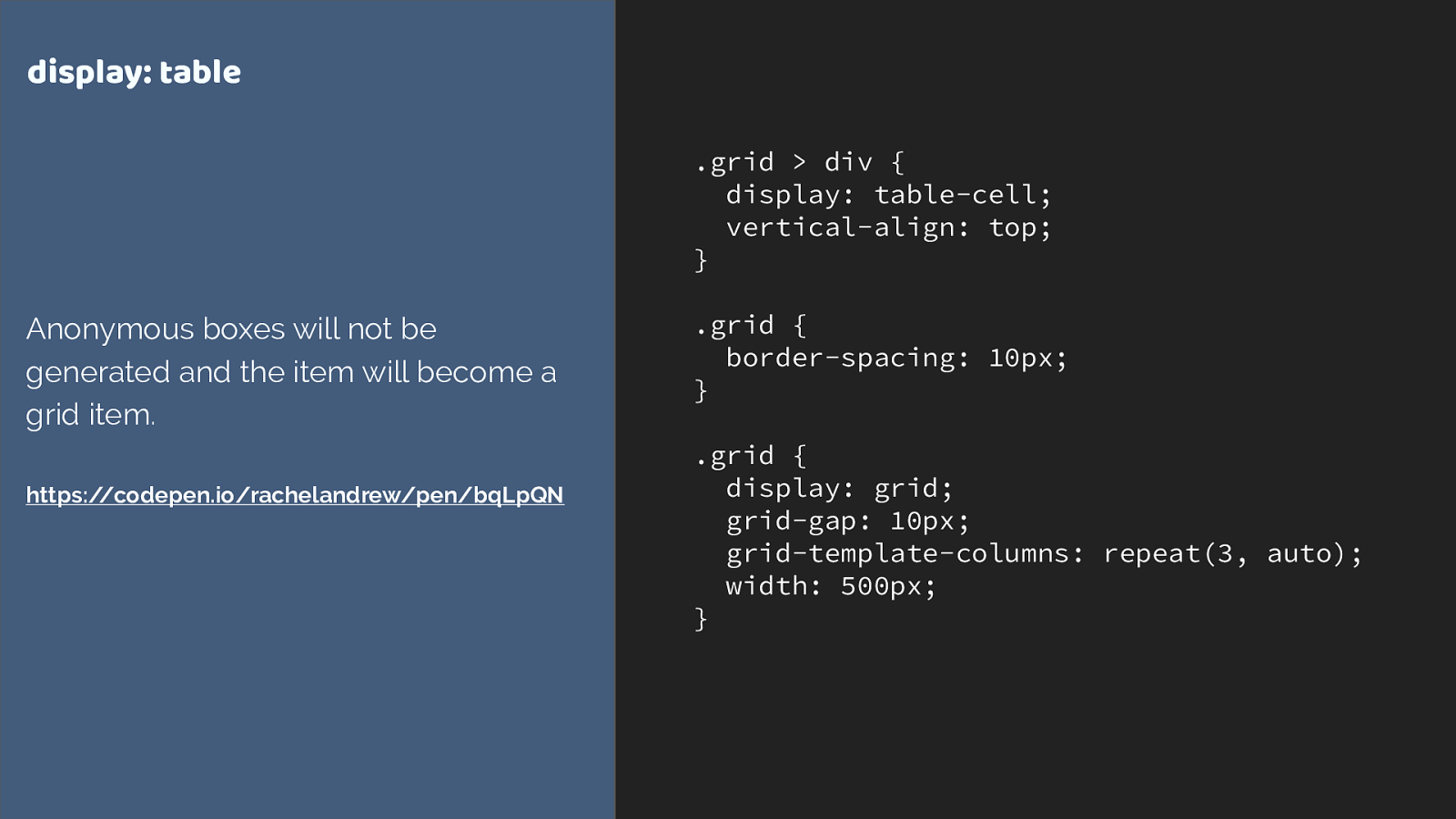
.grid > div { display: table-cell; vertical-align: top; } .grid { border-spacing: 10px; } .grid { display: grid; grid-gap: 10px; grid-template-columns: repeat(3, auto); width: 500px; } display: table Anonymous boxes will not be generated and the item will become a grid item. https://codepen.io/rachelandrew/pen/bqLpQN
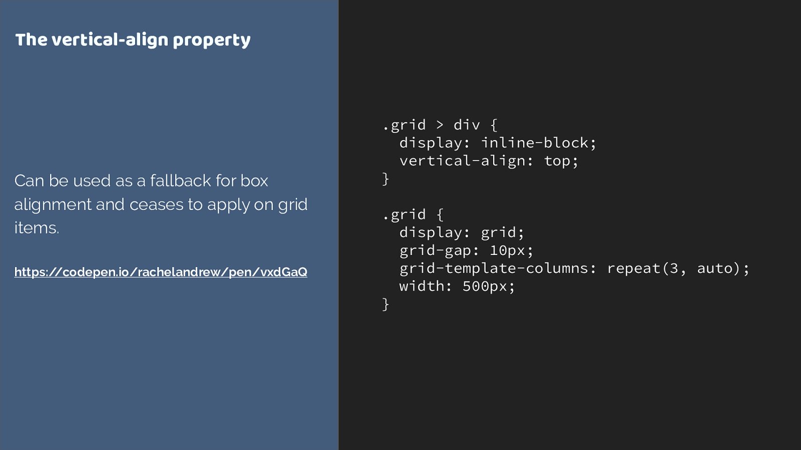
.grid > div { display: inline-block; vertical-align: top; } .grid { display: grid; grid-gap: 10px; grid-template-columns: repeat(3, auto); width: 500px; } The vertical-align property Can be used as a fallback for box alignment and ceases to apply on grid items. https://codepen.io/rachelandrew/pen/vxdGaQ
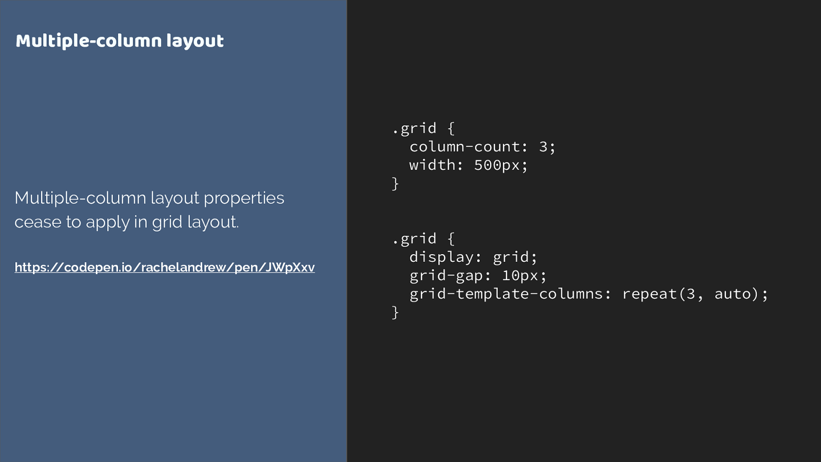
.grid { column-count: 3; width: 500px; } .grid { display: grid; grid-gap: 10px; grid-template-columns: repeat(3, auto); } Multiple-column layout Multiple-column layout properties cease to apply in grid layout. https://codepen.io/rachelandrew/pen/JWpXxv
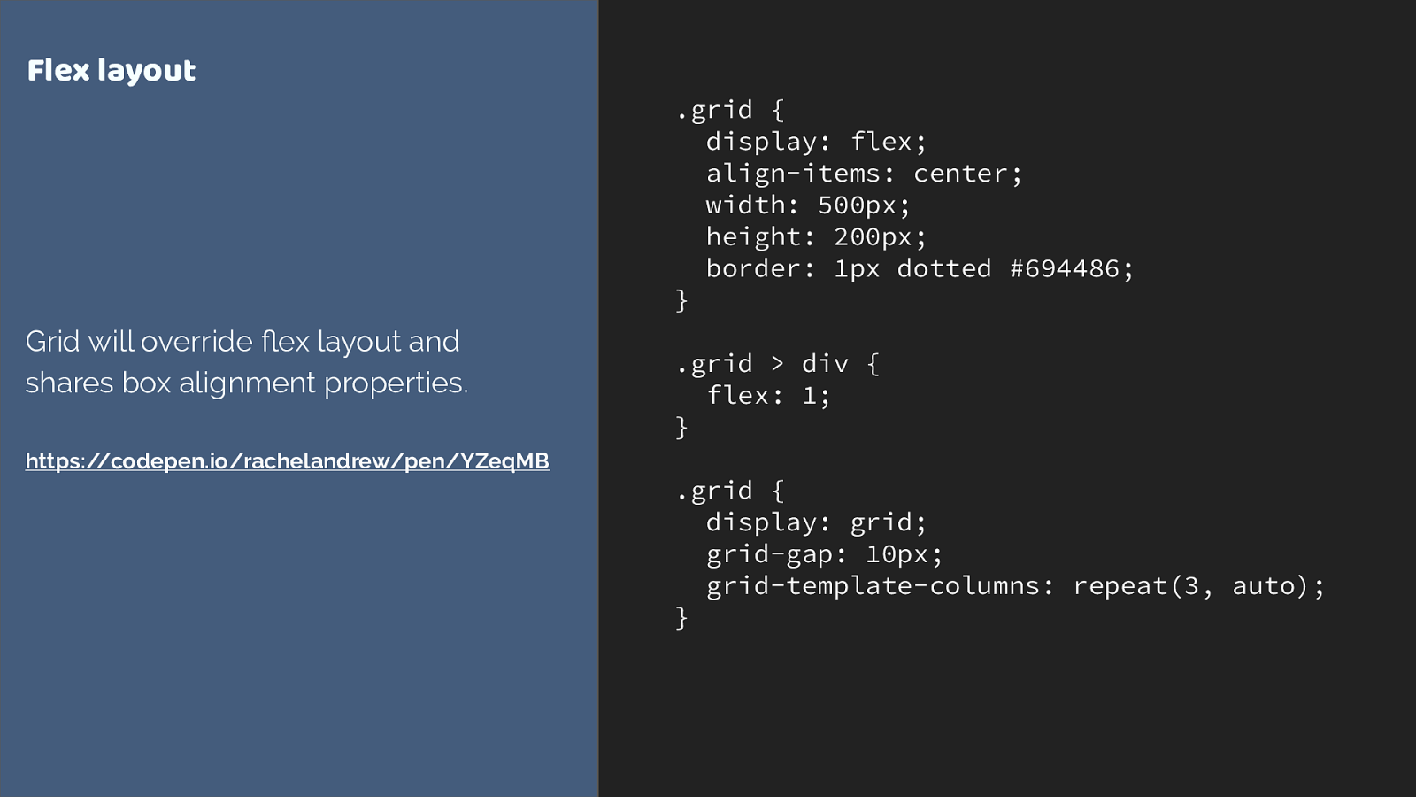
.grid { display: flex; align-items: center; width: 500px; height: 200px; border: 1px dotted #694486; } .grid > div { flex: 1; } .grid { display: grid; grid-gap: 10px; grid-template-columns: repeat(3, auto); } Flex layout Grid will override flex layout and shares box alignment properties. https://codepen.io/rachelandrew/pen/YZeqMB

Overrides inside @supports are mostly widths & margins
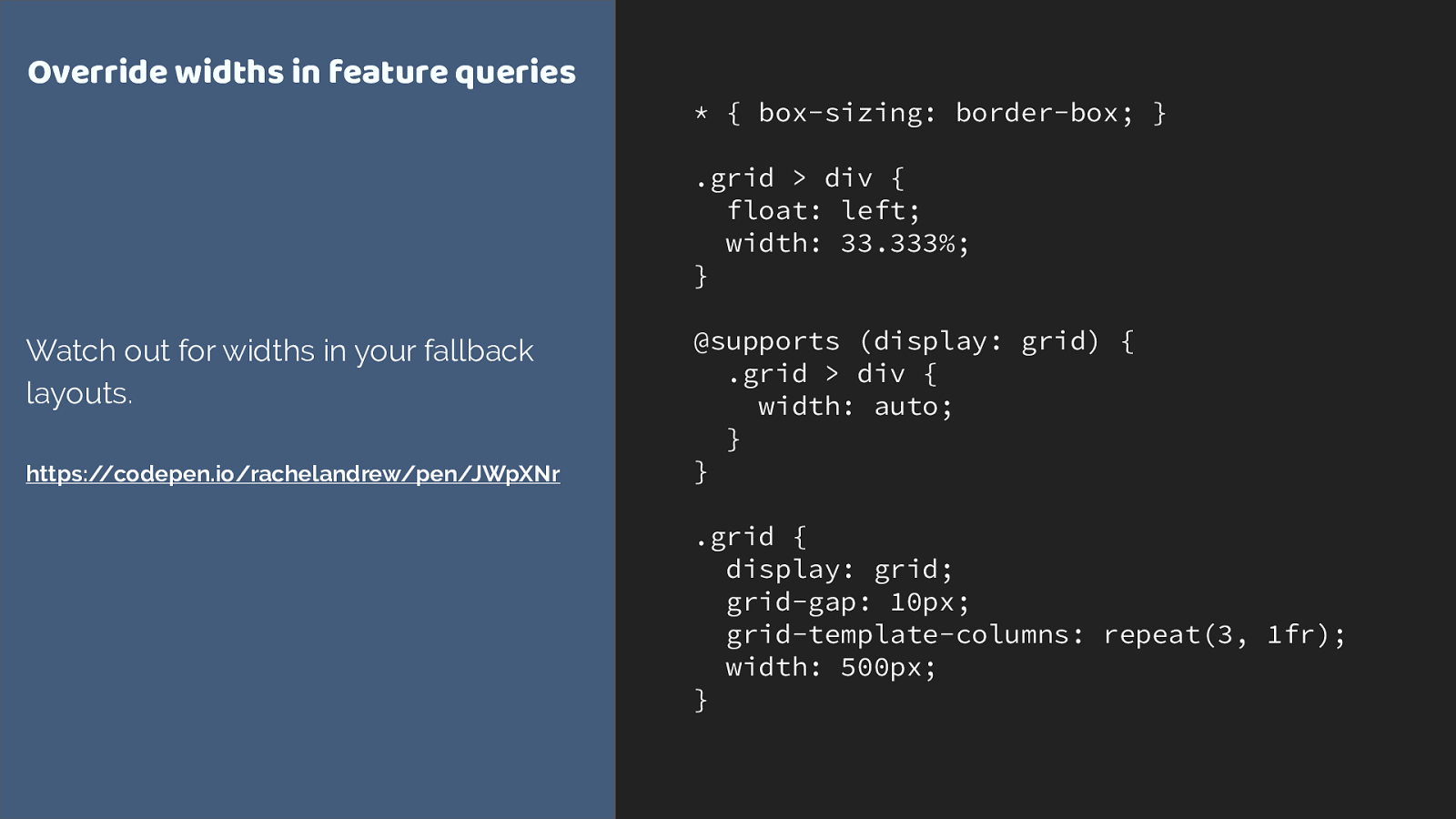
- { box-sizing: border-box; } .grid > div { float: left; width: 33.333%; } @supports (display: grid) { .grid > div { width: auto; } } .grid { display: grid; grid-gap: 10px; grid-template-columns: repeat(3, 1fr); width: 500px; } Override widths in feature queries Watch out for widths in your fallback layouts. https://codepen.io/rachelandrew/pen/JWpXNr
https://rachelandrew.co.uk/css/cheatsheets/grid-fallbacks
Edge Grid implementation
▸
Currently tied to the IE10 implementation
▸
Prefixed with -ms
▸
No auto-placement or grid-template-areas layout
▸
For simple line-based positioning it works
▸
More at
https://rachelandrew.co.uk/archives/2017/04/04/edge-starts-work-
on-their-grid-implementation-update/
IE / Edge Tips ▸ Update to Autoprefixer 7 - previous versions would add -ms-grid pre fi xes. You don’t generally want this! ▸ Post from Greg Whitworth of Microsoft if you are using Feature Queries and want to support future Edge: http://gwhitworth.com/blog/2017/05/ accurately-checking-for-css-grid-support-in-microsoft-edge
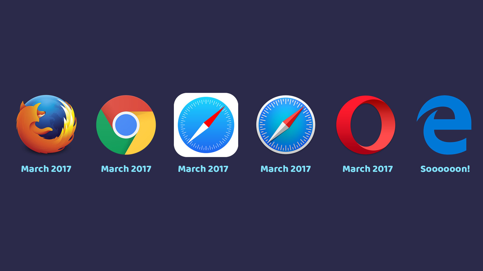
March 2017 March 2017 March 2017 March 2017 March 2017 Soooooon!

Let browser vendors know which features you want.
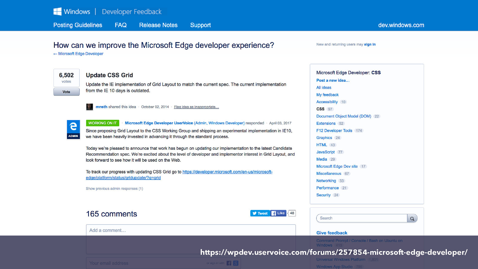
https://wpdev.uservoice.com/forums/257854-microsoft-edge-developer/
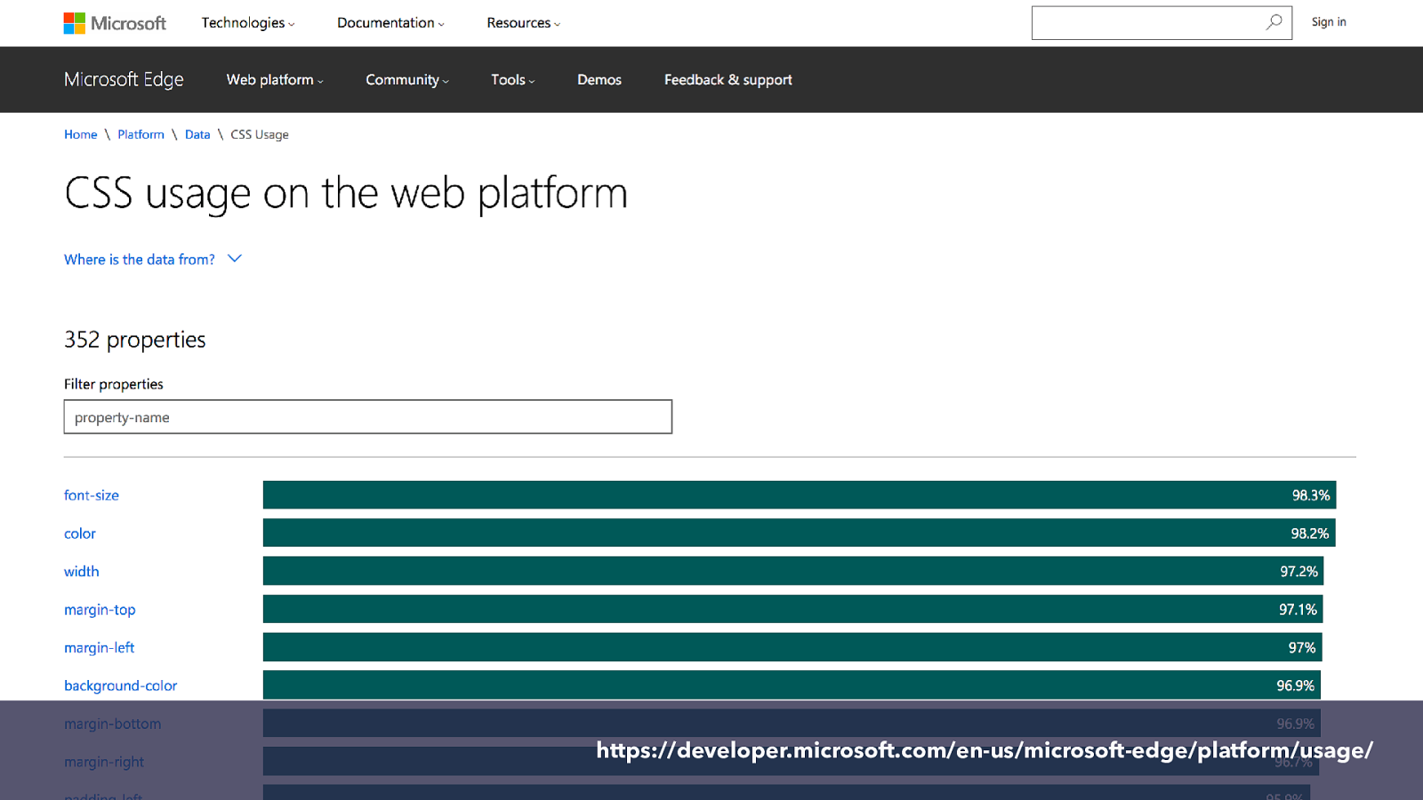
https://developer.microsoft.com/en-us/microsoft-edge/platform/usage/
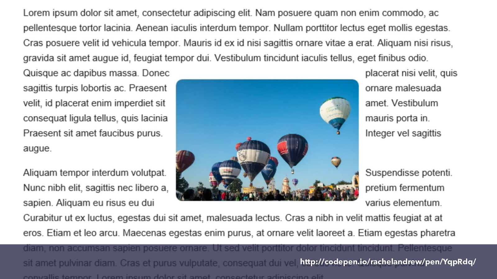
http://codepen.io/rachelandrew/pen/YqpRdq/
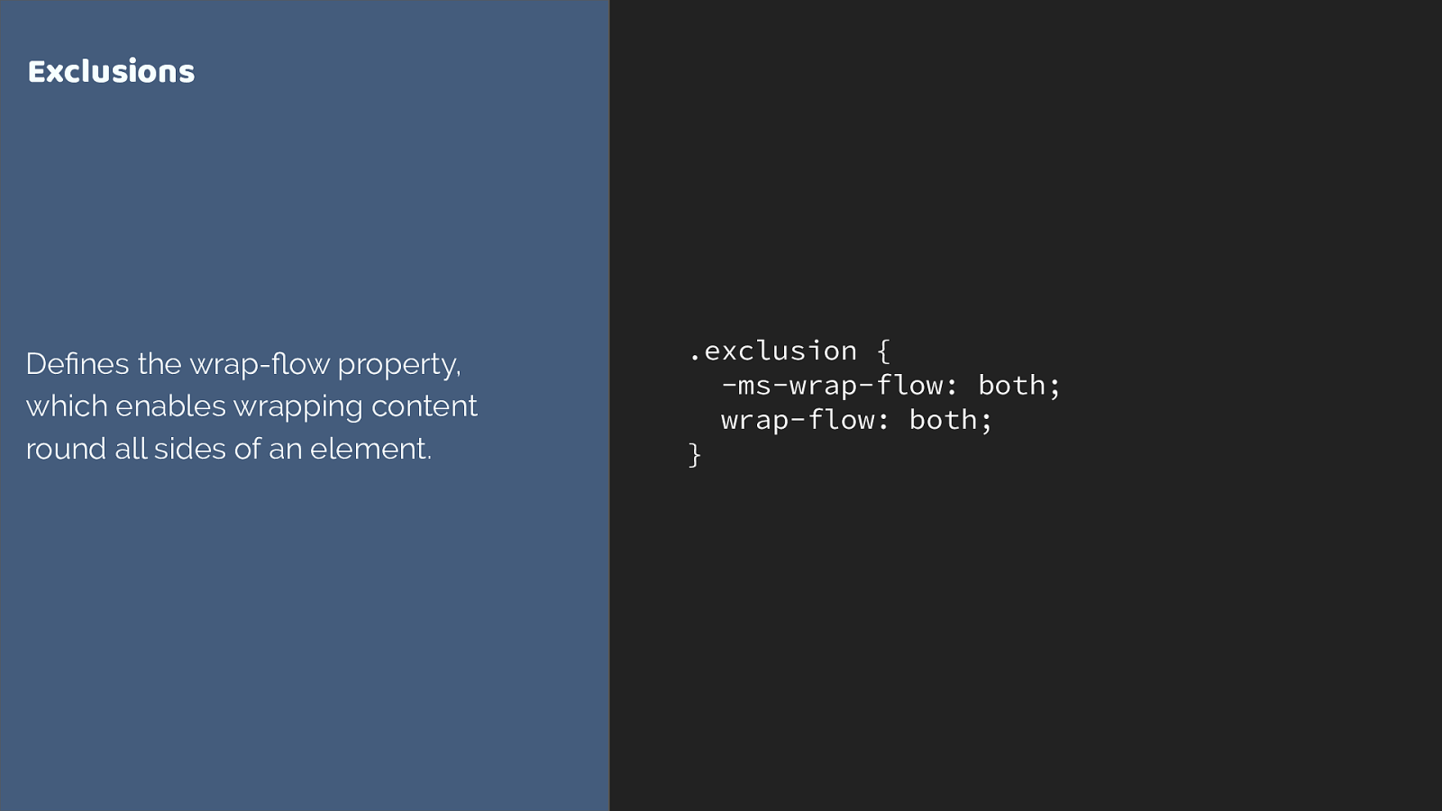
. exclusion { -ms-wrap-flow: both;
wrap-flow: both; } Exclusions Defines the wrap- fl ow property, which enables wrapping content round all sides of an element.
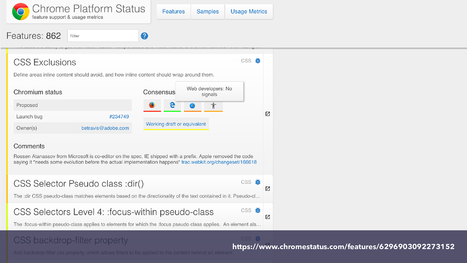
https://www.chromestatus.com/features/6296903092273152

You can get involved in the future of CSS.
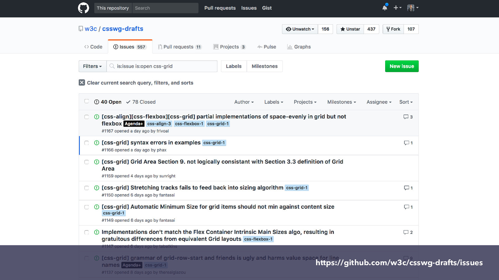
https://github.com/w3c/csswg-drafts/issues
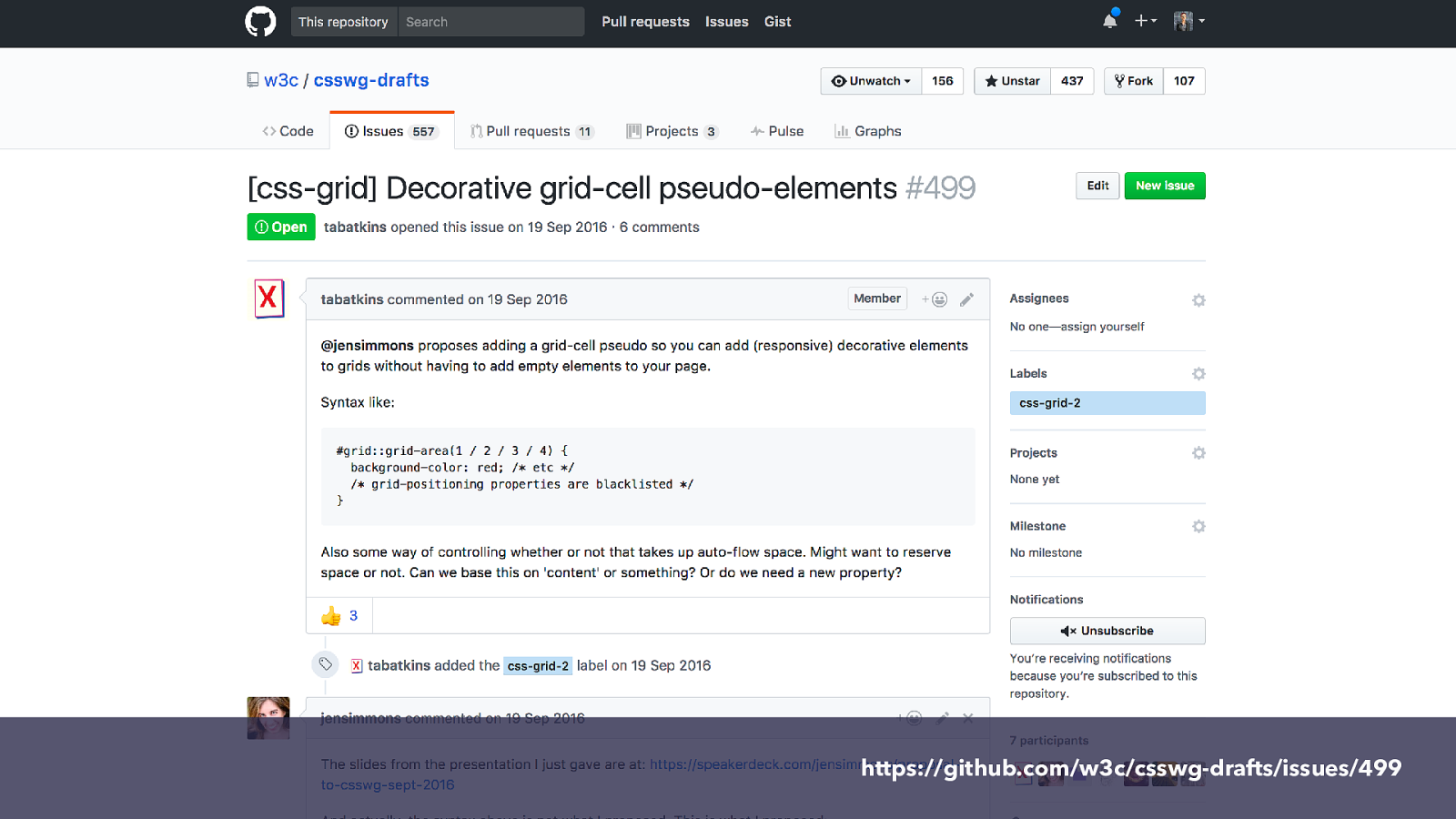
https://github.com/w3c/csswg-drafts/issues/499
Get involved with CSS ▸ Comment on or raise new issues against CSS specifications ▸ Raise bugs against browsers ▸ Vote on features where browsers have a platform to do so ▸ Write about new features - it demonstrates we want them ▸ Be nice while doing it. Browser engineers and spec editors work within constraints just as you do in your projects.
is here! CSS Grid
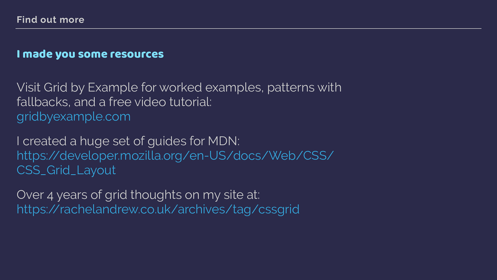
Find out more I made you some resources Visit Grid by Example for worked examples, patterns with fallbacks, and a free video tutorial: gridbyexample.com
I created a huge set of guides for MDN: https://developer.mozilla.org/en-US/docs/Web/CSS/ CSS_Grid_Layout
Over 4 years of grid thoughts on my site at: https://rachelandrew.co.uk/archives/tag/cssgrid
THANK YOU! @rachelandrew Resources & code: https://rachelandrew.co.uk/speaking/event/frontend-united-2017

2017 is the year of the Grid, with the long awaited CSS Grid Layout landing in browsers. In this talk I’ll demonstrate with practical examples what grid layout is, the basics of how to use it and how to start using it right now - without leaving older browsers out in the cold.