Grids All The Way Down
A presentation at Frontend United in in Utrecht, Netherlands by Rachel Andrew

Grids All The Way Down @rachelandrew at Frontend United Slides & resources https://noti.st/rachelandrew
Doing things on the web since 1996 Co-founder Perch CMS & Notist. Editor in Chief Smashing Magazine. Writer of many books. CSS Working Group Member representing Fronteers. Spec editor Multicol and Page Floats. MDN tech writer. Slides & resources https://noti.st/rachelandrew
CSS Grid Layout Two years on. Slides & resources https://noti.st/rachelandrew

“I can make flexbox do anything. Why should I learn grid?” Slides & resources https://noti.st/rachelandrew
“Should I use colour in this web design, or will fonts do?” Slides & resources https://noti.st/rachelandrew

“Should I build my site using Flexbox or Grid?” Slides & resources https://noti.st/rachelandrew

Stop thinking about Flexbox & Grid as two separate layout methods Slides & resources https://noti.st/rachelandrew

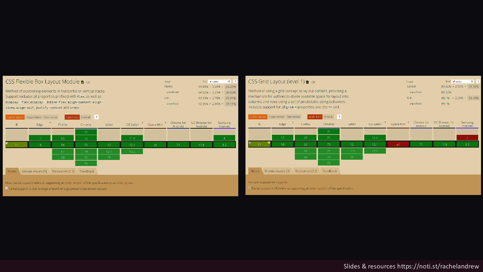
Should I build my site using Flexbox or Grid? YES. Slides & resources https://noti.st/rachelandrew
Slides & resources https://noti.st/rachelandrew
Look at the pattern you need to build. That will tell you which layout method you need. Slides & resources https://noti.st/rachelandrew

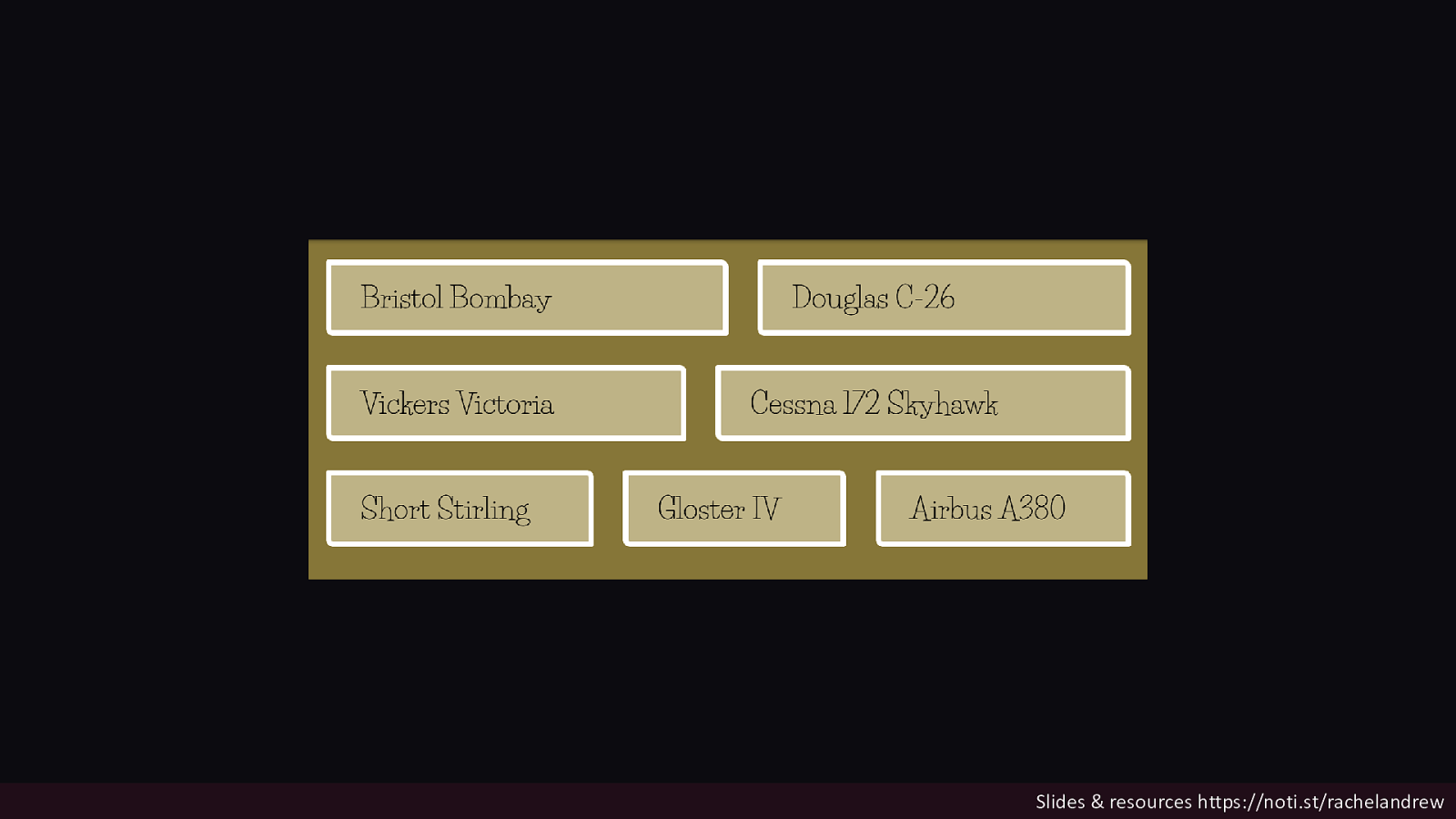
Flexbox when you have a bunch of different size stuff you want displayed in a readable way. Slides & resources https://noti.st/rachelandrew
Slides & resources https://noti.st/rachelandrew
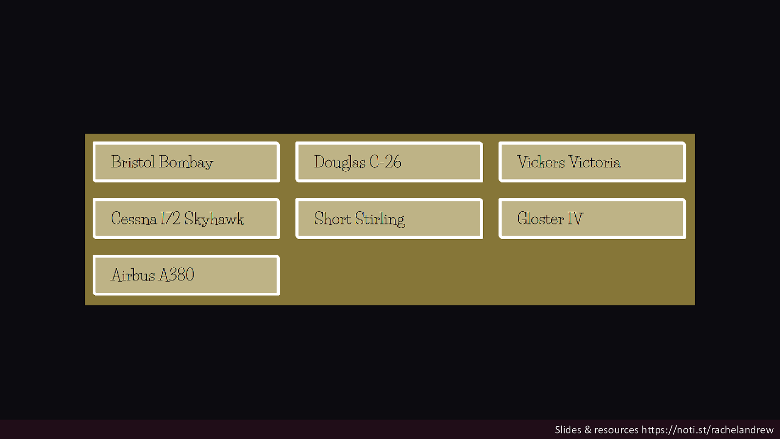
Grid for when you want to control the structure and place items into it. Slides & resources https://noti.st/rachelandrew
Slides & resources https://noti.st/rachelandrew
If you are putting widths on all your flex items to make them line up. You probably want grid. Slides & resources https://noti.st/rachelandrew

Slides & resources https://noti.st/rachelandrew

Slides & resources https://noti.st/rachelandrew
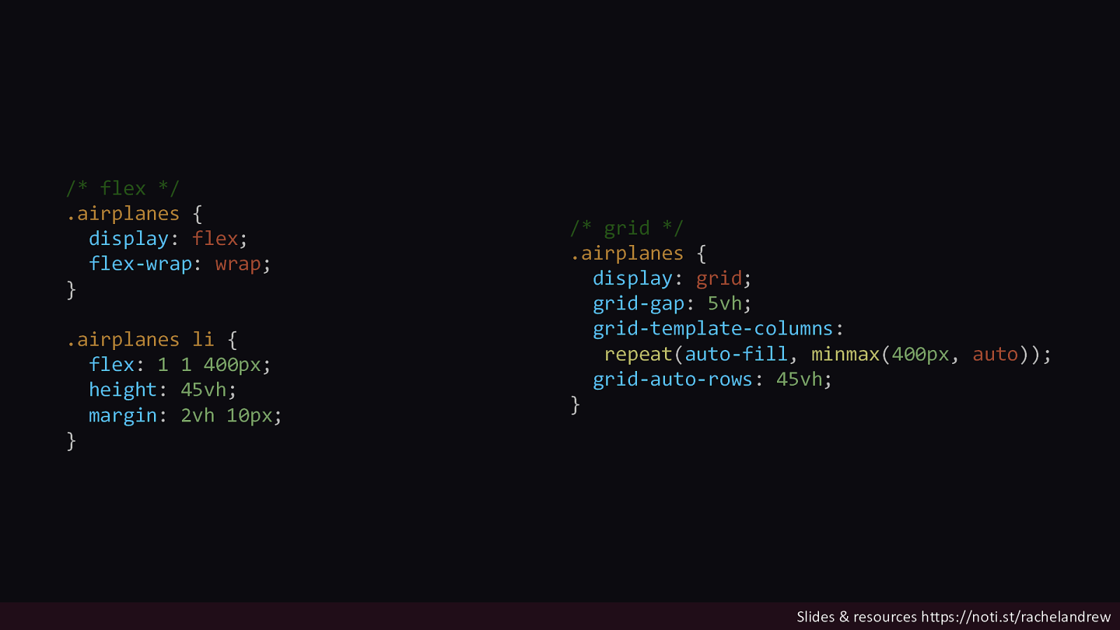
/* flex / .airplanes { display: flex; flex-wrap: wrap; } .airplanes li { flex: 1 1 400px; height: 45vh; margin: 2vh 10px; } / grid */ .airplanes { display: grid; grid-gap: 5vh; grid-template-columns: repeat(auto-fill, minmax(400px, auto)); grid-auto-rows: 45vh; } Slides & resources https://noti.st/rachelandrew

Slides & resources https://noti.st/rachelandrew
Two-dimensional Grid works in the same way in both axes. Slides & resources https://noti.st/rachelandrew
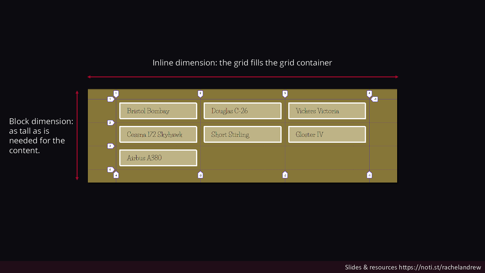
Inline dimension: the grid fills the grid container Block dimension: as tall as is needed for the content. Slides & resources https://noti.st/rachelandrew
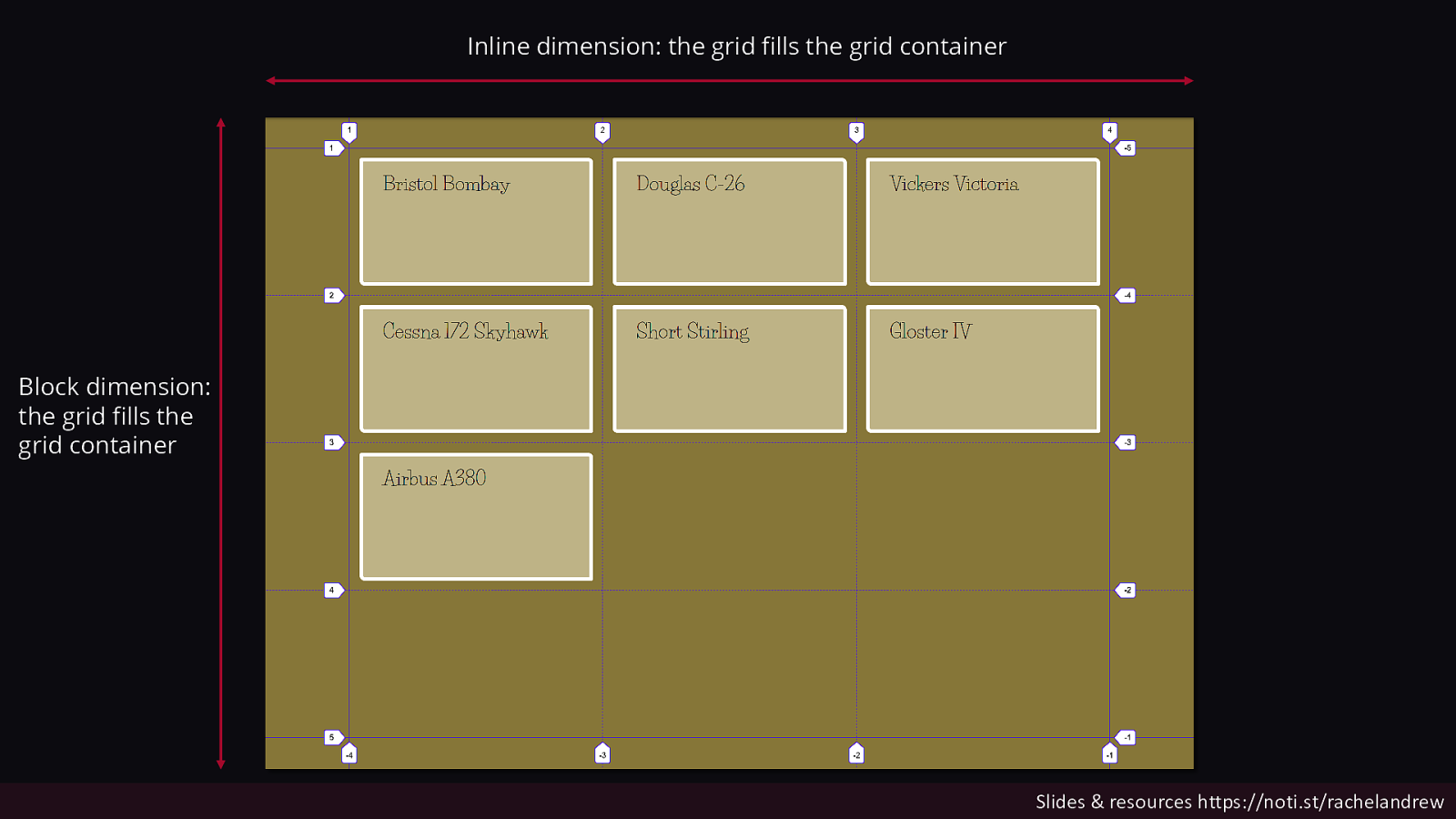
Inline dimension: the grid fills the grid container Block dimension: the grid fills the grid container Slides & resources https://noti.st/rachelandrew
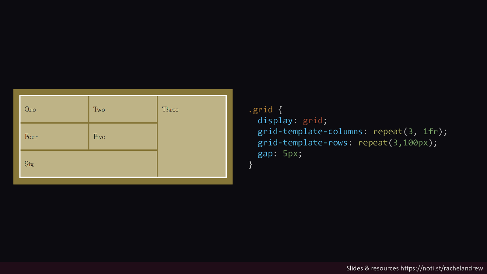
.grid { display: grid; grid-template-columns: repeat(3, 1fr); grid-template-rows: repeat(3,100px); gap: 5px; } Slides & resources https://noti.st/rachelandrew
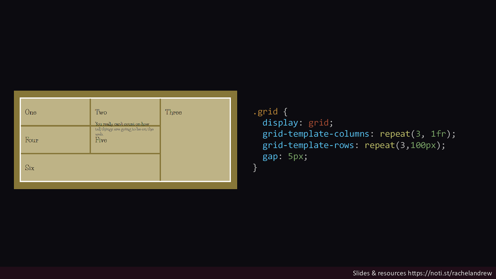
.grid { display: grid; grid-template-columns: repeat(3, 1fr); grid-template-rows: repeat(3,100px); gap: 5px; } Slides & resources https://noti.st/rachelandrew
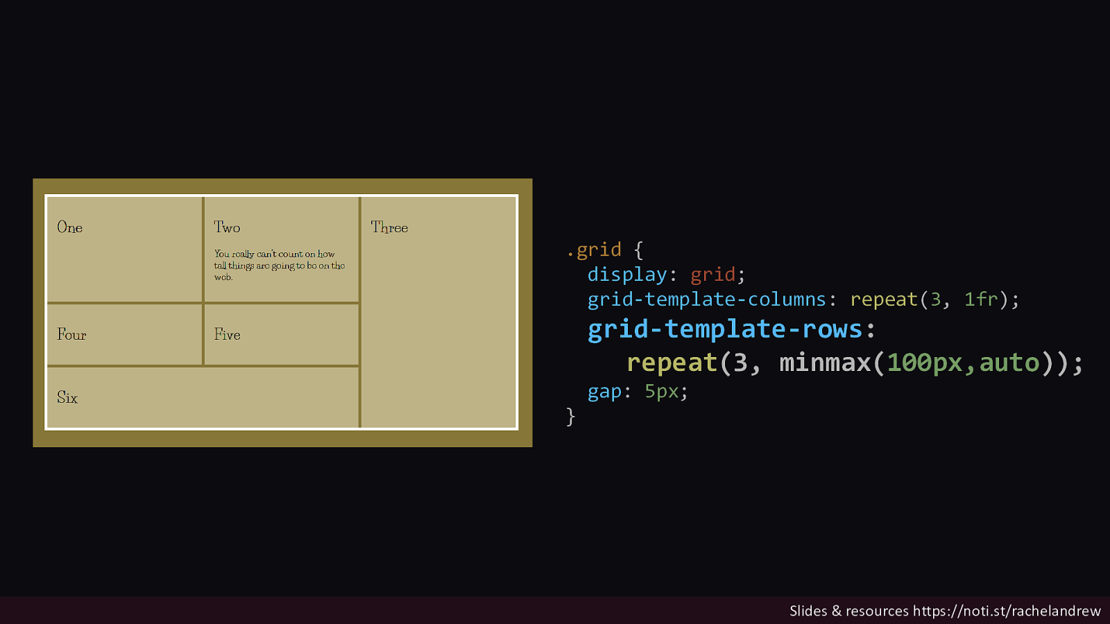
.grid { display: grid; grid-template-columns: repeat(3, 1fr); grid-template-rows: repeat(3, minmax(100px,auto)); } gap: 5px; Slides & resources https://noti.st/rachelandrew

We have choices now! Enjoy them, they have been a long time coming. Slides & resources https://noti.st/rachelandrew
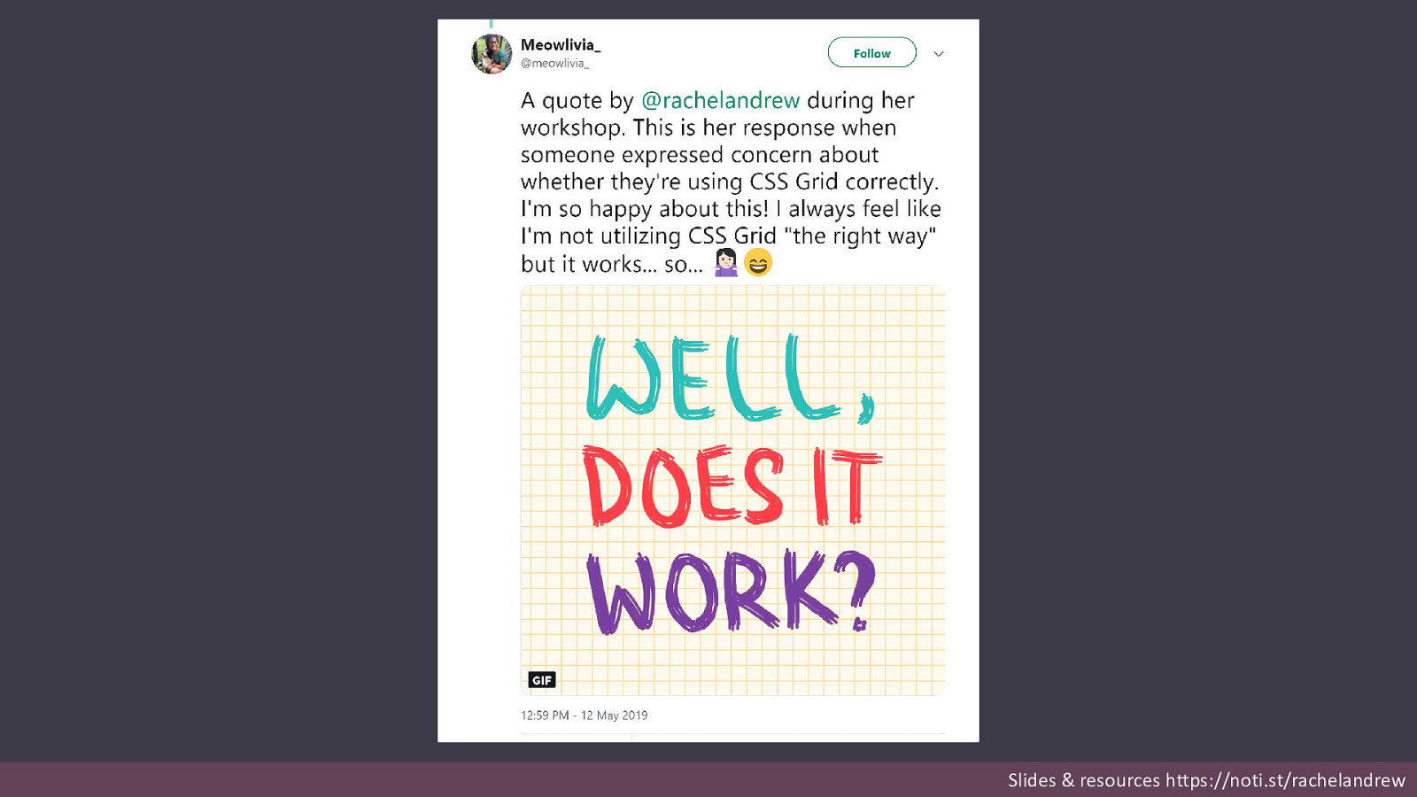
Slides & resources https://noti.st/rachelandrew

Slides & resources https://noti.st/rachelandrew
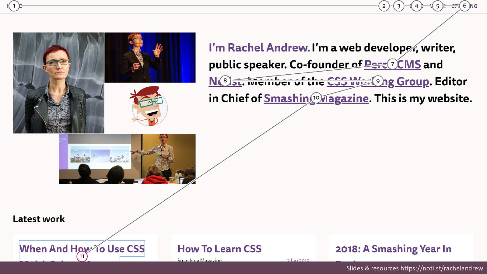
Slides & resources https://noti.st/rachelandrew

What can’t we do yet? Slides & resources https://noti.st/rachelandrew

Slides & resources https://noti.st/rachelandrew
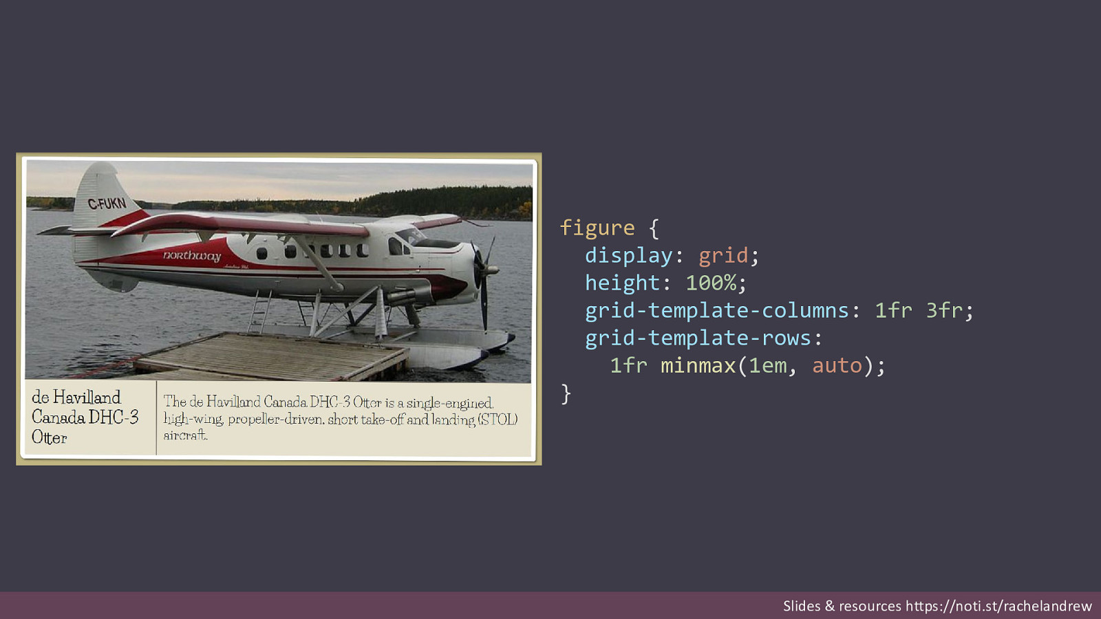
figure { display: grid; height: 100%; grid-template-columns: 1fr 3fr; grid-template-rows: 1fr minmax(1em, auto); } Slides & resources https://noti.st/rachelandrew
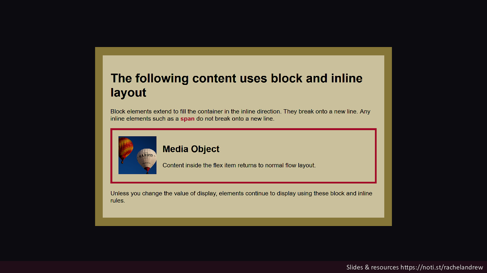
Only direct children become grid or flex items. Their children return to normal flow. Slides & resources https://noti.st/rachelandrew
Slides & resources https://noti.st/rachelandrew

Slides & resources https://noti.st/rachelandrew

Slides & resources https://noti.st/rachelandrew

1 2 3 4 Slides & resources https://noti.st/rachelandrew
display: contents Removing the box from the layout. Slides & resources https://noti.st/rachelandrew
Slides & resources https://noti.st/rachelandrew
Slides & resources https://noti.st/rachelandrew
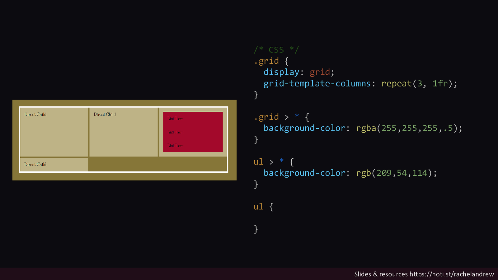
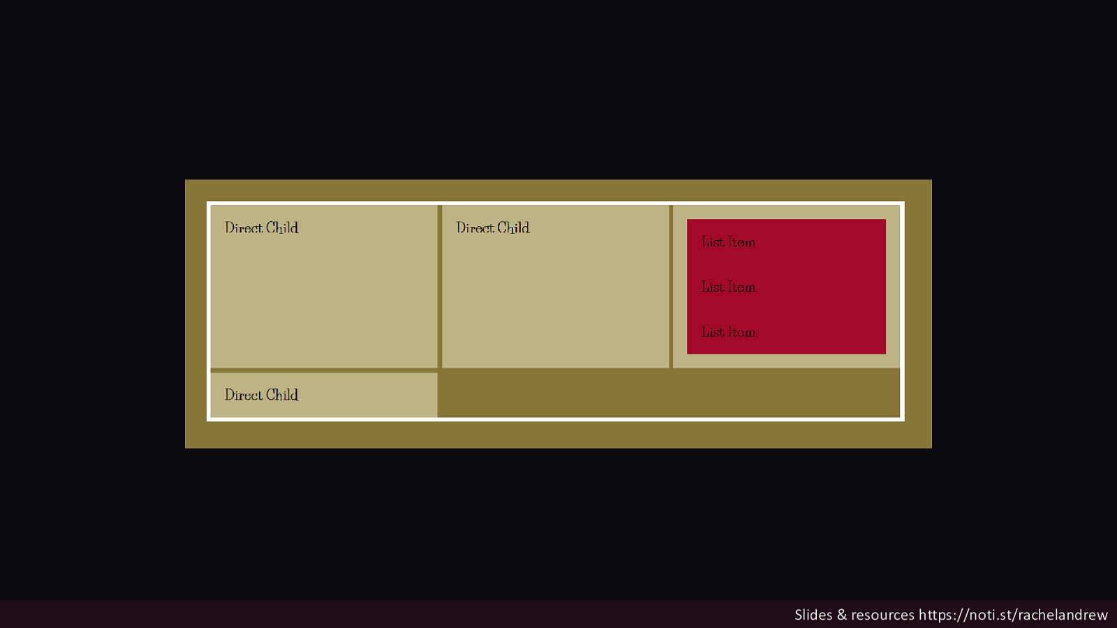
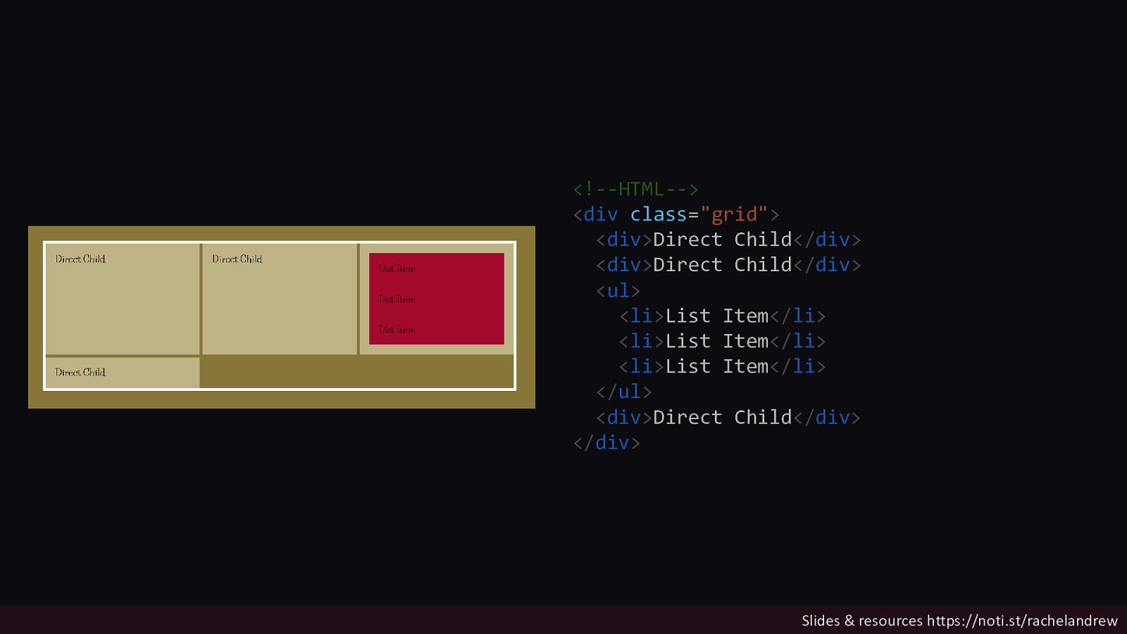
/* CSS */ .grid { display: grid; grid-template-columns: repeat(3, 1fr); } .grid > * { background-color: rgba(255,255,255,.5); } ul > * { background-color: rgb(209,54,114); } ul { } Slides & resources https://noti.st/rachelandrew
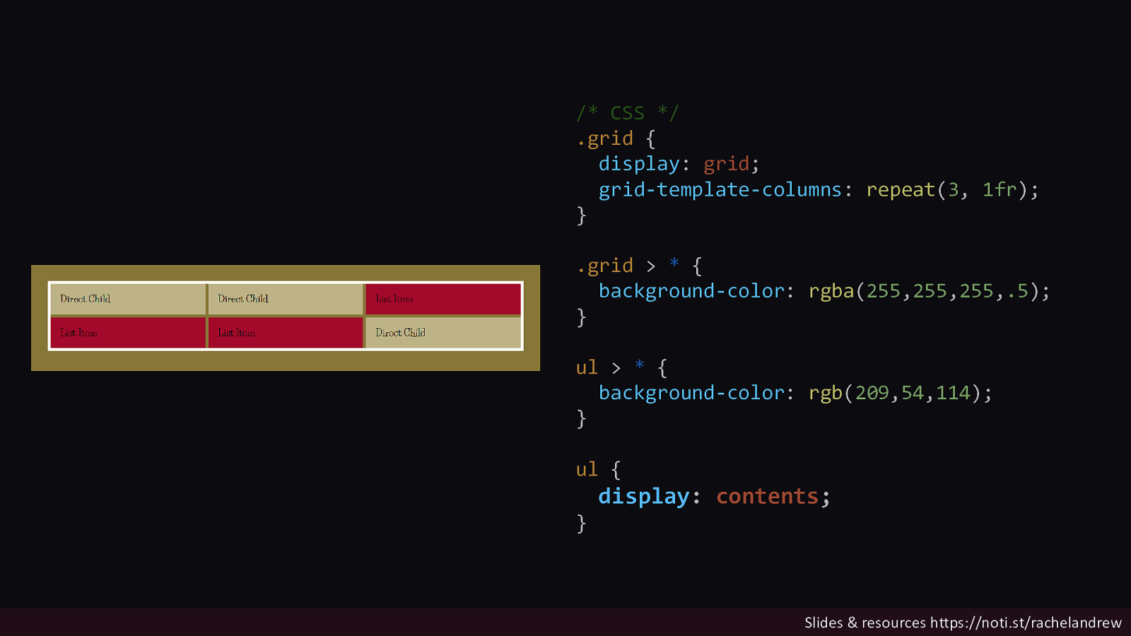
/* CSS */ .grid { display: grid; grid-template-columns: repeat(3, 1fr); } .grid > * { background-color: rgba(255,255,255,.5); } ul > * { background-color: rgb(209,54,114); } ul { } display: contents; Slides & resources https://noti.st/rachelandrew
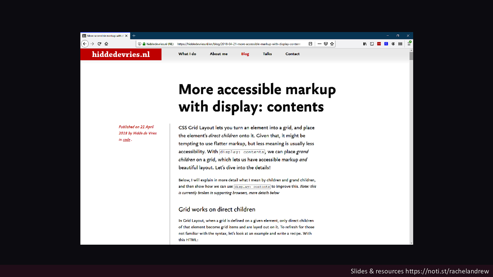
Slides & resources https://noti.st/rachelandrew
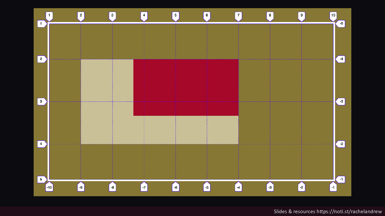
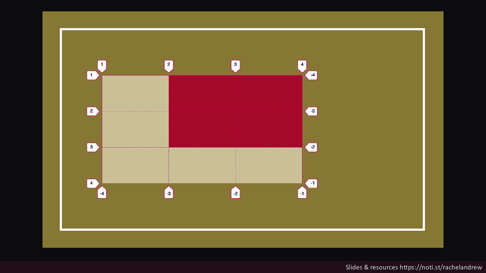
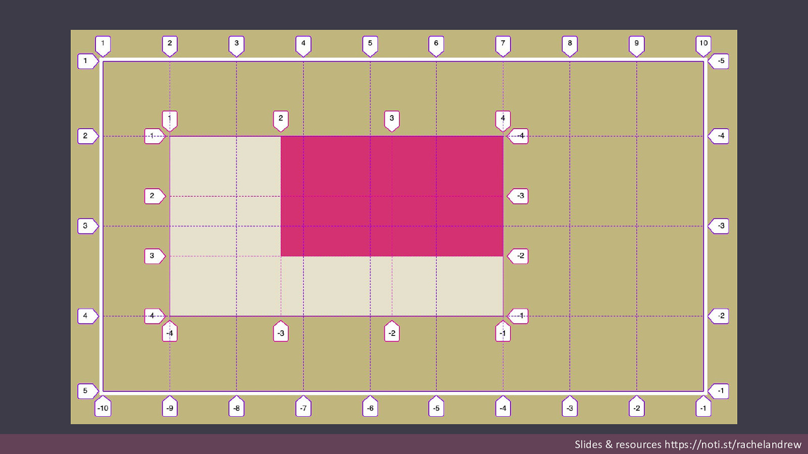
Subgrid Create a grid on a grid item which uses the grid tracks defined on the parent – for rows, columns or both. Slides & resources https://noti.st/rachelandrew
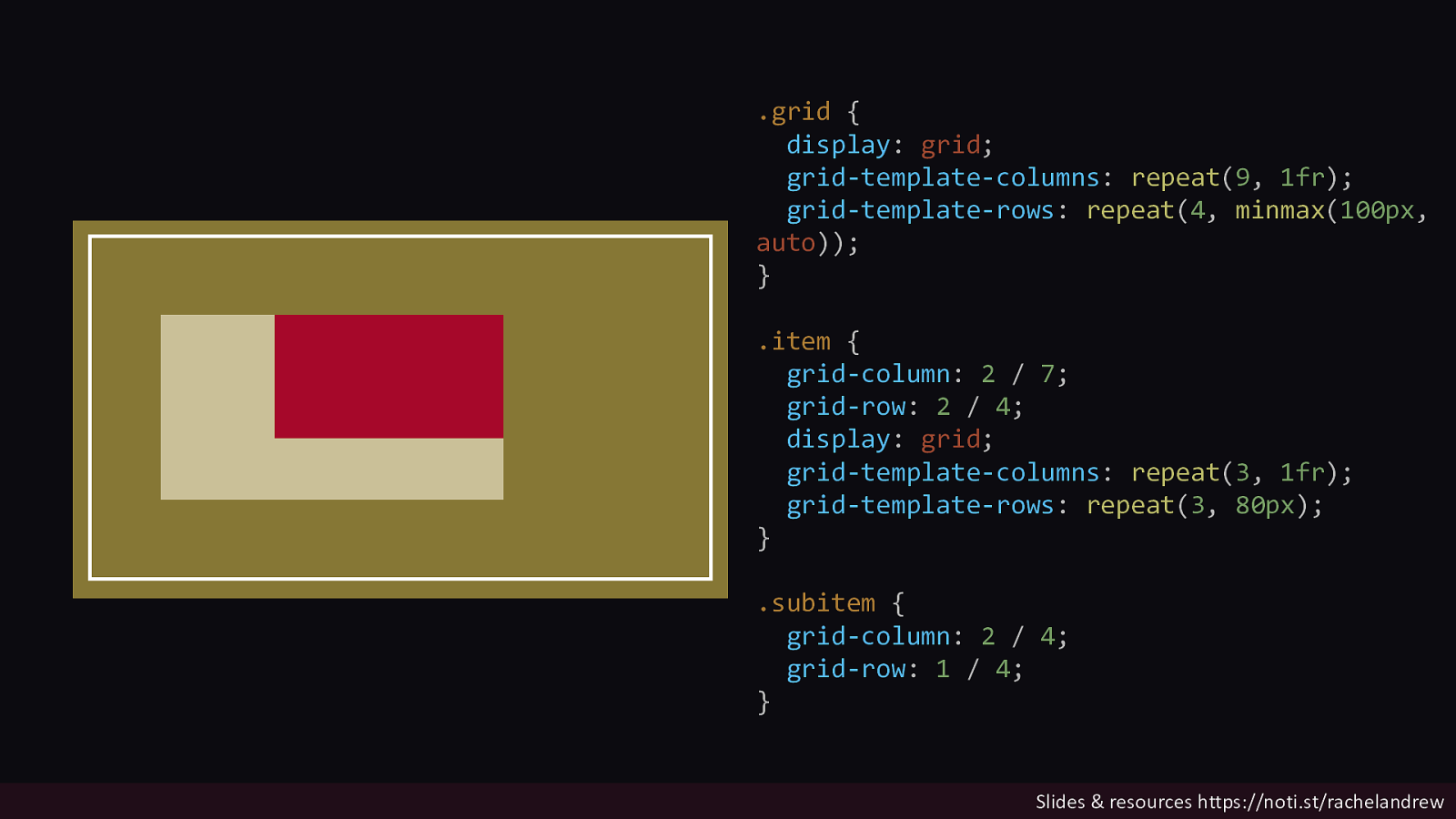
.grid { display: grid; grid-template-columns: repeat(9, 1fr); grid-template-rows: repeat(4, minmax(100px, auto)); } .item { grid-column: 2 / 7; grid-row: 2 / 4; display: grid; grid-template-columns: repeat(3, 1fr); grid-template-rows: repeat(3, 80px); } .subitem { grid-column: 2 / 4; grid-row: 1 / 4; } Slides & resources https://noti.st/rachelandrew
Slides & resources https://noti.st/rachelandrew
Slides & resources https://noti.st/rachelandrew
Slides & resources https://noti.st/rachelandrew
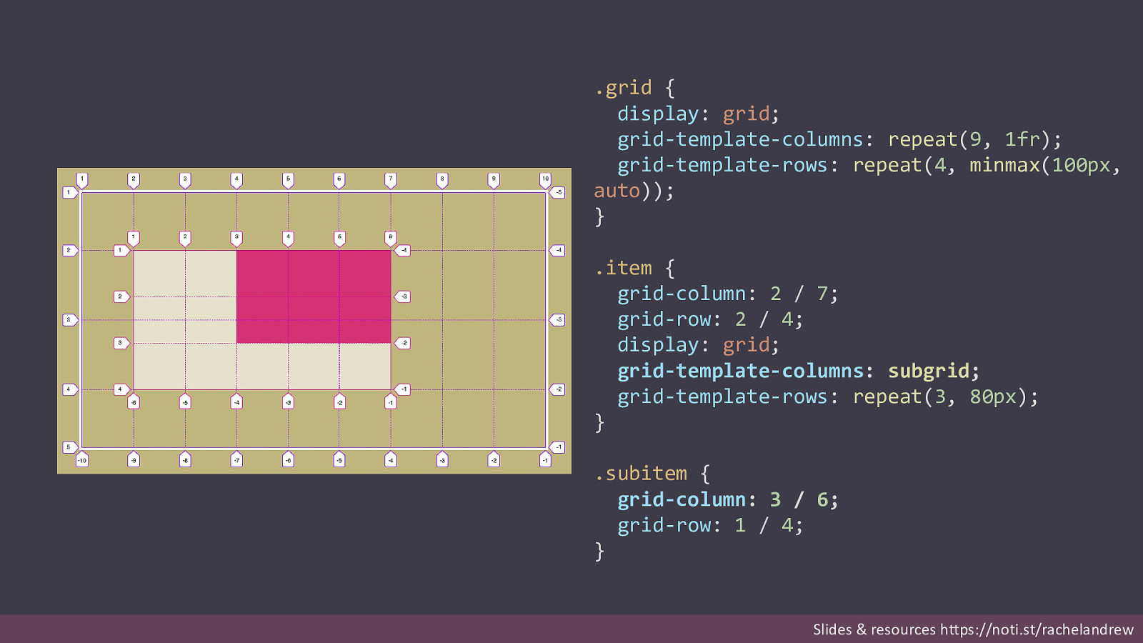
.grid { display: grid; grid-template-columns: repeat(9, 1fr); grid-template-rows: repeat(4, minmax(100px, auto)); } .item { grid-column: 2 / 7; grid-row: 2 / 4; display: grid; grid-template-columns: subgrid; grid-template-rows: repeat(3, 80px); } .subitem { grid-column: 3 / 6; grid-row: 1 / 4; } Slides & resources https://noti.st/rachelandrew
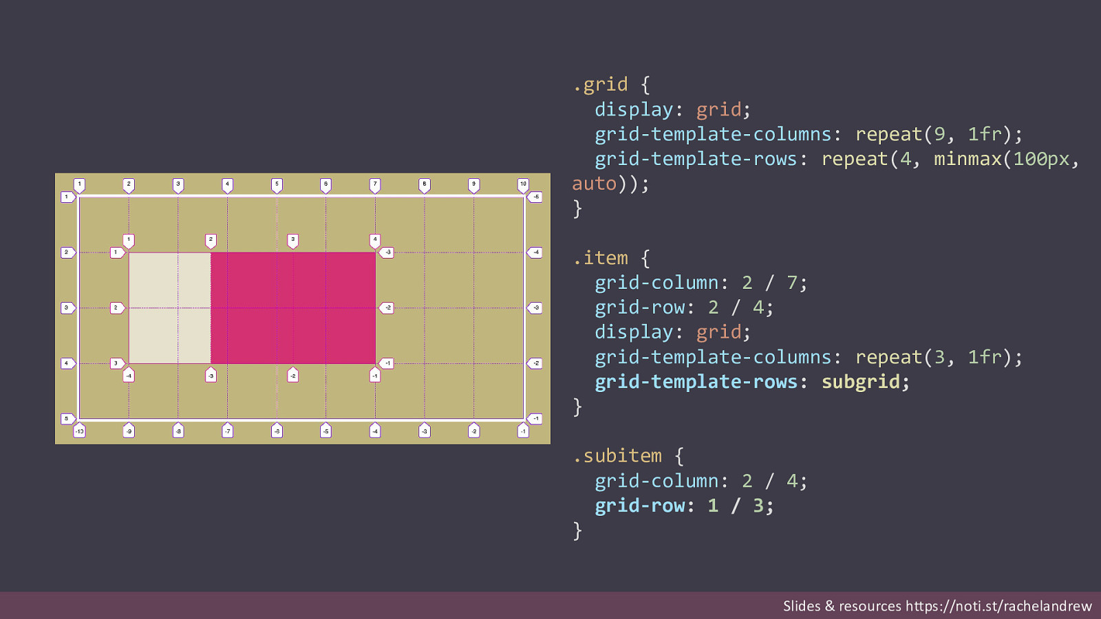
.grid { display: grid; grid-template-columns: repeat(9, 1fr); grid-template-rows: repeat(4, minmax(100px, auto)); } .item { grid-column: 2 / 7; grid-row: 2 / 4; display: grid; grid-template-columns: repeat(3, 1fr); grid-template-rows: subgrid; } .subitem { grid-column: 2 / 4; grid-row: 1 / 3; } Slides & resources https://noti.st/rachelandrew
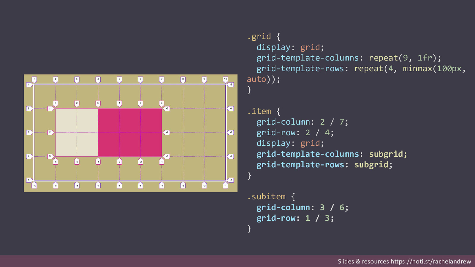
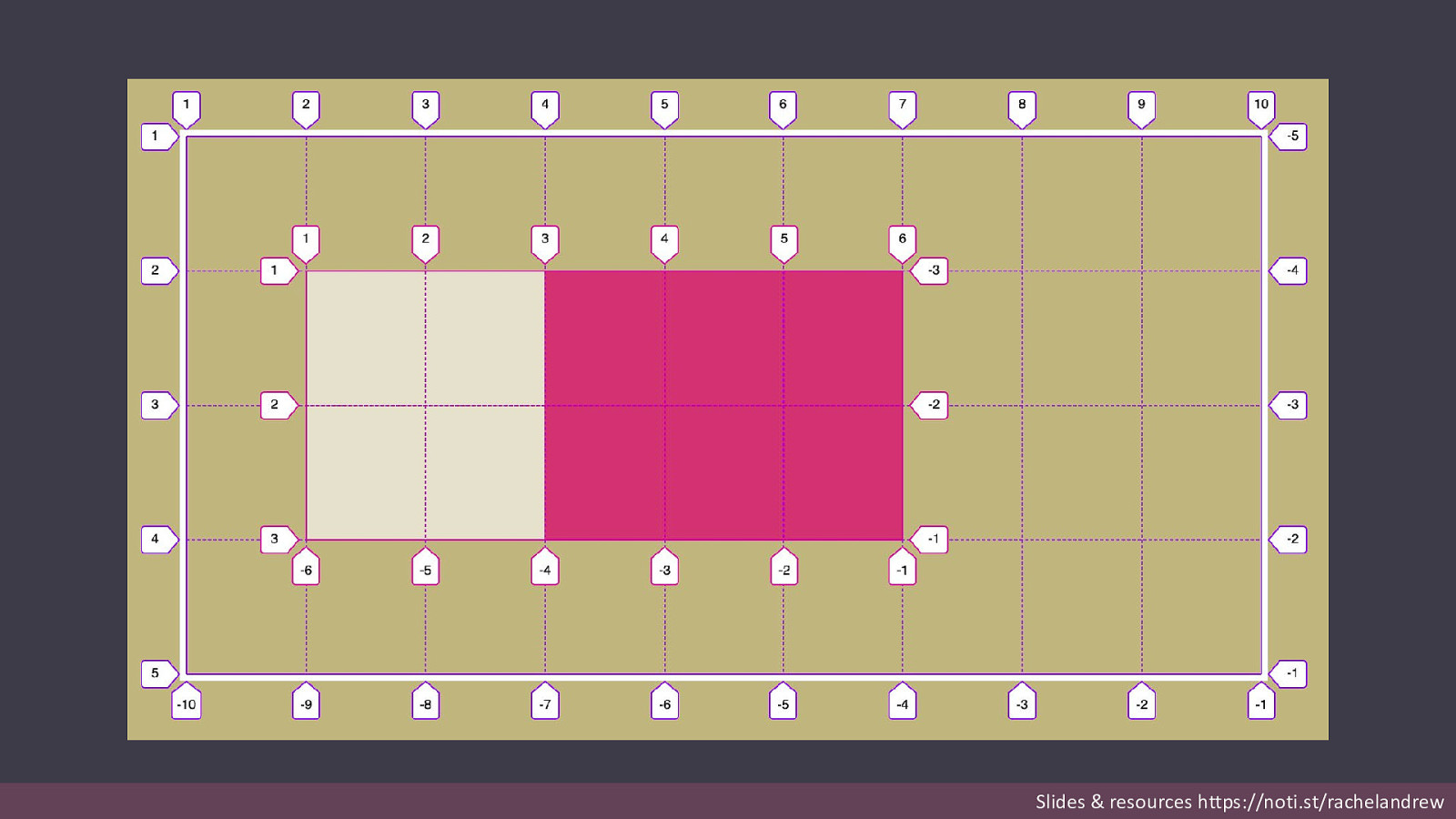
.grid { display: grid; grid-template-columns: repeat(9, 1fr); grid-template-rows: repeat(4, minmax(100px, auto)); } .item { grid-column: 2 / 7; grid-row: 2 / 4; display: grid; grid-template-columns: subgrid; grid-template-rows: subgrid; } .subitem { grid-column: 3 / 6; grid-row: 1 / 3; } Slides & resources https://noti.st/rachelandrew
Line numbers start from 1 inside the subgrid. You position child items in the subgrid according to the subgrid line numbering, not those of the parent. Slides & resources https://noti.st/rachelandrew
Slides & resources https://noti.st/rachelandrew
Line names on the parent are passed into the subgrid. If you have named lines on the parent grid they will be passed into the subgrid and added to any names defined there. Slides & resources https://noti.st/rachelandrew
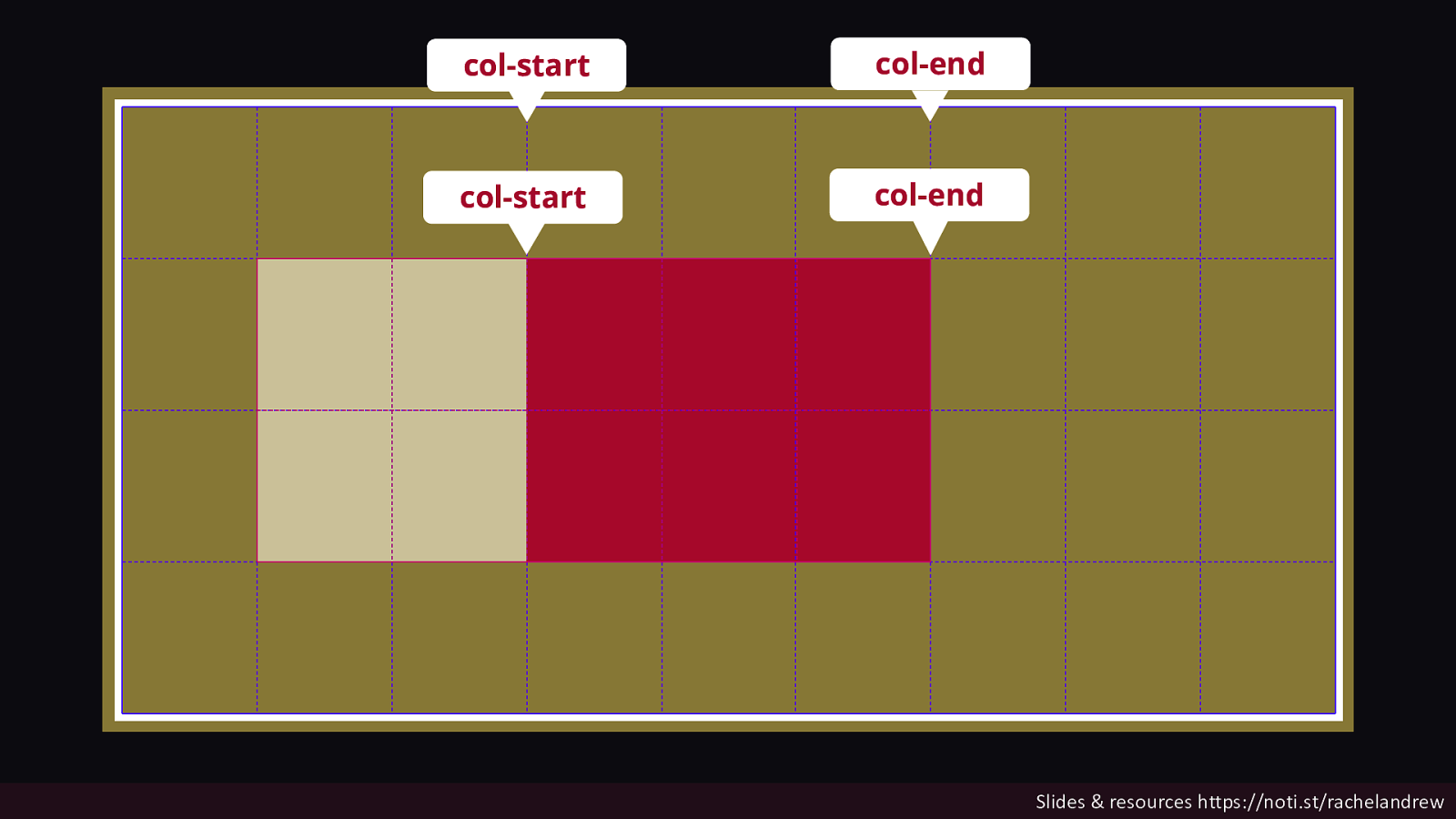
col-start col-end col-start col-end Slides & resources https://noti.st/rachelandrew
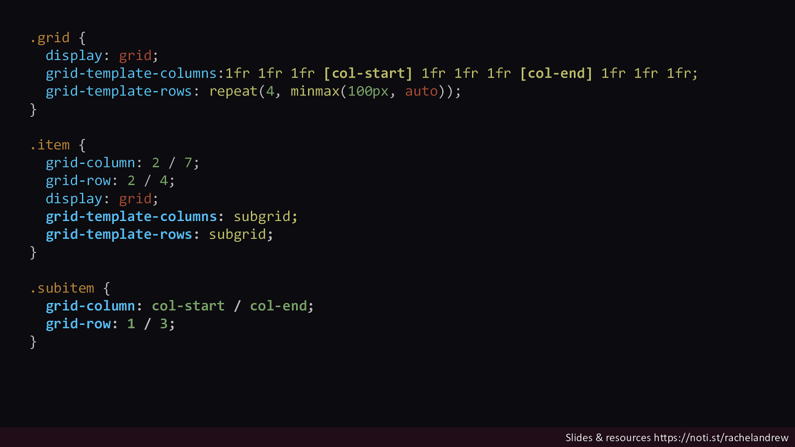
.grid { display: grid; grid-template-columns:1fr 1fr 1fr [col-start] 1fr 1fr 1fr [col-end] 1fr 1fr 1fr; grid-template-rows: repeat(4, minmax(100px, auto)); } .item { grid-column: 2 / 7; grid-row: 2 / 4; display: grid; grid-template-columns: subgrid; grid-template-rows: subgrid; } .subitem { grid-column: col-start / col-end; grid-row: 1 / 3; } Slides & resources https://noti.st/rachelandrew
You can add named lines to the subgrid. Line names are added after the subgrid keyword. Slides & resources https://noti.st/rachelandrew
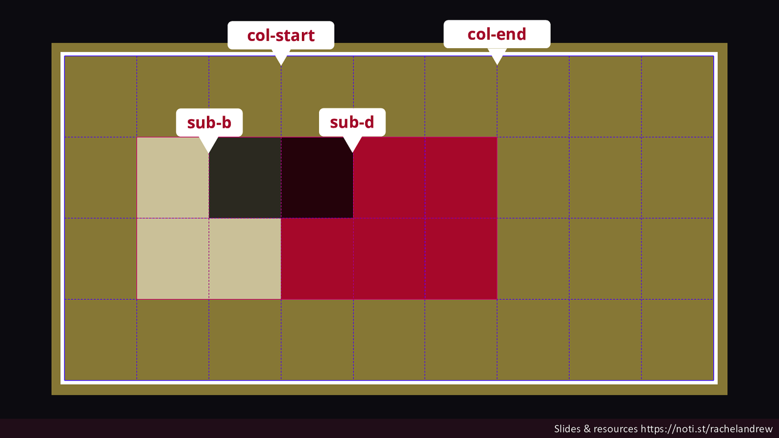
col-end col-start sub-b sub-d Slides & resources https://noti.st/rachelandrew
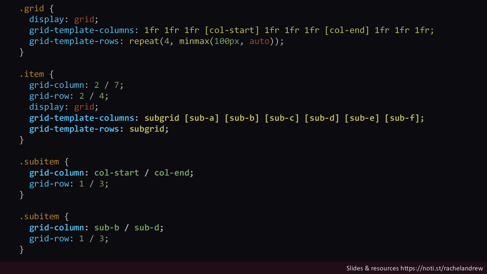
.grid { display: grid; grid-template-columns: 1fr 1fr 1fr [col-start] 1fr 1fr 1fr [col-end] 1fr 1fr 1fr; grid-template-rows: repeat(4, minmax(100px, auto)); } .item { grid-column: 2 / 7; grid-row: 2 / 4; display: grid; grid-template-columns: subgrid [sub-a] [sub-b] [sub-c] [sub-d] [sub-e] [sub-f]; grid-template-rows: subgrid; } .subitem { grid-column: col-start / col-end; grid-row: 1 / 3; } .subitem { grid-column: sub-b / sub-d; grid-row: 1 / 3; } Slides & resources https://noti.st/rachelandrew
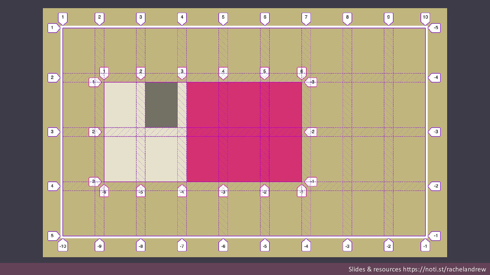
The subgrid inherits the gaps from the parent. Slides & resources https://noti.st/rachelandrew
Slides & resources https://noti.st/rachelandrew
You can change the gaps on the subgrid. Slides & resources https://noti.st/rachelandrew

Slides & resources https://noti.st/rachelandrew
Sizing of items in the subgrid can change the size of the parent tracks. Slides & resources https://noti.st/rachelandrew

Slides & resources https://noti.st/rachelandrew

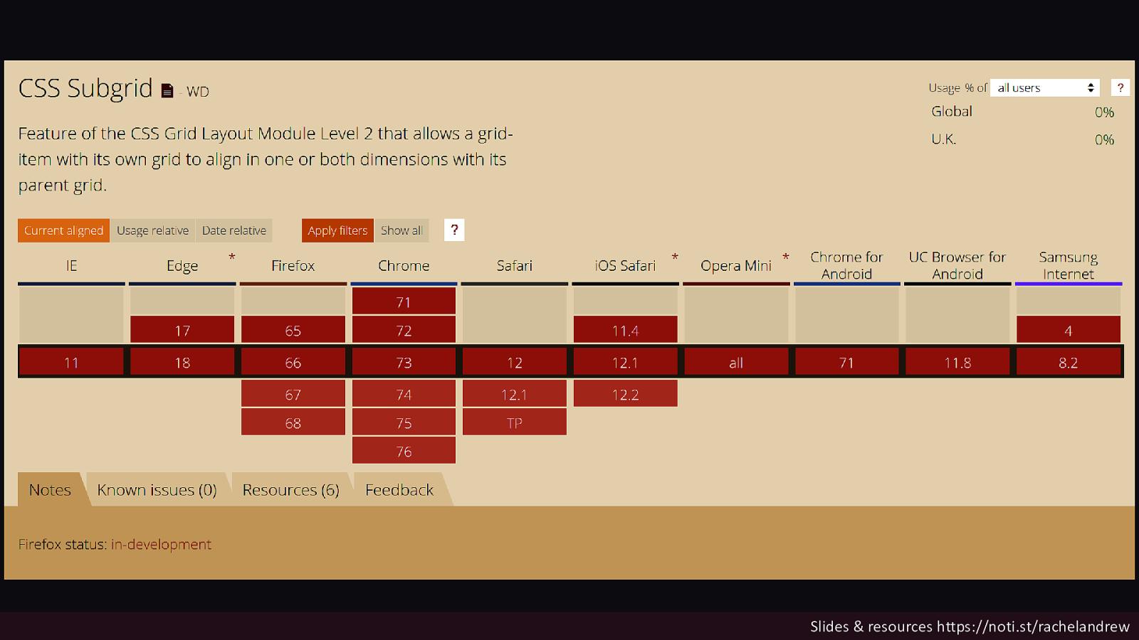
Now the bad news There are currently no browser implementations of subgrid. Slides & resources https://noti.st/rachelandrew
Slides & resources https://noti.st/rachelandrew

Slightly better news Firefox are implementing subgrid as we speak! Slides & resources https://noti.st/rachelandrew
Fewer rendering engines fewer places where new ground can be broken. Slides & resources https://noti.st/rachelandrew

Tell browsers what you want in the platform. Slides & resources https://noti.st/rachelandrew
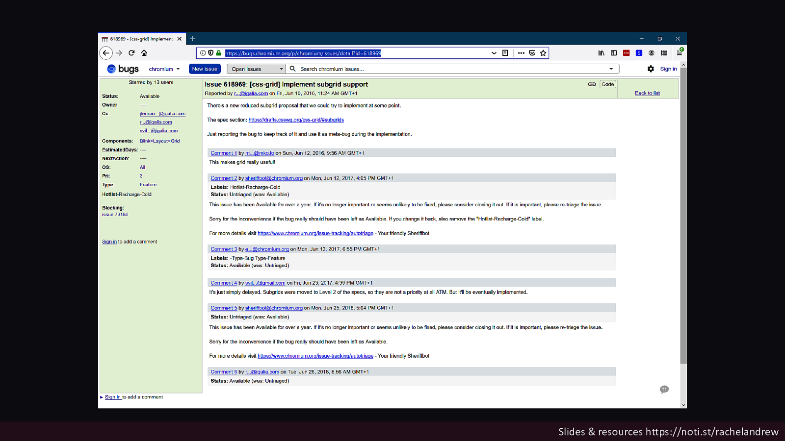
Slides & resources https://noti.st/rachelandrew

https://bugs.chromium.org/p/chromium/issues/detail?id=618969 Slides & resources https://noti.st/rachelandrew

Slides & resources https://noti.st/rachelandrew

https://bugzilla.mozilla.org/show_bug.cgi?id=1240834 Slides & resources https://noti.st/rachelandrew
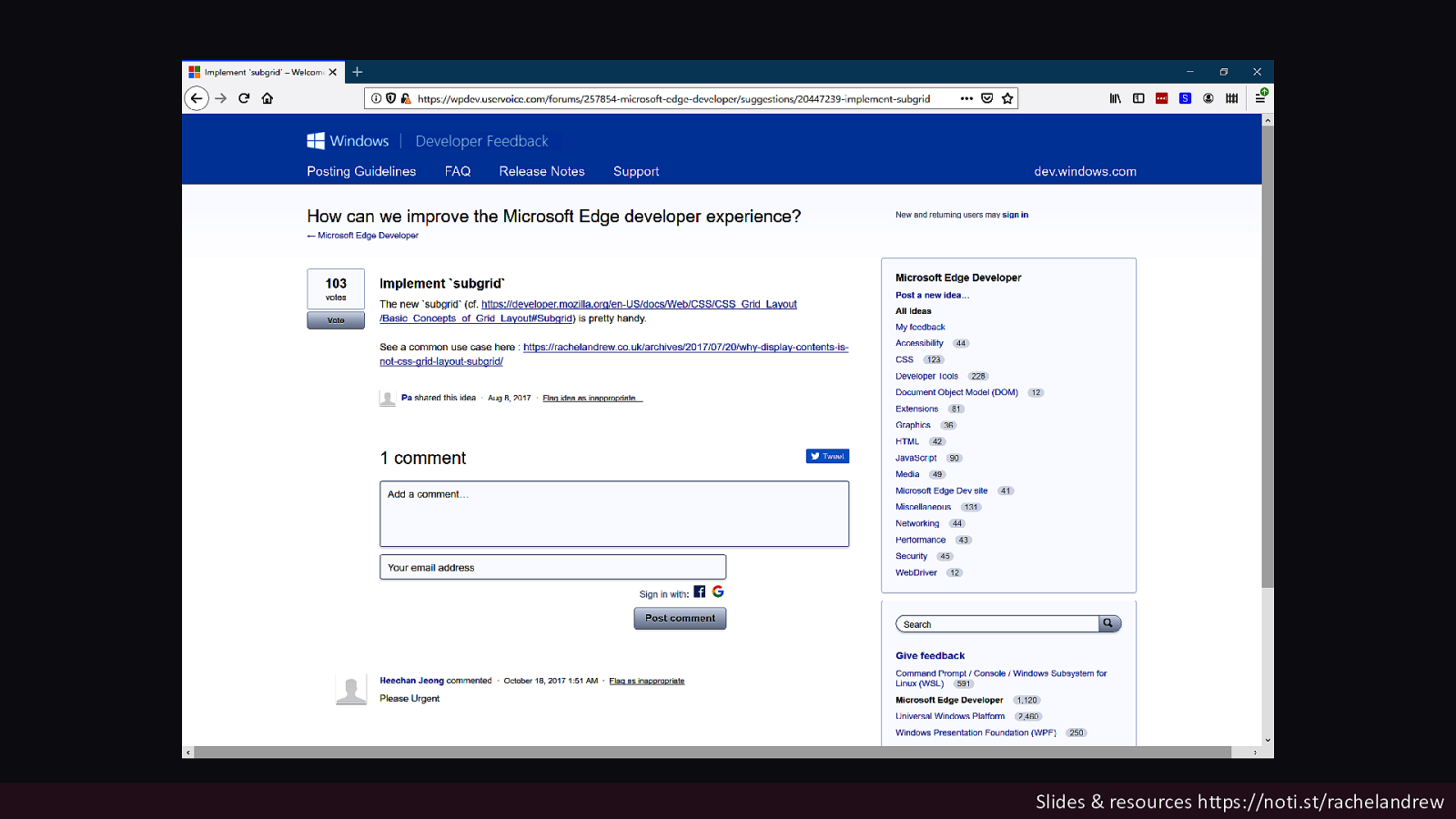
Slides & resources https://noti.st/rachelandrew

https://wpdev.uservoice.com/forums/257854-microsoft-edgedeveloper/suggestions/20447239-implement-subgrid Slides & resources https://noti.st/rachelandrew

Write about features you want to see in browsers Write up your use cases, the problems having the feature will solve. Slides & resources https://noti.st/rachelandrew

Use new features Browsers are watching. Slides & resources https://noti.st/rachelandrew
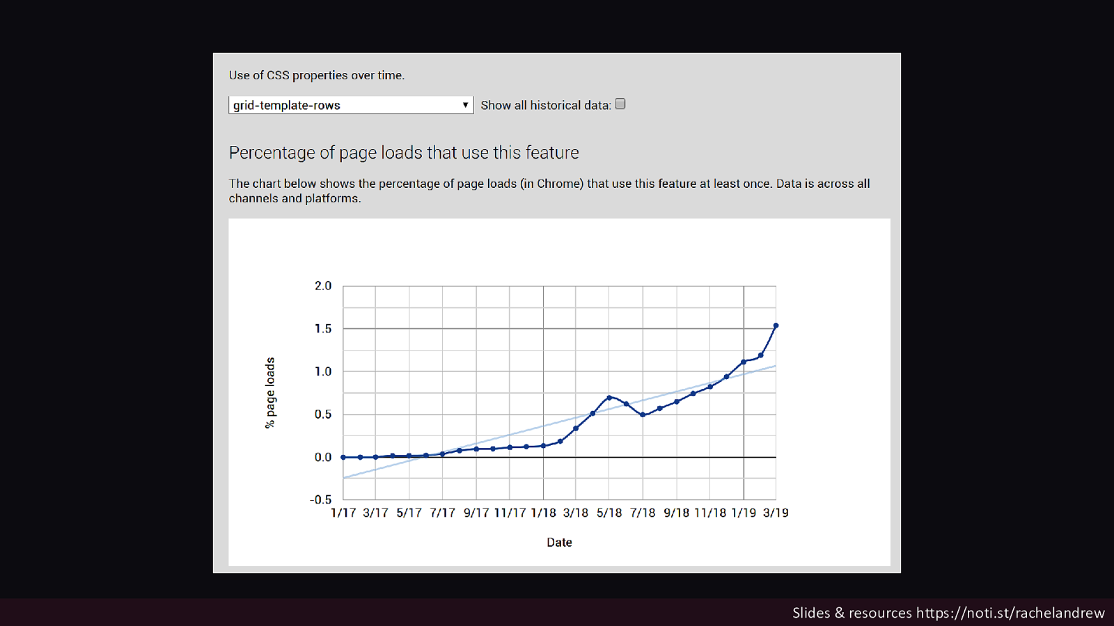
Slides & resources https://noti.st/rachelandrew

Use new features when they are behind a flag You get to beta test the web platform! Slides & resources https://noti.st/rachelandrew
Give feedback to the CSS Working Group https://github.com/w3c/csswg-drafts/issues Slides & resources https://noti.st/rachelandrew
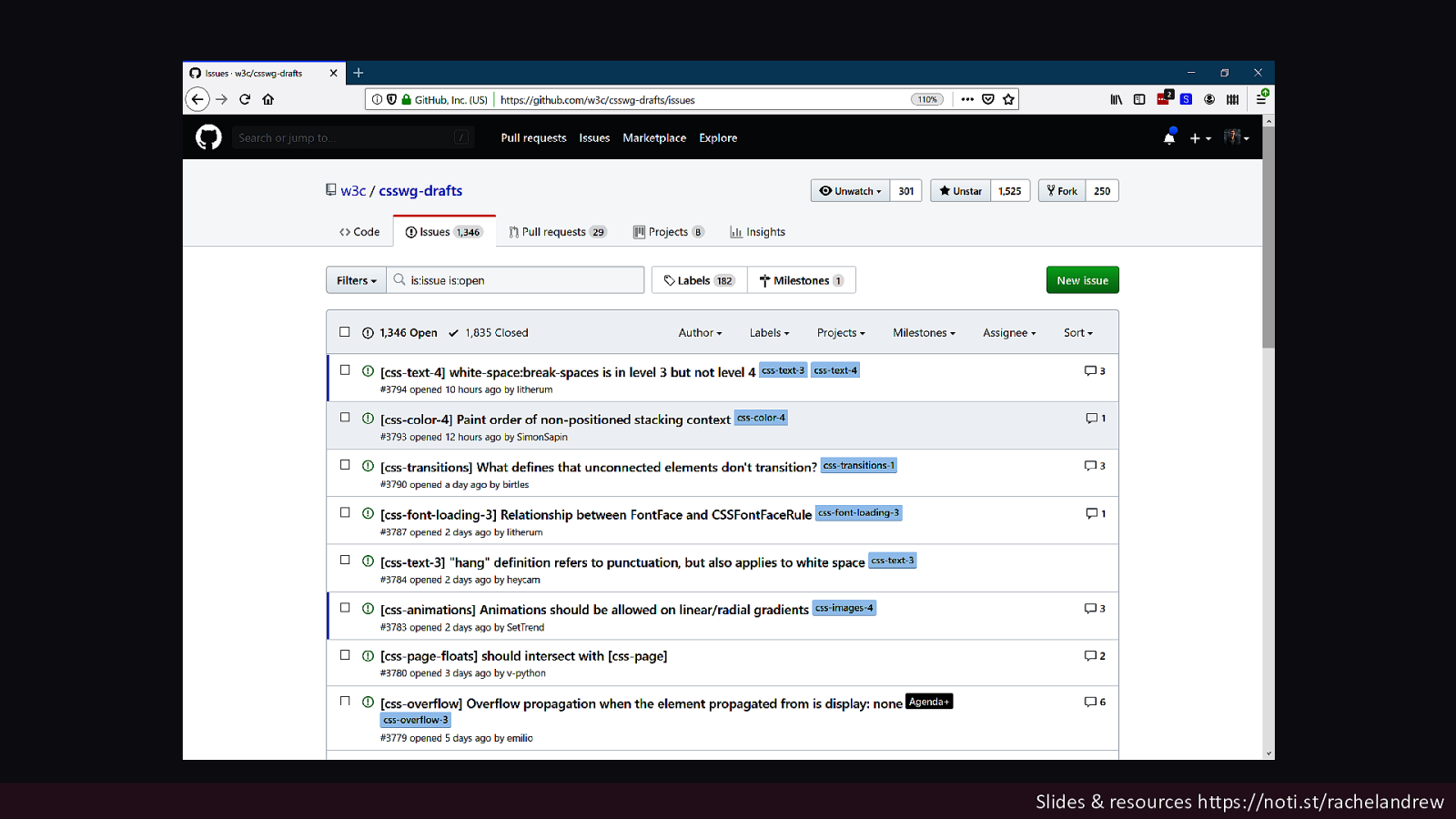
Slides & resources https://noti.st/rachelandrew

Participate in the web platform Or you are leaving your future as a designer or developer in the hands of the very few who do. Slides & resources https://noti.st/rachelandrew

Thank you @rachelandrew Slides & resources https://noti.st/rachelandrew
Two years have passed since Grid Layout launched across all major browsers. However as it was landing and becoming available for us to use in production, work on the spec continued. Due to this work, Level 2 of the Grid Specification contains the most wanted feature as people come to grips with the spec - subgrid.
In this talk I will explain what subgrid is, the problems that it will solve for web designers and developers, and the things that it will make possible. I’ll also take a look at some of the other things that are coming to CSS Layout, and how you can get involved in pushing all of these new things forward.
Buzz and feedback
Here’s what was said about this presentation on social media.
-
My favorite css spec: Grid, explained by @rachelandrew herself! #FrontendUnited #sketchnotes pic.twitter.com/Hg428cupmq
— 𝔸ℕ𝕂𝔼 (@ankedesign) May 18, 2019 -
One of the few moments a question with an "or" in it can be answered with a single "YES" 😆 @rachelandrew @frontendunited #frontendunited pic.twitter.com/pG016R0Pp3
— Gerald v.d. Hengel (@G_Hengel) May 18, 2019 -
Grids all the way down with @rachelandrew in our @fronteers room. #FrontendUnited pic.twitter.com/9tA4R64YPe
— Frontend United (@frontendunited) May 18, 2019 -
Watching @rachelandrew showcase the css subgrid spec is just 🤯 in the best way possible! #FrontendUnited
— Giovanni Zunino (@giothevanni) May 18, 2019 -
‘There's not really a wrong way to use Grid Layout, except if it causes an accessibility problem. For example when source order and layout order don't match, as that can ruin keyboard accessibility’, explains @rachelandrew #FrontendUnited
— Hidde (@hdv) May 18, 2019
